

7-day demo
Three high-traffic surfaces redesigned, multiple iterations each. Day 8 the team handed us the platform.
Every successful B2B SaaS eventually outgrows its original design. Most teams know it. Few do anything about it before the user numbers tell the story.
PayEngine is a B2B fintech SaaS that runs multi-processor payment infrastructure for other SaaS companies, embedded merchant dashboards, transaction stack, settlement runs, the lot. Years in market, engine working, UX falling behind. They wanted designers with a modern fintech sense and the chops to prove the work first. They scoped a 7-day free demo on three high-traffic surfaces. Day 8 they handed us the rest of the platform.
A live platform, not a sandbox. Real merchants running real transactions every day, the redesign couldn’t freeze the product or break the engine. Same data, modern surface.
Prove it first. The PM wasn’t committing to a multi-quarter rebuild on a deck. They scoped a 7-day paid pilot on the three surfaces users hit every day. If the work clicked, the platform opened up.
Modernize without rewriting. Years of feature work behind the engine, integrations and multi-processor logic intact. The revamp had to bring the front end forward without disturbing the back.
PayEngine runs multi-processor payment infrastructure for other SaaS companies: merchant directory, transaction stack, settlement runs, the lot. Years in market, engine working, UX falling behind. They were after designers with a modern fintech sense and the chops to prove the work first, partners, not vendors. Instead of bidding with a deck, we bid with the screens. We picked the three surfaces users hit every day, transactions, main dashboard, search filter popups, and shipped multiple iterations of each inside a 7-day free demo window. Day 8, they handed us the rest of the platform.
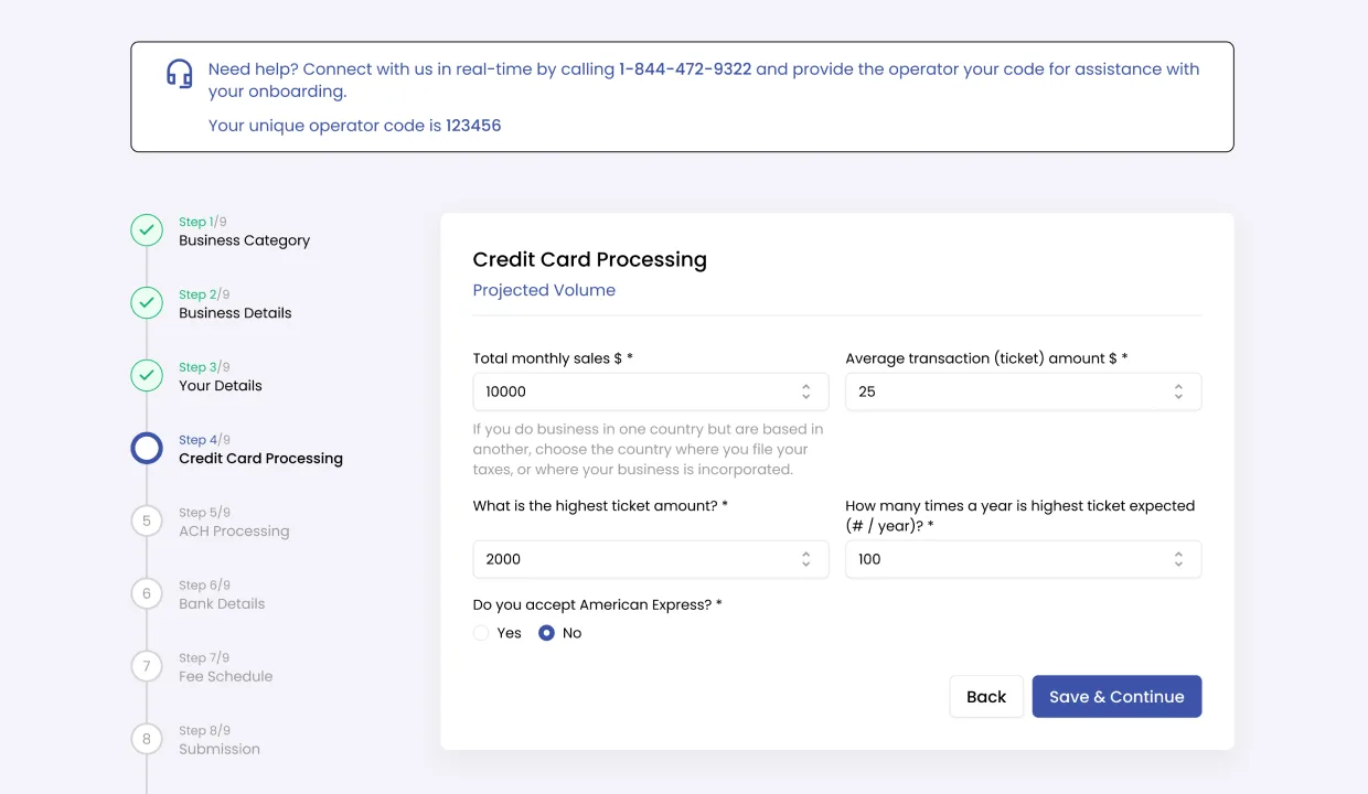
Once the platform opened up, we ran a full UX audit before redesigning a single flow. We pitched modernization ideas to the PM, deferred to stakeholders on direction, then shipped. A component-based design system, tokens, primitives, patterns, went out alongside the production screens so new flows would assemble instead of redraw. Daily designer / PM syncs, weekly stakeholder reviews, real before and after pairs on the high-traffic surfaces (transactions, merchants, onboarding) to keep the receipts visible.
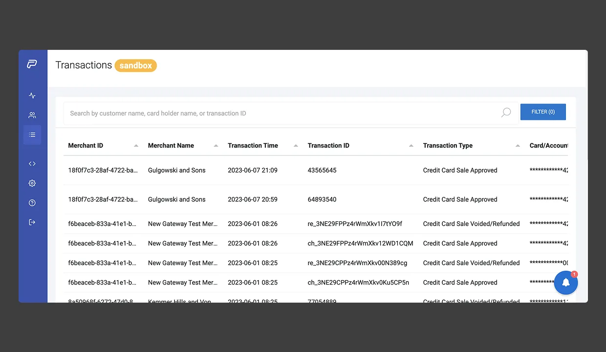
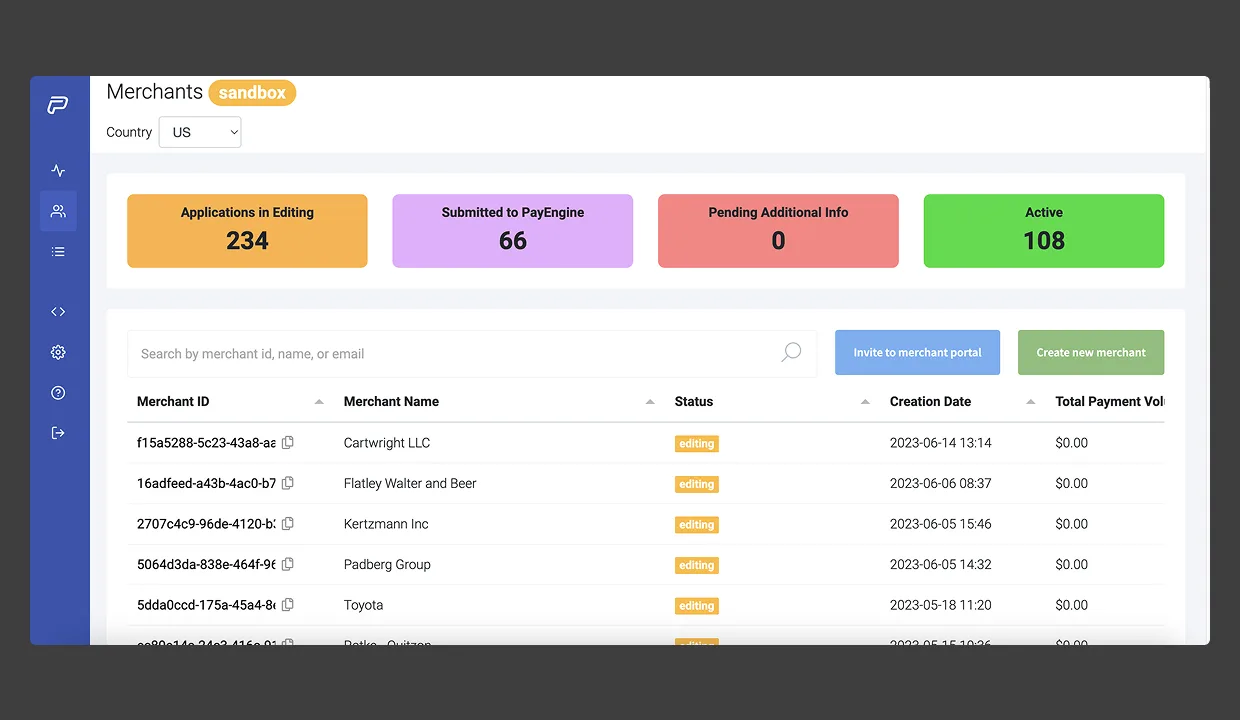
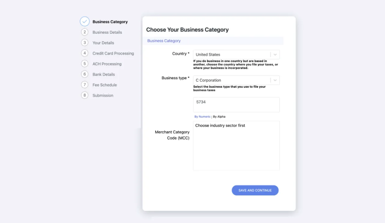
A working payments engine wrapped in years of feature accretion. Transactions, merchants, and onboarding, the three surfaces every customer hit every day, were the ones aging the fastest: cramped tables, low-contrast statuses, monolithic onboarding forms. This is what the platform looked like the day before the demo started.
Most agency demos are slides about how good the agency is. Ours was the work. We picked the three surfaces PayEngine’s users hit every day, transaction interface, main dashboard, search filter popups, and shipped multiple iterations of each in seven days. Visual hierarchy, density, modern fintech patterns, motion, error states, empty states. Day 8 the team handed us the rest of the platform.
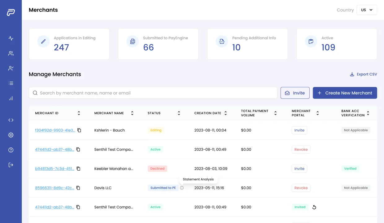
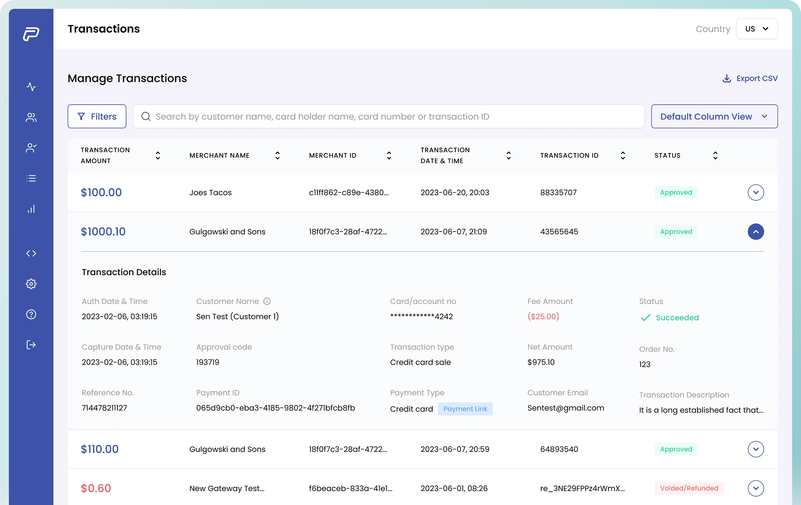
A revamp earns its keep when you can put the before next to the after and not need a paragraph to explain what got better. Three of the highest-traffic surfaces. Transactions, Merchants, Onboarding, rebuilt for clarity, density, and modern visual hierarchy. What changed wasn’t cosmetic. We rebuilt the IA on each screen: what’s scannable at a glance, what lives behind a click, where the eye goes first, and how the surface holds up at 1,000 rows instead of 12.
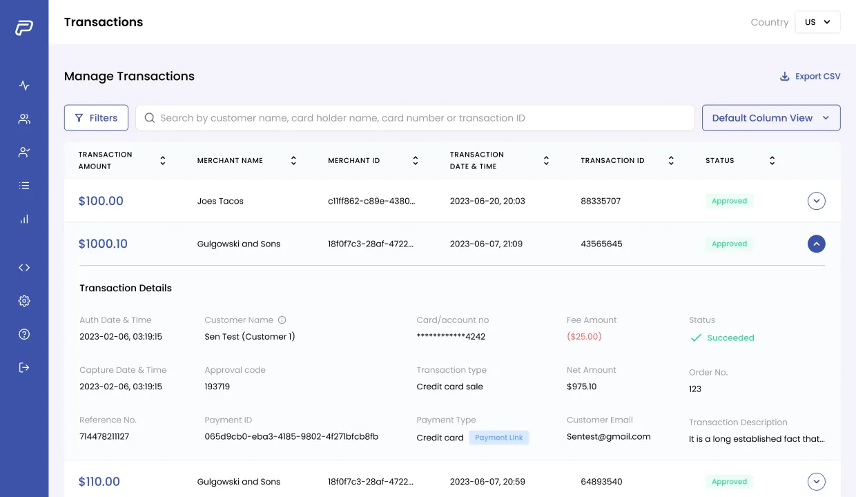
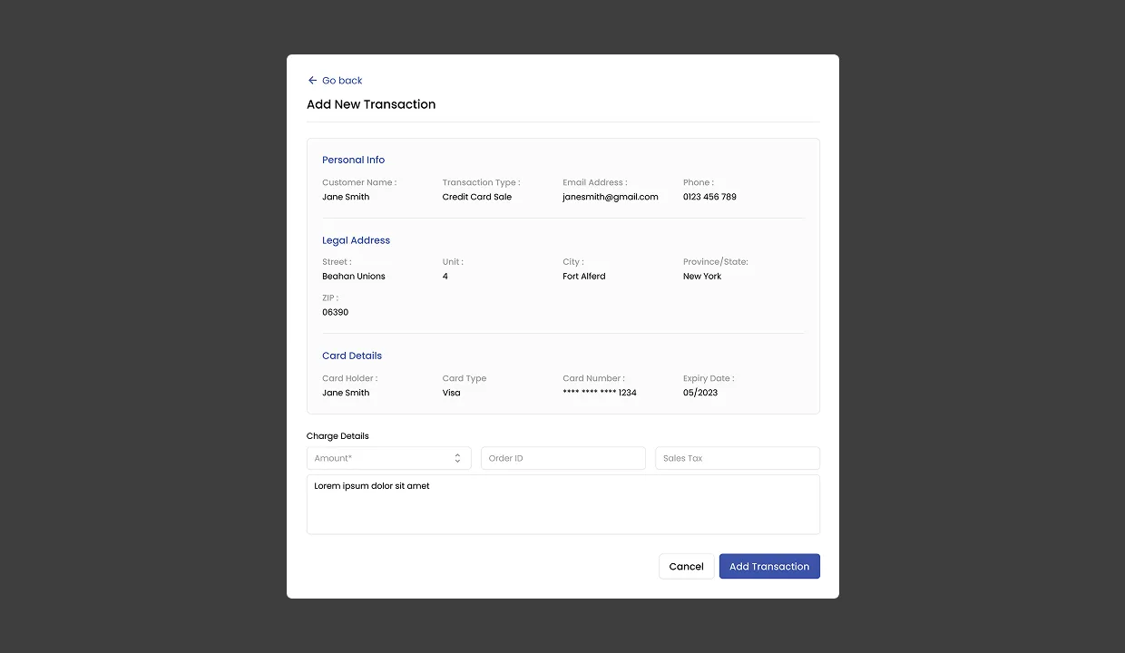
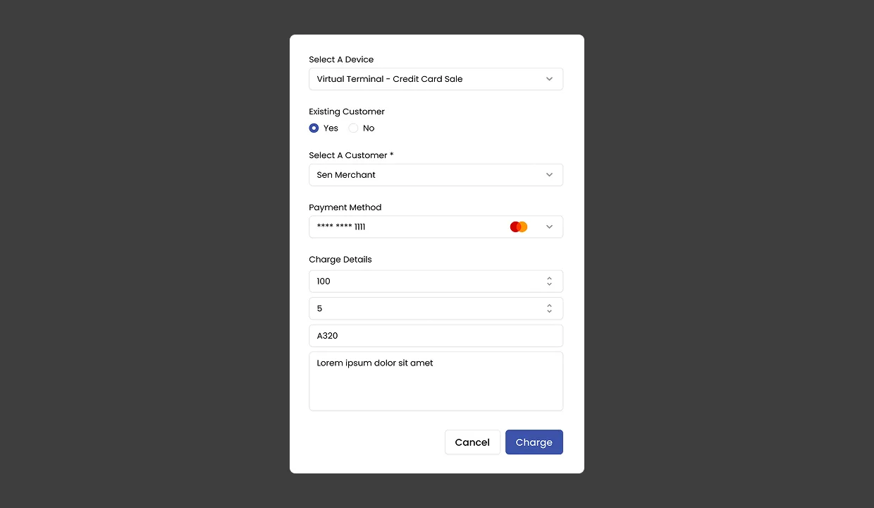
Transactions is the surface users return to most. We treated it as a three-state stack: the table for reading, the modal for creating, and the inline charge flow for amounts. The new transaction modal collapses a multi-page form into one focused dialog, merchant, method, amount, processor, while the charging surface gives the operator clean feedback on the amount being processed and the route it’s taking.
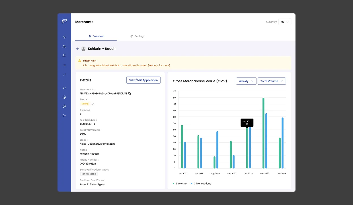
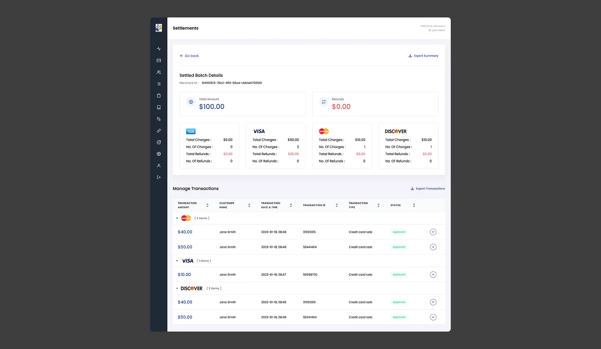
The merchant lifecycle on PayEngine has three beats: onboard, manage, settle. We rebuilt each one with the same principle, the surface should answer the operator’s question before they have to click. Merchant detail pulls KPIs, processor splits, and risk signals into one page. Settlements give batch totals, processor splits, and downloadable runs without a second tab. The component-based design system shipped alongside is what keeps the platform from going stale.
Relaunched, the platform saw a visible lift in user engagement, customers stayed hooked, new users came in, and the design system shipped alongside the screens lets the in-house team keep building without falling out of step.
Book a free sprintFive working days, a senior product designer on the most painful surface in your platform. If it doesn’t click, keep every file we ship.
A B2B logistics SaaS for one of the largest integrated logistics companies in the USA. Strategic partner from concept, idea + user stories in, full platform out, sent straight to development.