
Notes from the studio.
Field notes from shipping complex software. Playbooks, teardowns, and patterns from B2B SaaS, AI-native products, fintech, healthcare, and data-heavy dashboards.
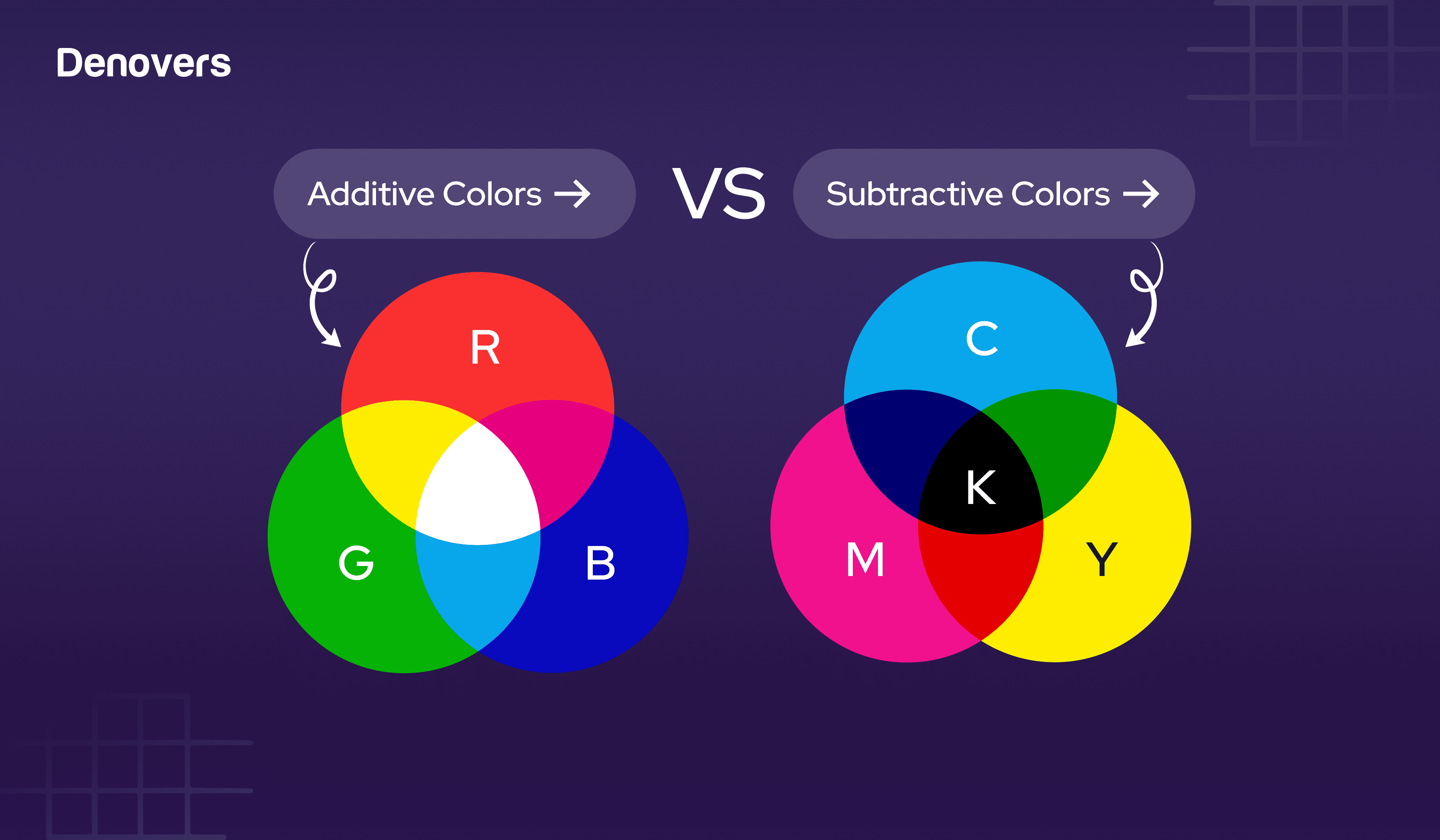
Additive Colors vs Subtractive Colors
Color has a strong effect on your design. Therefore, it is important to pick the right color models, as they can either make or break the success of your product. There are two types of color models. One is addictive colors, which create color by combining light. The other is subtractive colors, which rely on absorbing and reflecting light that results in colors shifting towards black. Feeling overwhelmed already? That’s perfectly fine, as understanding color models, their management, and their application can be challenging at first. But Denovers has got your back. We are a product design agency and have worked on several web and mobile applications where we have successfully set the color scheme according to the expectations of our clients and their target audience. Keeping that in view, in this article, we will share deep insights about additive and subtractive. Let’s first begin by studying additive colors in detail. Time to get started! Additive Color Model Additive colors ar
7 min read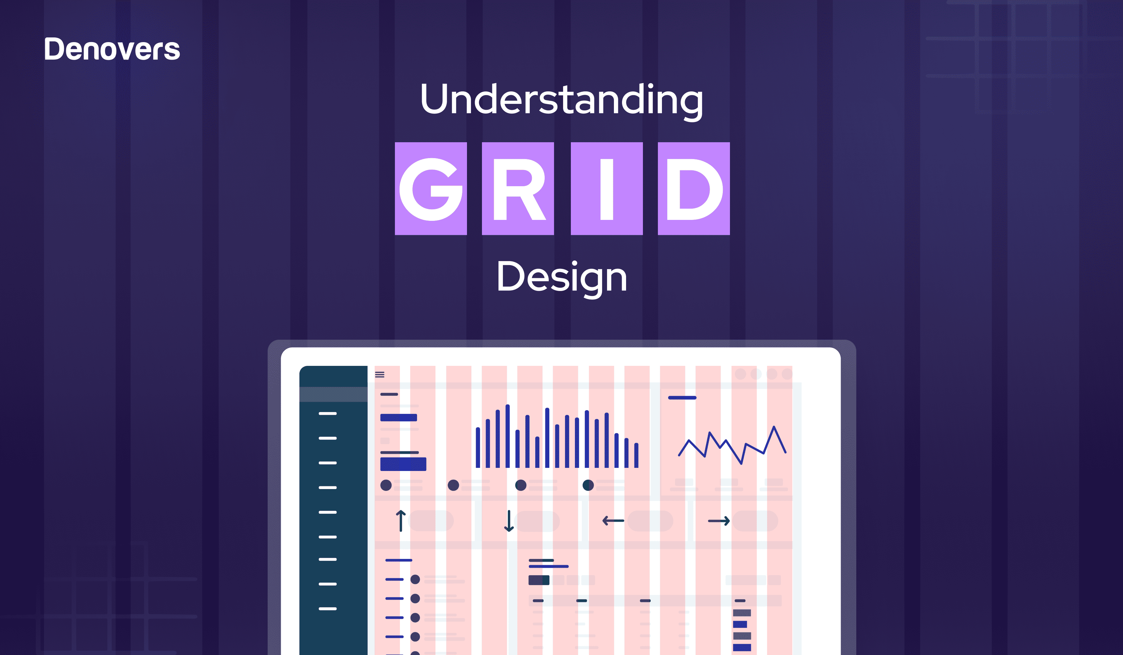
Understanding Grid Design: A Comprehensive Overview
Ever looked at a website or a product and thought, Wow, everything just feels… right? Like every button, image, and line of text was meant to be exactly where it is? Wondering how that is achieved? This magic is done through grid design. Grids provide designers with a framework to position and align elements on a page. This establishes a sense of order and structure. Grids are structures that turn chaos into clarity, which makes the design not only visible but also felt. Our designers at Denovers create various SaaS products and web and mobile applications, and we effectively use grid layouts to ensure the design is organized, smooth, and efficient. In this article, we would like to shed light on grid design and its best practices to ensure your products have structure, balance, and clarity to give a smooth and organized user experience. Let’s first begin by understanding what grid design is. What are Grids? Every masterpiece starts with a foundation. In design, that foundation is t
12 min read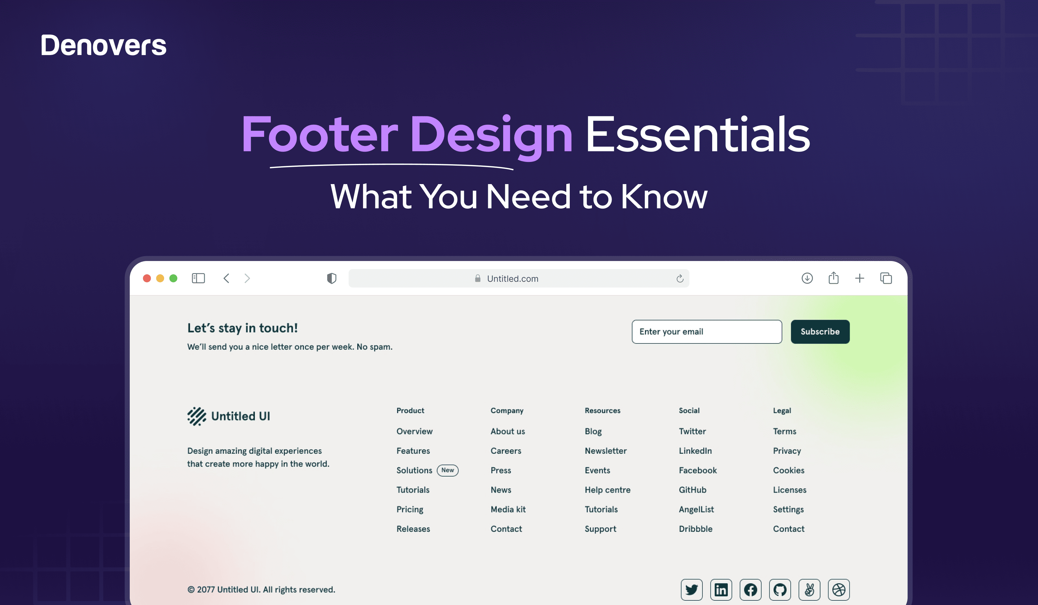
Footer Design Essentials: What You Need to Know
Do people even pay attention to the footer of a website? You might think, who’s going to be concerned about the content below the fold? But that’s where you are mistaken. The footer design of your website matters more than you think. Users scroll down all the way to it to get specific information that can improve your website’s efficiency or even drive sales. However, to achieve this, you need an exceptional footer design to hook the user completely and not leave them wanting more. Wondering how to design footers that retain the user’s attention on your site? You need to follow a specific structure and incorporate all the elements required for a complete and appealing design. In this article, we’ll explore some of the best example footers along with some design practices to create this key component effectively. But first, let’s start from the basics and see what a website footer is. Let’s get into it! What is the footer of a website? The footer of a website is the lowest section o
11 min read
Top 8 SaaS Trends in 2024
SaaS is everywhere. From shooting emails through Gmail, managing customer relations with HubSpot, and tracking sales via Zendesk to making online transactions through Paypal, ordering food through UberEats, and hitting add to cart on Shopify, SaaS solutions have taken the world by storm. But mind you, this has also significantly increased the competition. So, if you don’t keep up with the latest SaaS trends, your product might fall behind in the competitive market. The SaaS market is expected to grow from $197 billion in 2023 to $247 billion in 2024. This clearly shows that in a world where everything is moving to the cloud, SaaS is no longer just hype, but it’s the air we breathe. As a result, keeping up with B2B SaaS trends and efficiently incorporating them into your product is not a luxury but a necessity. You must be thinking about what’s new in SaaS these days. Fortunately, you are just in time, as we are here to shed light on the latest trends in SaaS in 2024. At Denovers, we a
15 min read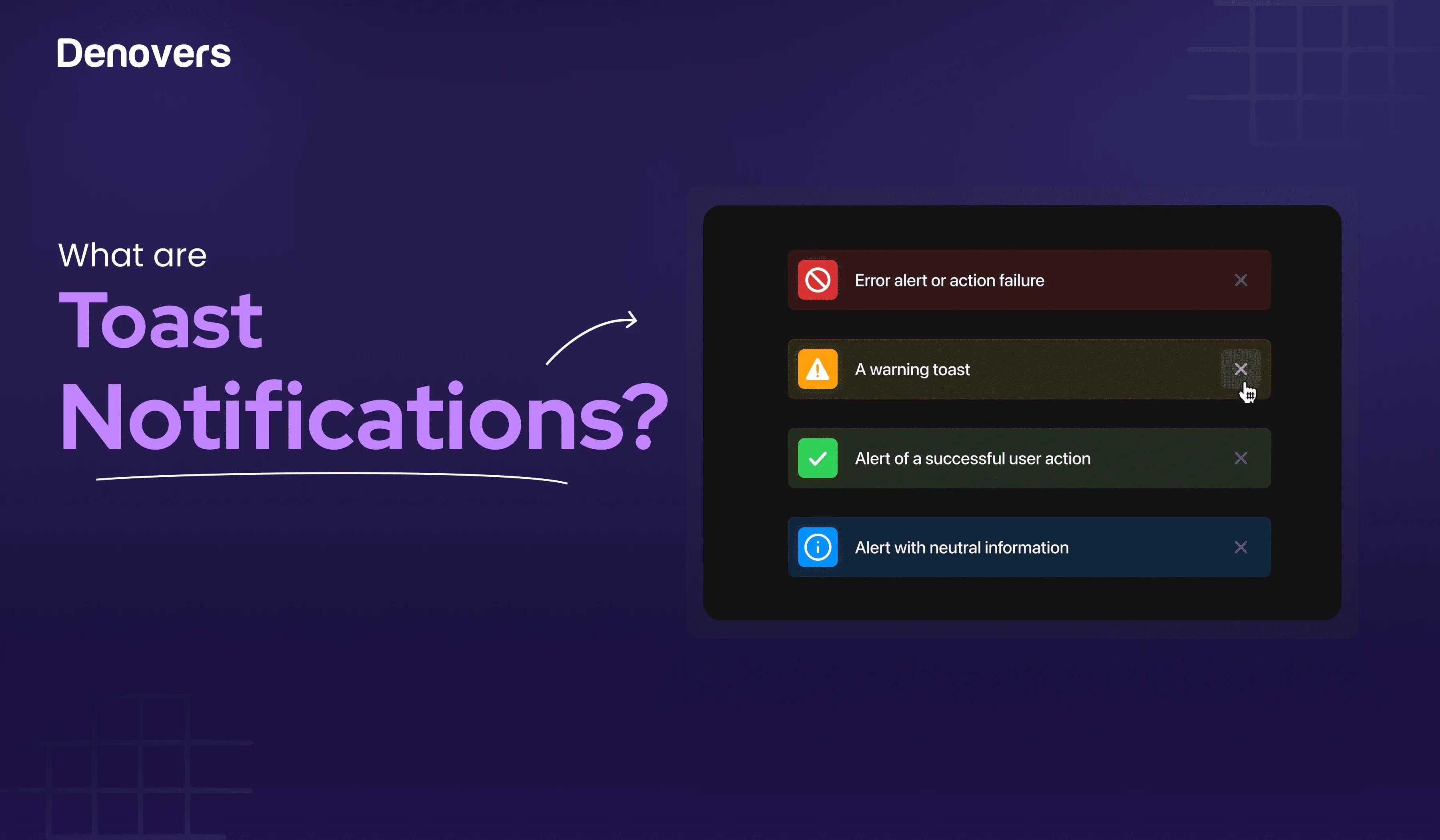
What is a Toast Notification?
You might think users are attracted to your SaaS platforms because of their aesthetics. Sure, but it’s not limited to that. Yes, they will be attracted to it, but what hooks them? It’s the user experience. And a toast notification plays a great role in amplifying it. These are brief messages that come to alert the users about system events without interrupting their task flows. Being a product design agency who have worked on 45+ UX and SaaS projects where we have used toast notifications several times, it puts us in the perfect position to shed light on everything you need to know about toast messages, stretching from when to and when not to use them, how to implement them, and what impact they have on the UX of your SaaS product. But before we jump into the nitty gritty of a toaster alert, let’s first learn what a toast notification is. Let’s get started! What is a Toast Notification? A toast notification is a brief alert or message that informs the user about a system event or w
11 min read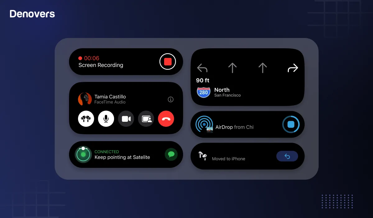
What is Dynamic Island Apple – An Updated Guide for iOS18
Are you also an apple freak? Then you must know about the thrilling addition that has leveled up the entire vibe of the iPhone. Yes, we are talking about the “Dynamic Island!” This sleek new feature transforms your front camera into an interactive hub for real-time updates. From displaying calls and notifications to apps and tasks, the dynamic Island creates an immersive experience. It would be an understatement to say that Apple never fails to raise the bar with every new innovation. Similarly, the latest inclusion of the dynamic Island has also changed how we interact with our iPhones. But is it really revolutionary or just a fancy add-on? This article will discuss exactly that. So, whether you’re a die-hard Apple fan or just curious about the hype, you will know everything about this feature by the end of this article and can come to a constructive answer. Let’s find out! What is Dynamic Island? The Dynamic Island is a recently introduced UI feature by Apple in the iPhone 14 Pro
11 min read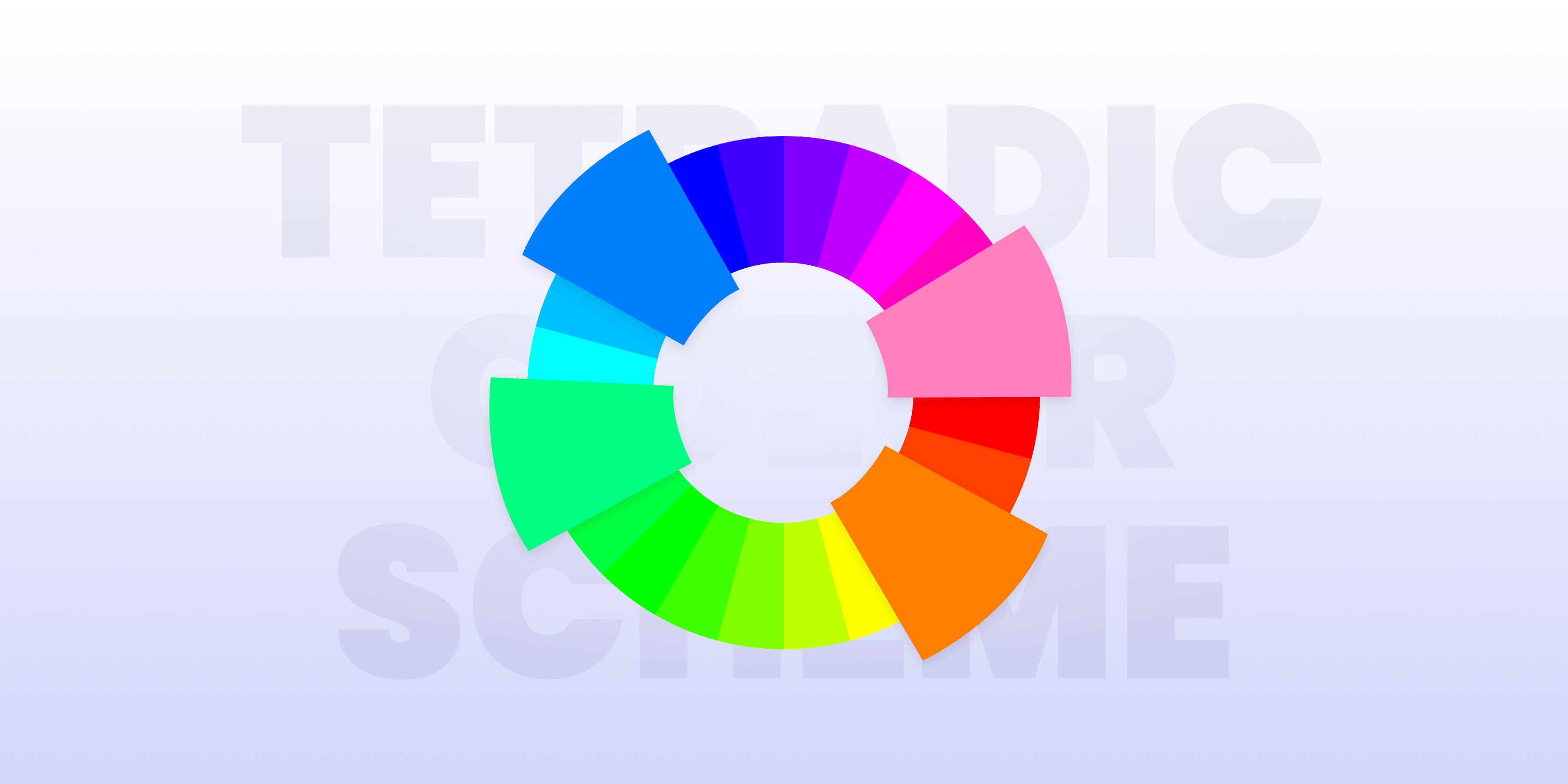
What is Tetradic Color Scheme – Everything you need to know
Ever wondered how brands pick the right colors to grab your attention? You might not notice, but brands communicate their brand language primarily through colors. They play with the colors in a way that their brand image sticks to your subconscious. Wondering how do they do that? They do so by picking a suitable color scheme! Yes, that’s straight-up facts. The right color story shows their personality, which is who they really are and what they want you to think of them. Colors significantly influence users’ moods and decisions on a platform or product. Choosing the correct color combinations is key to creating the right tone. Being a product design agency ourselves, we need to choose the right color scheme for all the products we design, whether they are SaaS Apps or Mobile Apps. For example, if we are designing an App for the Financial Industry, the color scheme would be different than what we do for a complex B2B SaaS App. There are many color schemes out there, and in this artic
5 min read
UX Design for Startup: A Complete Guide in 2024
Do you want to attract, hook, and retain users to your SaaS startup? Or do you wish to cut through the competition and rise above all? To achieve this, a stunning UX design for startups is necessary. We currently exist in a super competitive era where every SaaS product is better than the other in terms of innovation and user-centricity. So, you cannot afford to fall short by having a product design that is slow, crappy, or stuck in the past. On the contrary, your startup product’s substance should come through to offer a smooth and fluid experience. This can only be achieved through a UX design for startups that resonates with your users. We at Denovers prioritize both practicality and usability to create stunning and user-friendly products for your startup. We understand how important it is to design intuitive platforms, as this ensures customers are not only attracted to your platform but also stay engaged with it in the long run. Considering this, we will be shedding light on eve
31 min read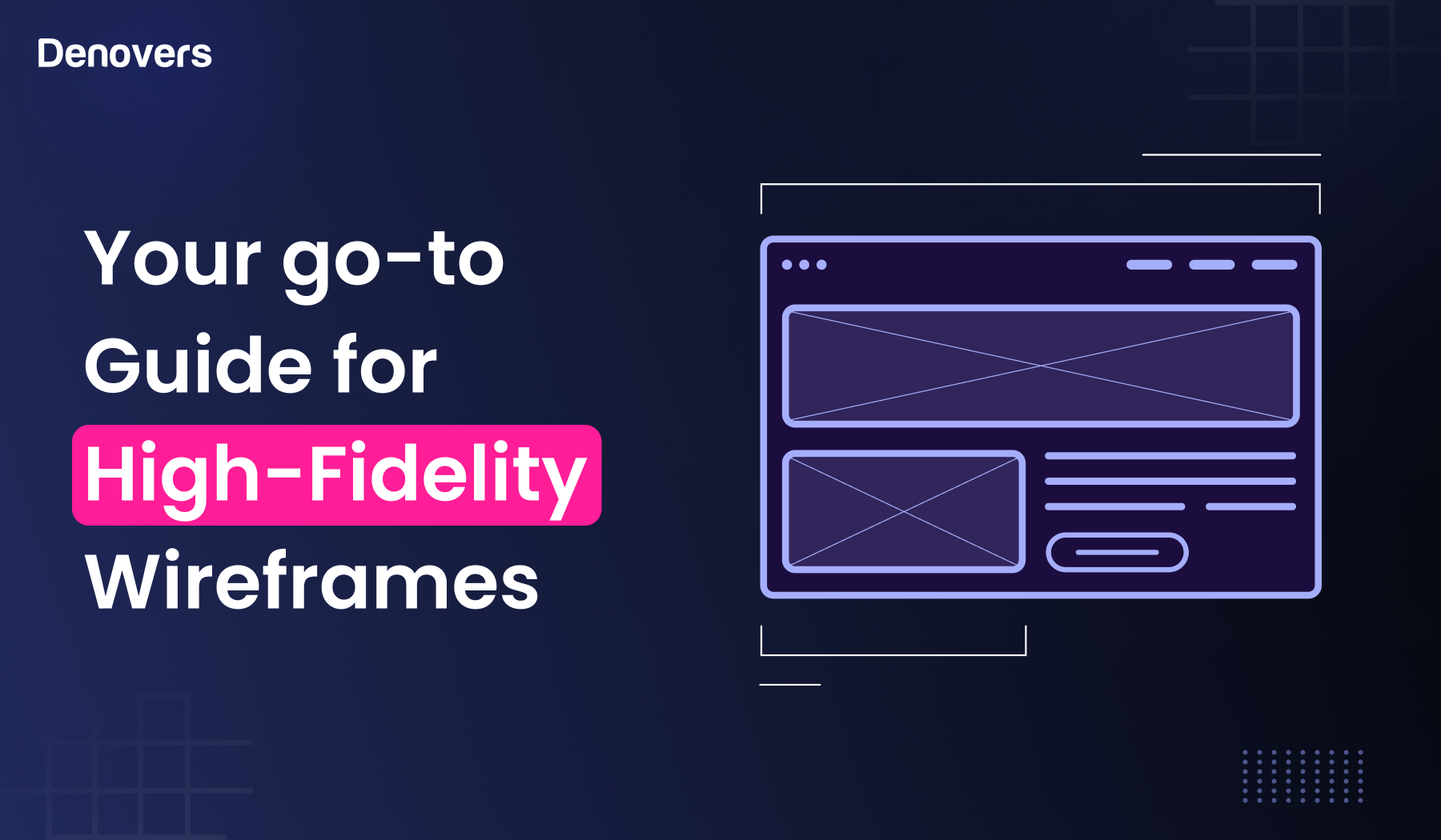
Your go-to Guide for High-Fidelity Wireframes
Have you come across the term “High-Fidelity Wireframes”? Sounds complex, right? But if you enter the design industry, you will notice that wireframes are a designer’s best friend. Wireframing is the starting point of every UX design project. Without this preliminary step, designing SaaS platforms would be like shooting arrows in the dark. We are a product design agency that puts us in the perfect place to talk about high-fidelity wireframes and things related to them. Stay hooked on this article as we will discuss this topic from scratch to address all your concerns regarding wireframing. Let’s get started. What is a Wireframe? A wireframe is a skeletal framework of a website’s final UX design. This screen blueprint is a layout that presents the interface’s Structure Flow Functionality Behavior Architecture Wireframes are page schematics that act as a visual lead for designers and product managers. They may seem complex from the outside, but they are simple models that provid
17 min read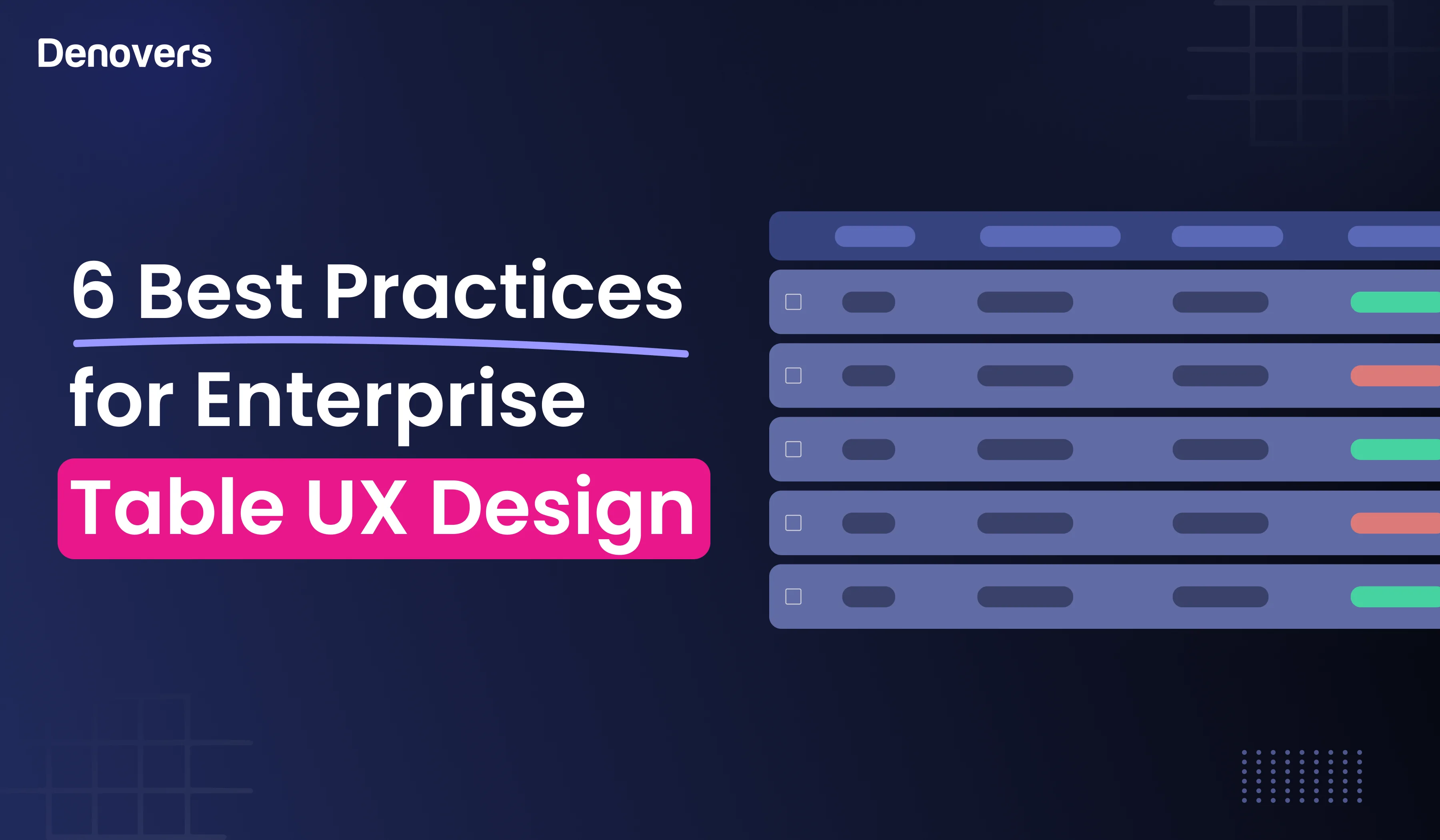
6 Best Practices for Enterprise Table UX Design
You might think there is no place for table UX design when it comes to data visualization in the modern design world. Although new-age tools for data representation like graphs, charts, infographics, diagrams, maps, and plots have become the latest sensation, it would be unfair to make data tables entirely a thing of the past. On the contrary, they are a fantastic tool to present complex data in a decluttered and easy-to-consume manner. A well-organized data table can exceptionally maximize the potential by making data interpretation and analysis as easy as pie. However, to make this possible, the key lies in designing an effective table UX design that presents the data in a clear, concise, and easily absorbable manner. After all, we all know how important data is for businesses these days. Responsive and informative data tables that aren’t boring can be a complete game changer for your business. Wondering how you could create a standout table UX design? Thankfully, you’ve landed at t
22 min read
SaaS Onboarding Guide: Steps, Examples, Best Practices and Metrics
No matter how amazing your SaaS services are, your product will fall flat within days if your SaaS onboarding process is not good. Think about it this way: How will your users even use your world-class SaaS app if they initially struggle to be on board? They would immediately abandon the product. After all, nobody likes Confusing signups Overwhelming interfaces No onboarding Tutorials Zero welcome emails Lengthy training periods Lack of personalization. As a result, it’s super important to focus on simple and smooth onboarding of your users as this is the deciding factor whether the user will stay and adopt your product or not. It has been estimated that 70% of customers abandon the product if it takes more than 20 minutes to complete the digital onboarding process. This shows how limited your time is in creating a lasting impression on your users so that they stay hooked to your product. Are you worried about how to carve the perfect SaaS onboarding experience? Well, luckily
33 min read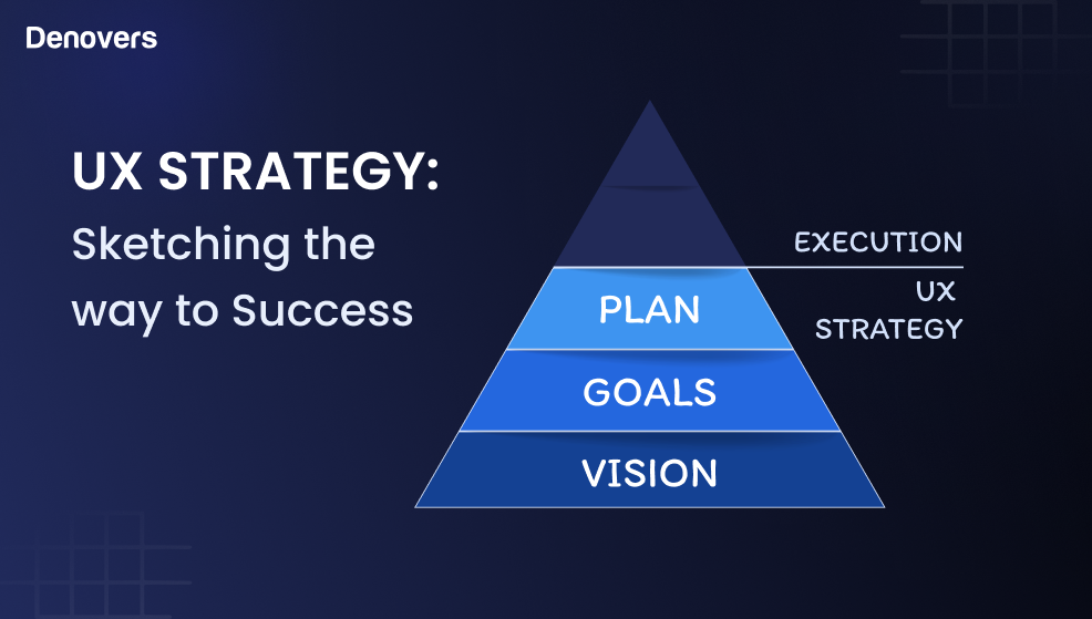
UX Strategy: Sketching the Way to Success
Picture this: Your potential customer lands on your app or website and clicks somewhere only to find out that it’s taking forever to load, or worse, it doesn’t work at all. Frustrating right? What should have been a simple task turned out to be an annoying situation. The clientele you were dreaming of is now abandoning your cart, closing your tab, and swearing never to return. This would not be the case if you had a solid UX strategy in the first place. Founder and CEO of Amazon, Jeff Bezos, has perfectly worded that, “If you make customers unhappy in the physical world, they might each tell six friends. If you make customers unhappy on the internet, they can each tell 6,000.” It is super important to understand that the user is king and not your content. If your user experience is poor, no matter how exceptional your content is, your brand will fall flat. Therefore, it’s not only nice to have but necessary to offer a flawless website with exceptional usability. This is where a UX st
13 min readBecome a UX-Led Product Team.
A practical SaaS UX audit checklist built from real product work across dashboards, onboarding flows, forms, tables, navigation, empty states, and data-heavy interfaces.