
Fintech platforms
Payment dashboards, merchant onboarding, transaction tables, filters, and 7-step flows.
PayEngine · Fils · HomeRemitt
Denovers audits your SaaS product, mobile app, dashboard, onboarding, and core user flows to uncover the friction points stopping users from activating, engaging, and converting.
Founders and Product Teams We’ve Shipped With
Your product may have powerful features, but if users cannot understand the flow, reach value quickly, or complete key actions without friction, adoption suffers.
Denovers reviews your product experience like a senior product team. We identify where users get confused, what slows them down, what breaks trust, and what needs to be fixed first.
The gaps we keep finding.
A senior product designer walks your product across these eight surfaces. Adoption blockers almost always live in one of them.
We review how quickly users can enter the product, understand the setup, and reach the first meaningful action.
We identify where users fail to experience the product’s core value and what can be simplified to improve adoption.
We check whether your dashboard gives users direction, priorities, insights, and clear next steps.
We audit important flows like creating projects, adding data, managing users, generating reports, completing transactions, or using AI features.
We review menus, sidebars, tabs, breadcrumbs, back actions, and information architecture so users always know where they are.
We improve complex product areas like data tables, filters, dropdowns, sticky columns, sorting, search, and bulk actions.
We check charts, graphs, scorecards, legends, tooltips, labels, and empty states so data becomes easier to understand and act on.
We review typography, spacing, button hierarchy, contrast, states, form behavior, responsiveness, and design system gaps.
Five product categories. Real product surfaces we have walked, flagged, and shipped recommendations for.
Payment dashboards, merchant onboarding, transaction tables, filters, and 7-step flows.
Data centers, nested tabs, dashboards, service requests, complex navigation, and admin workflows.
Workflow builders, input/output connections, onboarding, and content automation flows.
Employee sign-in flows, visitor management, profile setup, scheduling, and business settings.
Industry filters, financial tables, graph legends, tooltips, prospect lists, and market data dashboards.
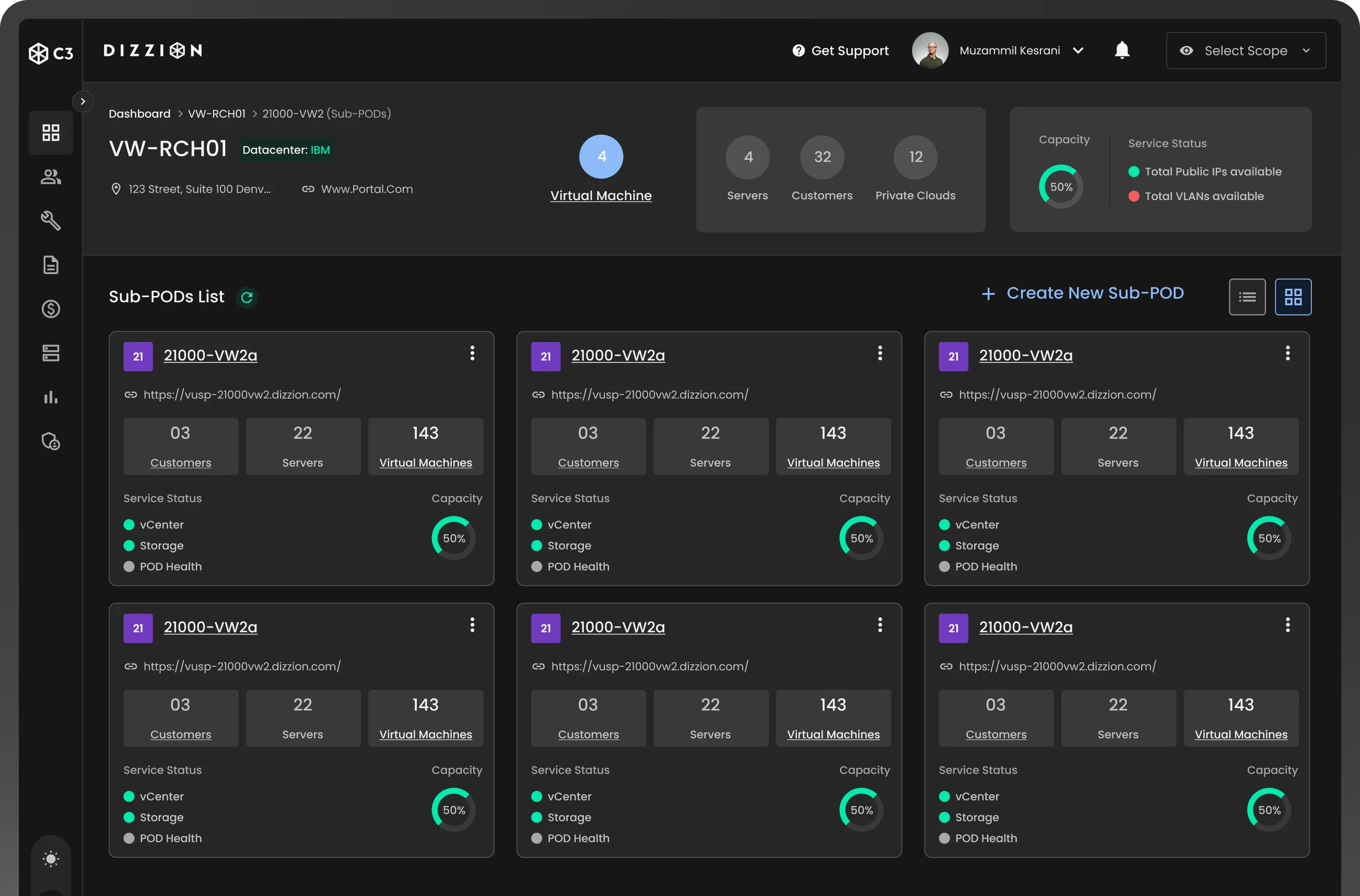
The audit walked the Cosmos Control Center portal and named the blockers: a black theme fighting the data hierarchy, status pipelines using colour alone with no tooltips, incomplete POD summaries, and a back button users kept missing. Two years embedded after, 100+ screens shipped across PODs, customers, schedule management, and a dual-theme design system.
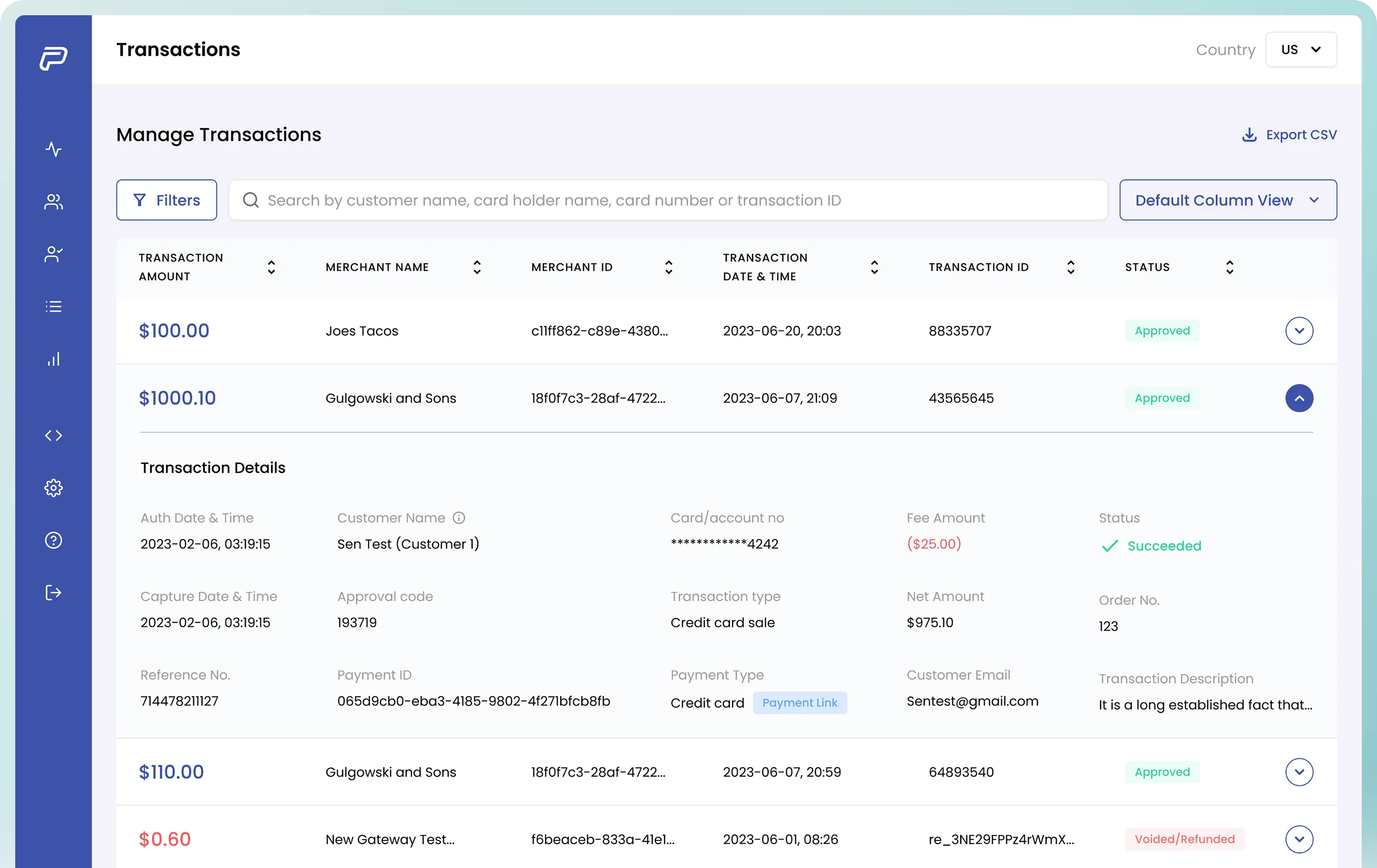
The audit covered the full merchant journey: dashboard scorecards failing WCAG AA contrast, a 7-step add-merchant stepper with no Back or Next, transaction tables losing row context with no frozen first column, and cramped filters that needed a side-drawer. A 7-day audit-led demo earned the contract. The rebuild that followed shipped with real before/after pairs.
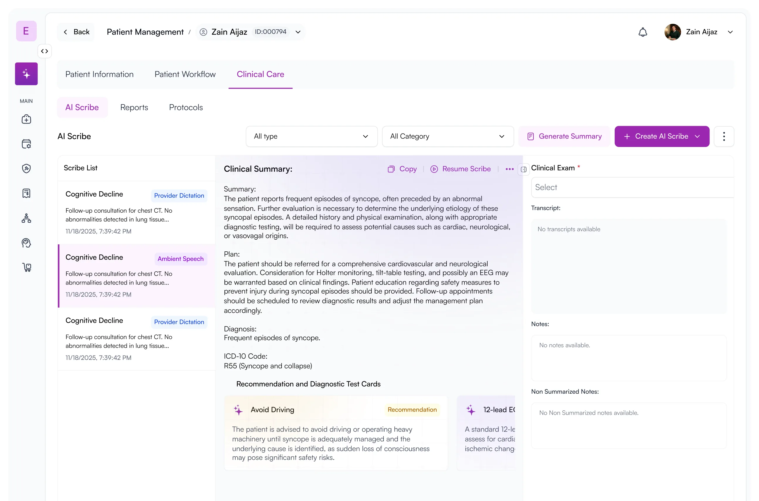
The audit named four MVP blockers: cluttered navigation burying workflow creation, patient info scattered across five tabs to answer one question, untracked workflow status, and AI Scribe sitting as an island. The 90-day rebuild made AI the navigation layer, unified the patient card, and added a workflow timeline with explicit stages plus a Kanban view across patients.
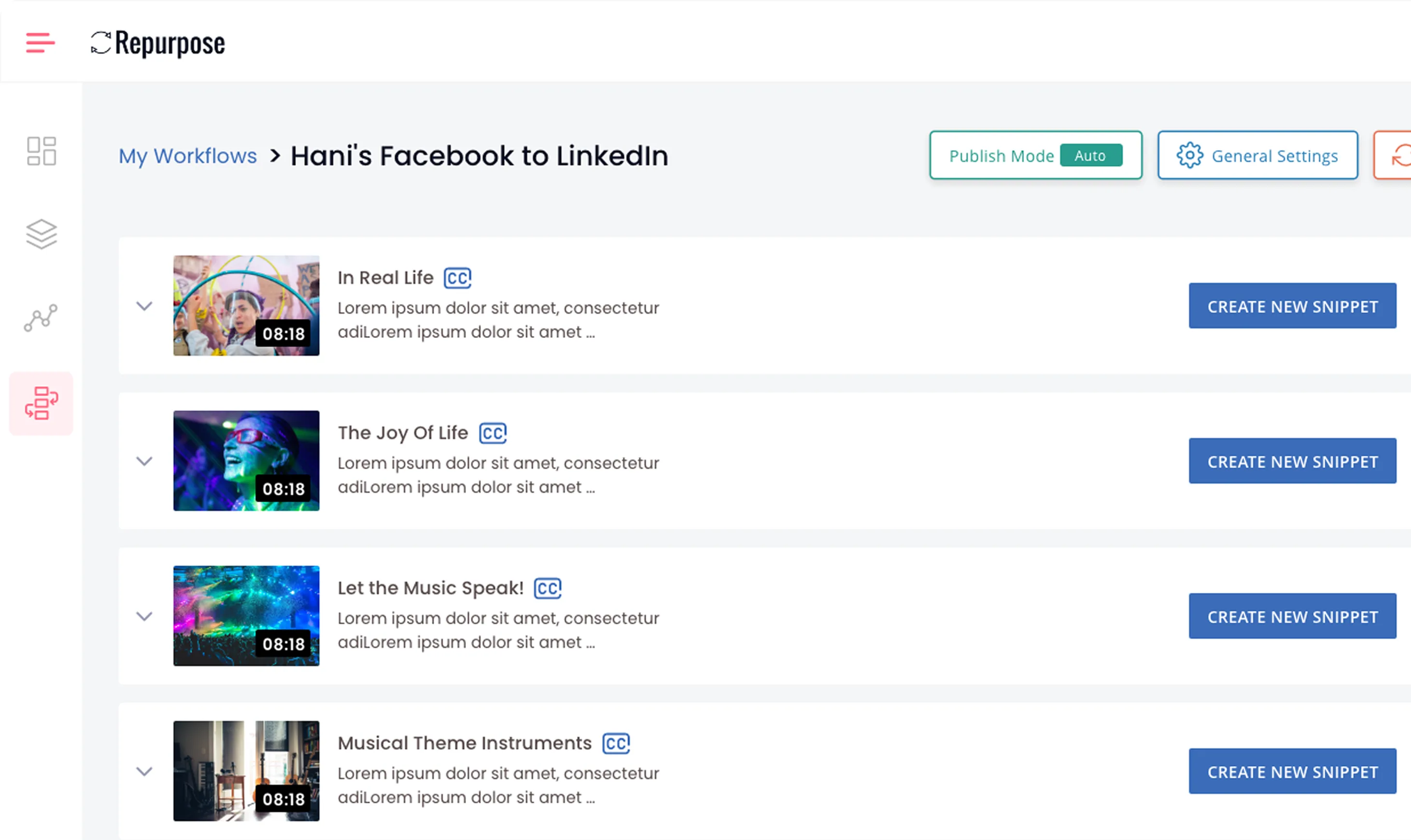
The audit flagged a 23-second mobile load (very critical), a bloated signup, a hostile zero-data state pushing a free course popup, and a workflow vs connections IA that confused new users. We split it into Input/Output tabs and rebuilt the rest. The platform now powers 20,000+ paid creators. CEO Hani Mourra became a referrer.
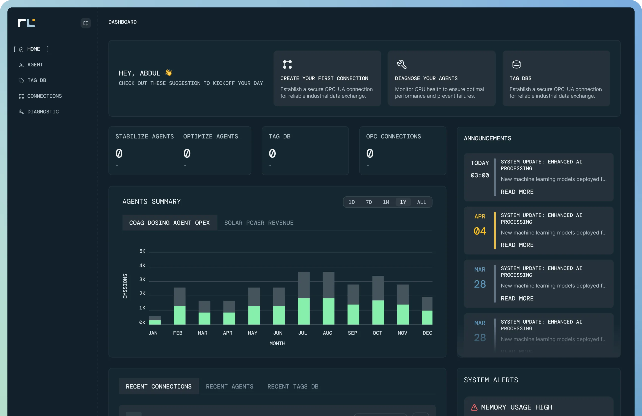
The pre-launch audit named four blockers: a wireframe-grade Bootstrap MVP with an immovable launch date, agent setup requiring engineer-on-site, safety-zone bands with placeholder threshold numbers, and a cramped diagnostics page. We rebuilt as a dark industrial-control system: self-guided agent wizard, multi-band safety zones with explicit thresholds, full diagnostics. Launched on schedule.
Earned great reviews and onboarded over 200,000 users on a product that’s both sleek and tough.
Critical improvements maximized retention, feature usage, and aligned the product to our business goals.

Improved our process completion rates and feature release timelines with sharp, considered design.

Cut our drop-off rate from 51% to 14% and lifted 30-day retention by 11% with a frictionless overhaul.

Turned our concept into a developer-ready prototype on time, with the wireframes and journeys locked.

Their UX/UI helped us raise $165k in our pre-seed round and win over early clients.

Turned a wireframe-grade MVP into a launch-ready platform, and we hit the date.


Walked out 90 days later with an AI-native neurology platform our clinicians actually want to use.
Untangled our data-heavy analytics platform into something everyday investors could actually navigate.

Improved our webshop’s UX/UI and raised our conversion rates with a luxury responsive grid.

Excellent design at great speed. They integrated with our internal team and made collaboration easy.
Stretched our brand across every smart-lighting surface we shipped, same release cadence as our internal team.

Restructured how our learners interact with course content and shipped a clean, scalable design system.

Completely revamped our SaaS app with a stunning new UI and a scalable design system built from scratch.

A senior product designer, your product, a real call to start, a real report to end. No discovery sprints, no kick-off decks.
We talk to understand your product, your vision, your goals, and the surfaces where you suspect users are dropping off. Thirty minutes. No pitch deck.
A senior Denovers designer walks every flow against the 22-section framework. Annotated screenshots, severity tags, specific recommendations.
Audit report in your inbox by day three, followed by a walkthrough call with your product and engineering leads. A follow-up Loom covers anything we did not get to live.
A quick snapshot to test the water, or a full audit for teams ready to ship against a prioritised roadmap. Same senior product designer either way. Need strategy, not just findings? Start with Product Strategy.
A quick senior review of one product flow.
A deeper review for SaaS, mobile apps, and complex product teams.
Ten straight answers to the questions teams ask before a SaaS UX audit. Anything missing, email hello@denovers.com.
A SaaS UX audit is a structured, senior-led review of your product experience, focused on the surfaces where adoption is won or lost: signup, onboarding, dashboard, core workflows, navigation, tables and filters, data visualisation, and UI consistency. It identifies the specific friction points stopping users from activating, engaging, and converting, then translates them into a prioritised list of fixes your team can ship next sprint.
Three days, end to end. We get on a call to understand your product, vision, and goals. A senior product designer walks every flow, surfaces blockers, and writes the audit. You receive the deliverable in 72 hours along with a walkthrough call.
The Free SaaS UX Snapshot is exactly that, free. It covers one core product flow with 5 to 10 findings, annotated screenshots, and a short Loom or PDF. The Full Product UX Audit is priced against the surface count and complexity of your product. Send a brief and we return a fixed quote within one business day.
A UX audit is an expert-led, heuristic-based evaluation by a senior product designer. It is faster, less resource-intensive, and surfaces broad usability and conversion issues. User testing observes real users interacting with your product and is best for validating specific behaviours. We pair both when scope and timeline allow.
Most teams audit when activation feels flat, support tickets keep repeating, churn is creeping past forecast, or a major feature push or fundraise is coming. Audits are equally valuable as a proactive health check before a redesign or as a diagnostic when growth metrics decline.
Annotated screenshots of every flagged surface, severity-tagged findings, specific "what to change" recommendations, a priority roadmap your team can ship against next sprint, and a walkthrough call with the senior designer who ran the audit. A follow-up Loom covers anything raised on the call.
Yes, we audit the live product. You can give us a sandbox login, a screen-share Loom of the key flows, or test credentials on staging. We sign an NDA before any access if you require one.
Automated tools tell you what users are doing. A senior-led UX audit tells you why and what to change. The Denovers audit is a senior product designer walking your product end to end, comparing patterns against 9 documented SaaS audits and 50+ partner engagements. Maze and Hotjar are useful inputs; they are not the audit.
No. The audit is a standalone deliverable, not a sales motion. That said, three of our five most recent named audits (Dizzion, PayEngine, Repurpose) became multi-year partnerships because the buyer chose to continue. Both outcomes are valid.
We refund the engagement or rework the audit at no charge. Senior-led work earns its fee by being directly actionable. If the report does not give your team at least three shippable fixes inside the first sprint, we cover it.