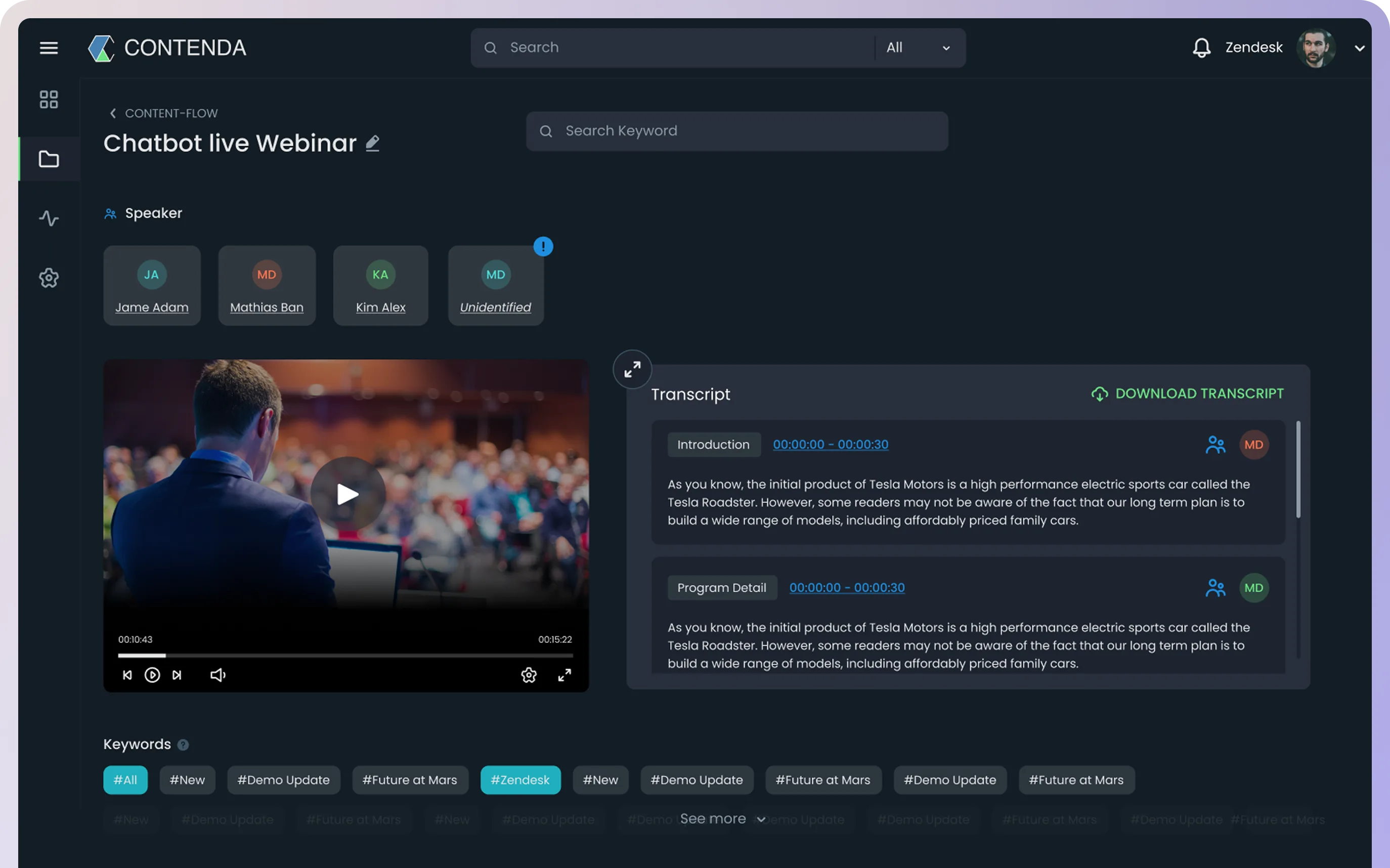
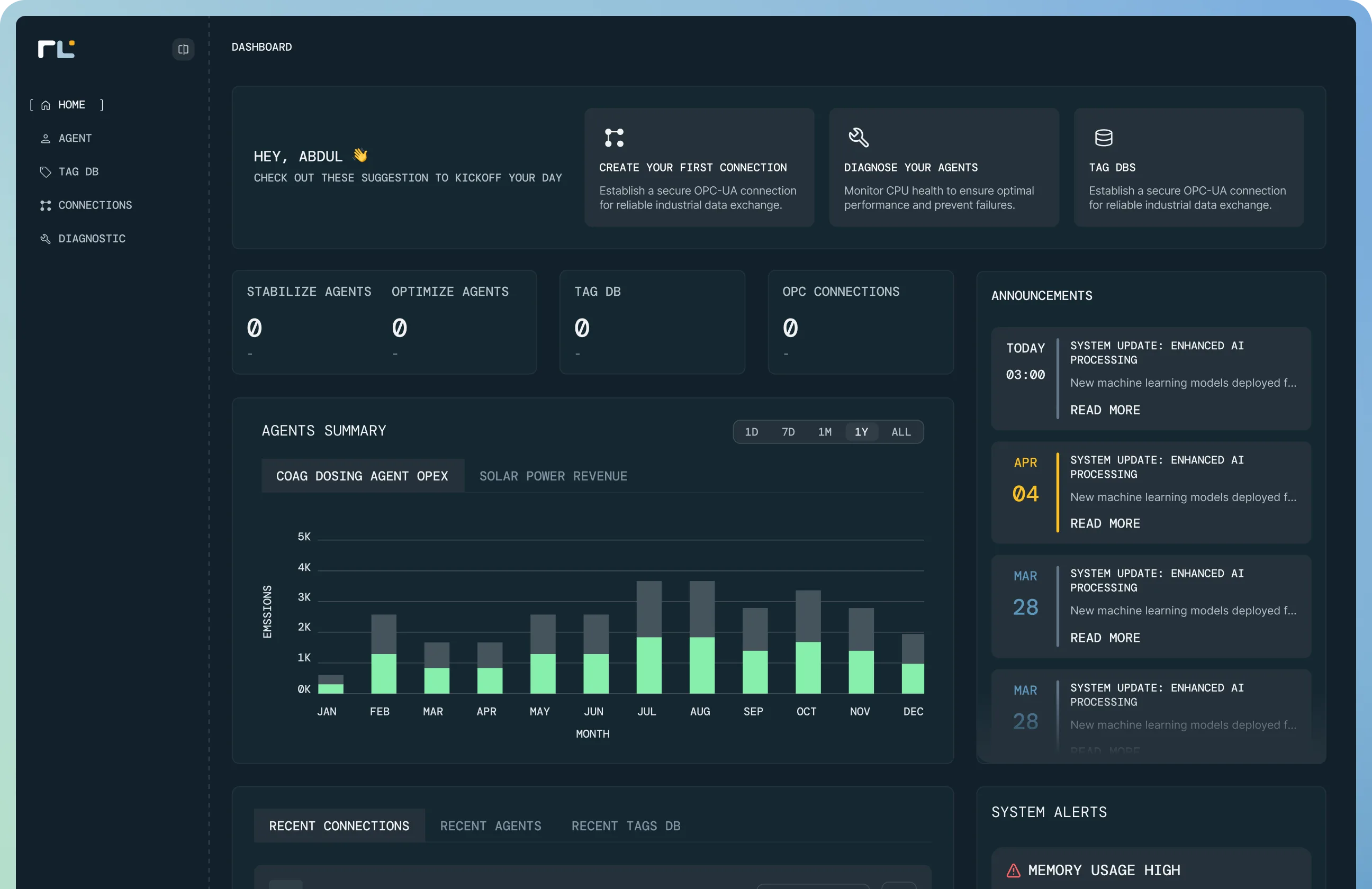
We work best with Denovers when it comes to product designs and front-end development. Across multiple enterprise AI products under one ongoing partnership, their pod has consistently translated complex data workflows into interfaces that ship at bank-grade. Their passion, commitment, and collaborative teamwork focus on delivering outstanding results.
An Excel-to-AI digital transformation inside the world’s largest FMCG.
Enterprise B2B SaaS doesn’t win on the data. It wins on the UX that lets a Category Manager run their whole day on the new screen without slowing down.
A global AI & data-science specialist had won the contract to replace decades of Excel inside the world’s largest FMCG, an enterprise digital-transformation program covering sales forecasting, demand planning, and the entire promotion lifecycle. They owned the data engineering, the analysis, the ML, and the backend. They needed a white-label enterprise B2B SaaS design + frontend partner who could sit in their team and ship the customer-facing half. We embedded a pod, one product designer plus two React engineers, and shipped two flagship enterprise products together: SFOS and PRAT.
White-label, in the partner’s team. Our pod shipped inside the prime contractor’s repo, in their standups, with the FMCG’s end users in the loop, they stayed the named vendor, we stayed the design + frontend layer.
Excel-to-platform without breaking the workflow. Category Managers had spent decades inside spreadsheets, promotions, sales, demand planning. We had to ship interfaces fast enough not to slow them down on day one.
Enterprise UX on top of AI. Multi-stage approval chains, region rollouts, audit-grade reporting, five-plus reviewer workflows, the surface had to handle real enterprise complexity, not show off the model underneath.
Enterprise B2B SaaS, white-label, in front of the world’s largest FMCG.
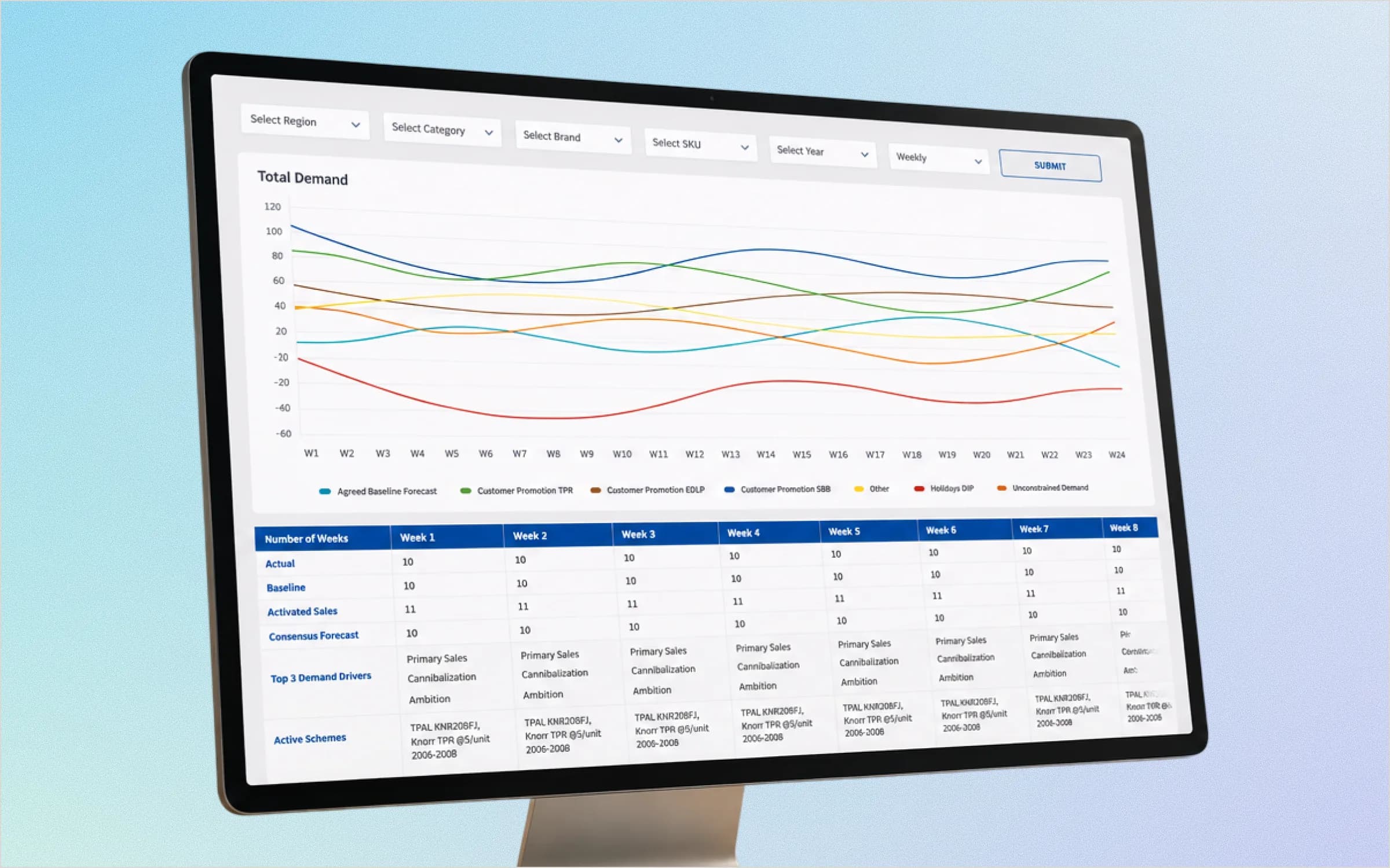
The partner is a global AI & data-science specialist. Their end customer is the world’s largest FMCG, Category Managers spending their days inside Excel for promotions, sales, and demand planning. The partner owned the data engineering, the ML, and the backend; they needed us as the white-label enterprise B2B SaaS design + frontend half of the product. We shipped under their name into the FMCG’s estate: SFOS (Sales Forecasting Operating System) for analytics + demand planning, PRAT (Promotion Real-time Analytics Tool) for the entire promotion lifecycle.
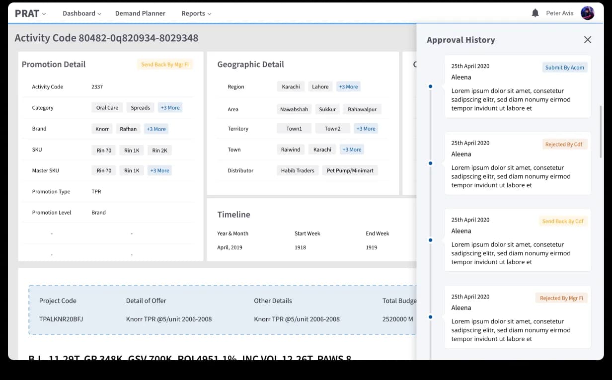
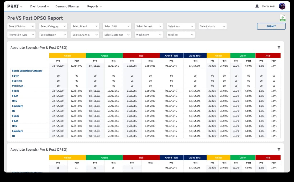
Embedded in the partner’s team, not over the wall. Same Slack, same Jira, same repo, same standups with the end users. Designs got reviewed in the same pull request as the React code that implemented them. Two products shipped under one shell (Dashboard / Demand Planner / Reports nav, scope filters at the top of every surface), one component vocabulary across SFOS and PRAT. Color carries semantic load (Amber / Green / Red OPSO bands, 5-status calendar tiles) so an operator scans the year ahead like a heatmap. Every Activity carries its own approval-history side panel: Acom → Cdf → Mgr Fi → regional → master, time-stamped, role-stamped, one click from the detail page.
One product designer, embedded in the partner’s repo.
CEO Muzammil ran requirements engineering and initial concept design with the partner’s PM in the early months; the embedded product designer carried both products through 2.5 years of delivery.
Two React engineers shipping in the same PR as design.
React.js frontend integrated with the partner’s AI / ML / data backend. Designs landed reviewed and built in the same pull request, no spec hand-off across the wall.

SFOS: sales forecasting, finally legible.
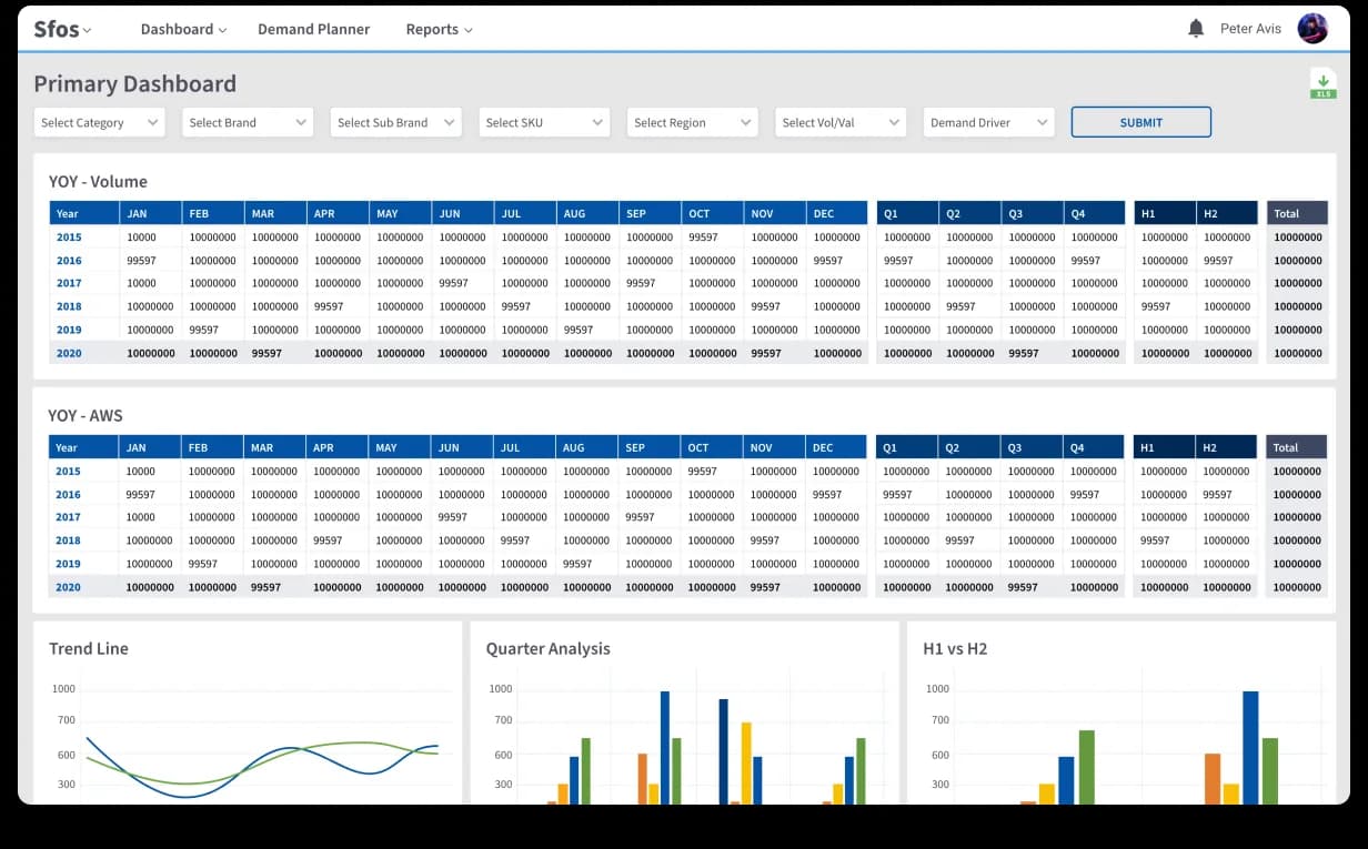
SFOS. Sales Forecasting Operating System, replaces the analyst’s yearly-volumes Excel workbook with a Primary Dashboard. Seven scope filters at the top (Category / Brand / Sub Brand / SKU / Region / Vol vs Val / Demand Driver) carry through every chart. A YOY Volume matrix leads, color-banded so an analyst spots the worst row in two seconds. AWS table underneath, then Trend Line + Quarter Analysis + H1-vs-H2 charts pivot the same data three ways. AI-driven demand forecasting feeds the Demand Planner module on the same shell.

PRAT: a 12-month plan you can read at a glance.
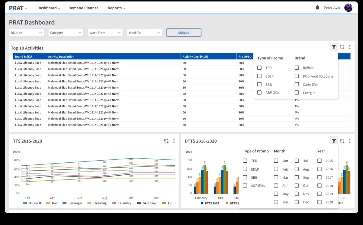
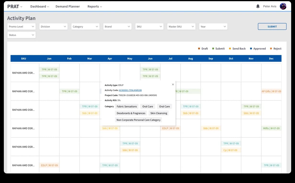
PRAT. Promotion Real-time Analytics Tool, plans, runs, and audits every promotion across categories, brands, regions, and channels. The home is a Dashboard with the year’s Top 10 Activities, TTS / DTTS charts, and an Activation Metrics panel. The Activity Plan moves the work into a 12-month calendar. SKU rows down the side, months across, week-coded tiles plotted in. Tiles carry their type (TPR, EDLP, SBB, A&P, MT, Coupon) and a status pill so the calendar reads like a heatmap of the year. Hover surfaces Activity Code, Project Code, ROI, and categories without leaving the calendar.


Activity detail: every promotion has a paper trail.
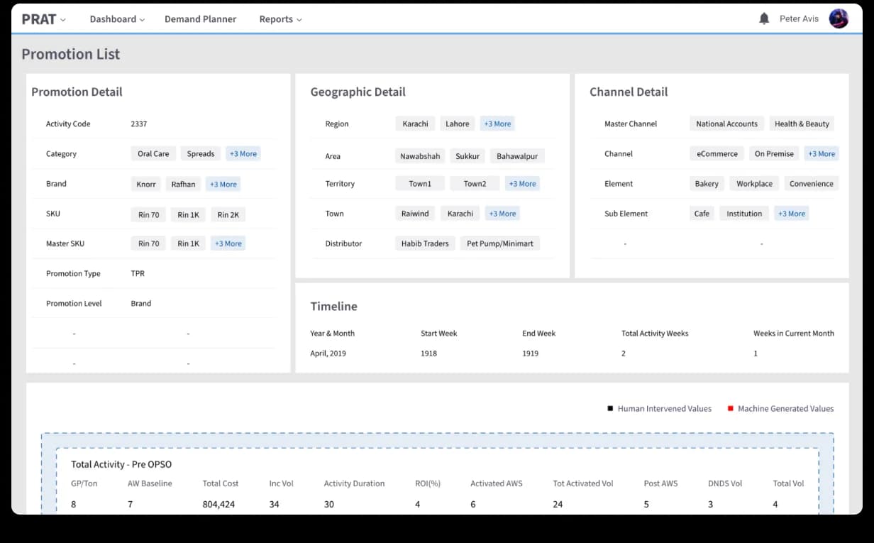
A promotion crosses Account Management → Customer Development Finance → Manager Finance → regional → master before any budget moves. We made that chain visible: every Activity has its own page (Promotion / Geographic / Channel detail cards + Timeline + Project Code & Total Budget). The headline move is the Approval History side panel, opened on demand, time-stamped, role-stamped, with status pills on every entry. The Promotion List view adds a Human Intervened vs Machine Generated Values band so the operator always sees where AI ended and human judgment took over.


Reports: the auditor’s view, in one screen.
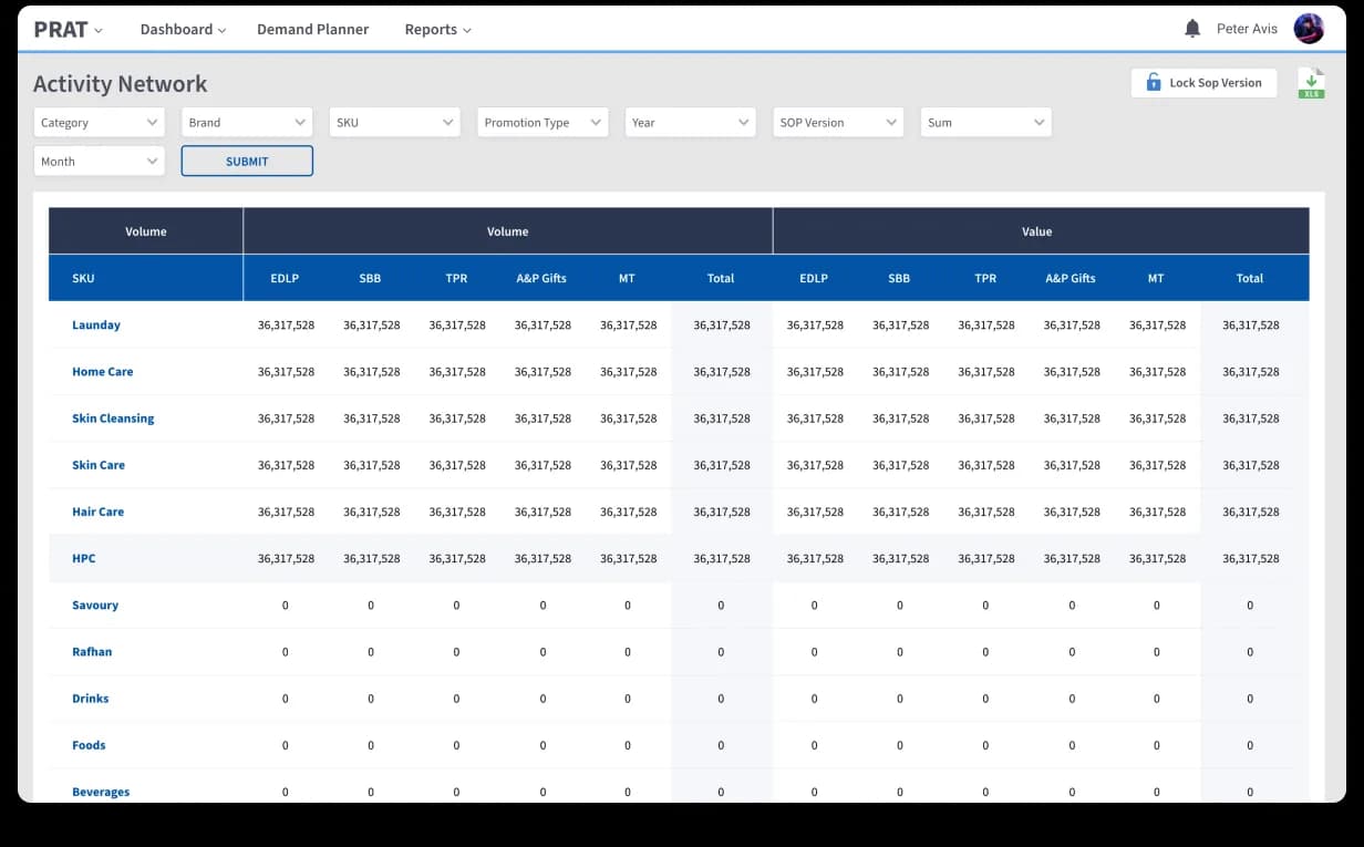
Two power-user surfaces sit on top of everything PRAT + SFOS know: a Pre vs Post OPSO Report (Amber / Green / Red bands for one-glance performance) and an Activity Network cross-tabbing SKU × promotion type. Both share an eleven-filter scope, XLS export, and a Lock SOP Version control so finance can freeze a snapshot without losing the live view. The conversation moves from "send me the workbook" to "send me the link."


Excel chaos in. Intelligent FMCG platform out.
One designer, two React engineers, embedded in the partner’s repo for 2.5 years. Manual Excel work down 70%+. Live across multiple regions of the FMCG’s business.
Book a free sprint