Denovers made critical improvements to Repurpose.io that maximized retention and feature usage and assisted in incorporating business goals into an improved, intuitive, user-friendly design. The team was very responsive and proactive and surpassed my expectations.
How we helped a creator startup transform UX and scale to 20,000+ paid users.
Solo-founder SaaS rarely fails because the engine is bad. It fails because the UX hides what the engine can do.
Hani Mourra built Repurpose.io himself, a SaaS where content creators upload once and the platform auto-distributes to YouTube, Facebook, Instagram, LinkedIn, TikTok, audio podcasts. Creators were paying. Growth was slowing. We led with a paid UX audit; Hani read it, didn’t need a second pitch, and converted it into the full SaaS + landing-page rebuild.
A live product, paying users, no full-time designer. Hani was wearing five hats and design got the smallest. Retention was slipping; the best features were hidden behind a blank-canvas onboarding.
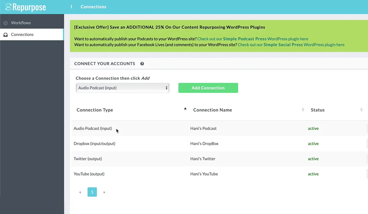
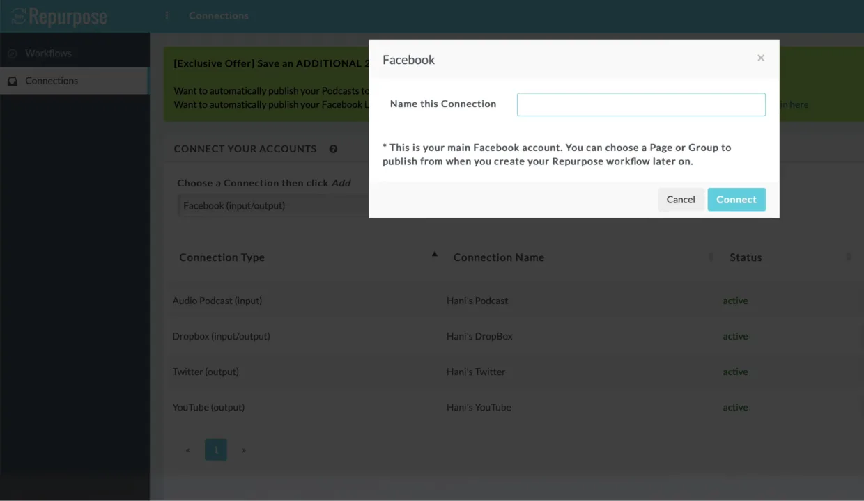
Input vs output, never separated. Users couldn’t tell whether a Facebook connection was supposed to feed content in or push it out, the single biggest source of support tickets.
Landing page loading in 8s on desktop, 23s on mobile. Hero copy soft, conversion lever weak. The page was costing leads before the product had a chance to fire.
A paid UX audit that converted into a full rebuild.
Hani Mourra built Repurpose.io himself. By 2021 the engine was working, paying users on day one, but growth was slowing as the UX got in the way. We led with a paid UX audit: site-speed teardown (8s desktop, 23s mobile), hero-messaging review, blank-screen-onboarding analysis, input-vs-output connection ambiguity, full written recommendations. Hani read it, didn’t need a second pitch, and converted it into the full SaaS + landing-page rebuild.
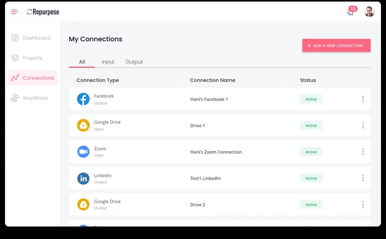
From there we rebuilt the IA around four entities (Dashboard, Projects, Connections, Workflows), each its own page. Connections got split into All / Input / Output tabs with platform logos and role labels, the single biggest support-ticket source resolved, and connection setup time fell 40%. We replaced the blank workflow canvas with a use-case template grid (YouTube to Facebook, Audio Podcast to Audiogram for Instagram, Zoom to LinkedIn) and rebuilt the marketing site for speed and conversion. 20,000+ paid creators now run content through the platform, and Hani sends other founders our way.

The product worked. The UX was hiding it.
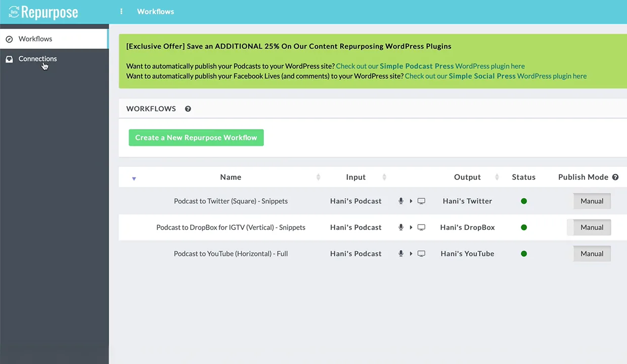
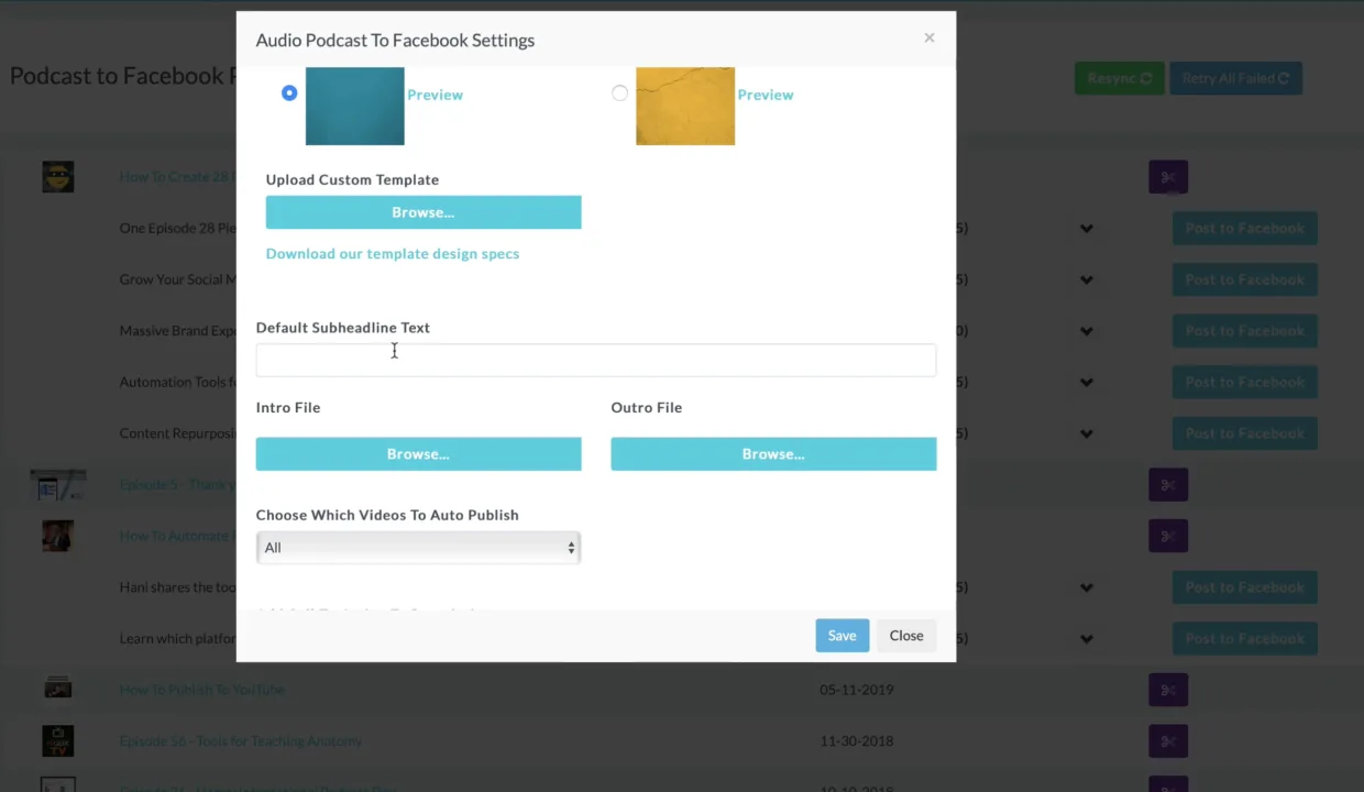
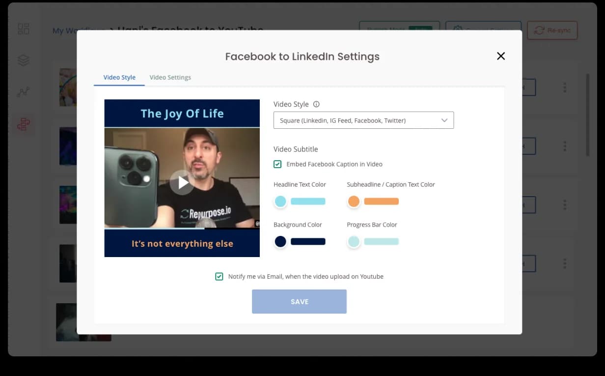
Solo-founder-built and paying its way, but the surface read like an engineer’s admin tool, not a creator’s daily workflow. A blank-canvas workflow creator, an overstuffed video-style editor, input vs output mashed together, and a marketing site loading in 8 seconds on desktop, 23 on mobile. This is what the original platform looked like when Hani brought us in.


A Dashboard, finally. And a Connections page that makes sense.
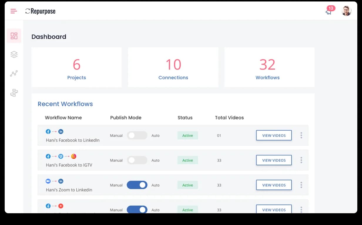
The new home is a Dashboard with three KPI tiles (Projects / Connections / Workflows) and a Recent Workflows table that surfaces platform-icon chains, publish-mode toggles, and one-click actions per row. Connections splits into All / Input / Output tabs with platform logos and role labels, 40% faster setup, fewer support tickets.


Workflow creation: a use case, not a blank canvas.
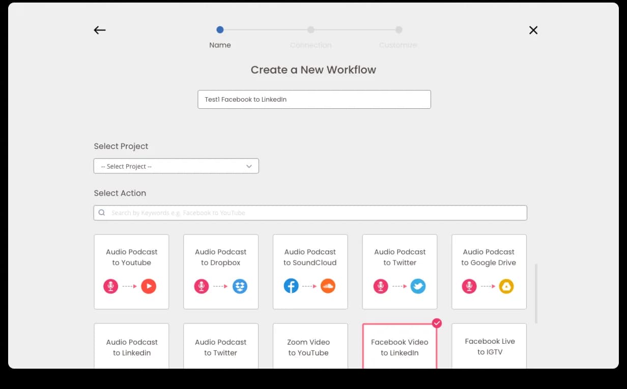
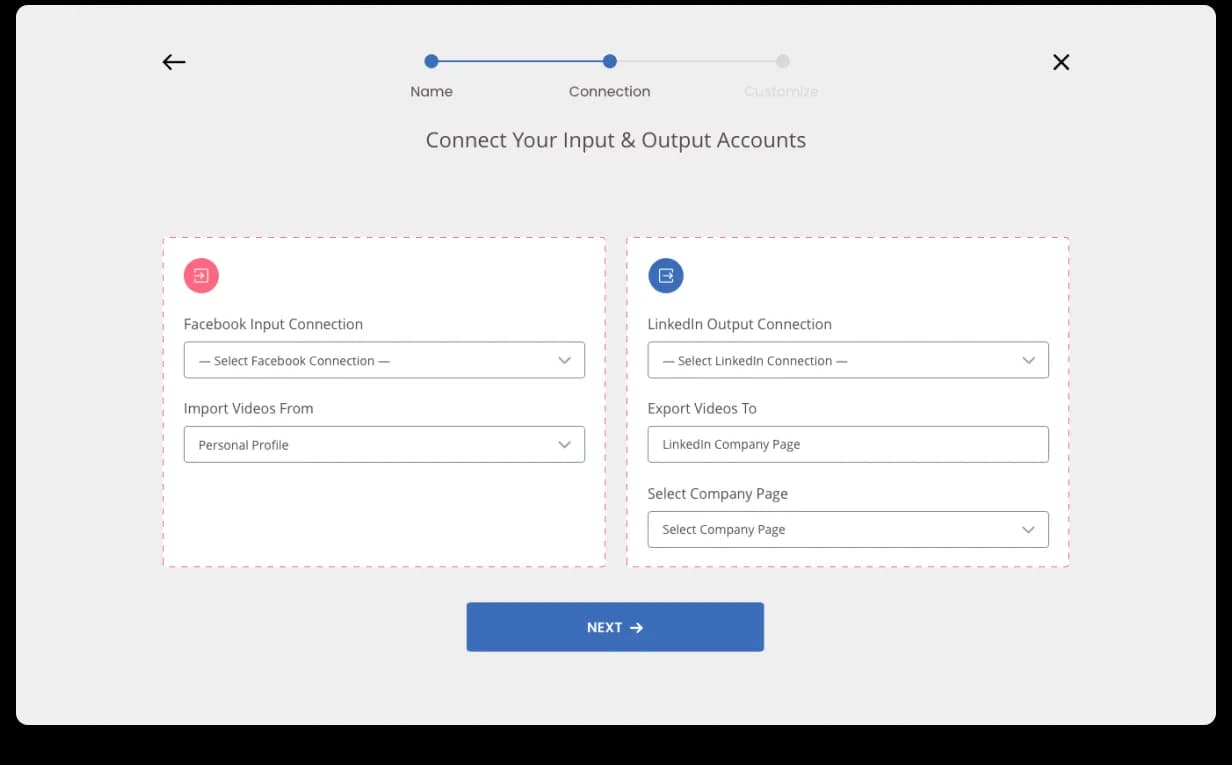
Rebuilt as a three-step wizard (Name → Connection → Customize) with a use-case template grid on screen one: Audio Podcast → YouTube / Dropbox / SoundCloud / Twitter / LinkedIn, Zoom Video → YouTube, Facebook Live → IGTV. Pick a goal, the template fills the structure. The Connection step uses two side-by-side dashed-border cards (Input + Output, colour-coded) so the source/destination split is visual, not a tooltip.


The workflow page: a centralized content library.
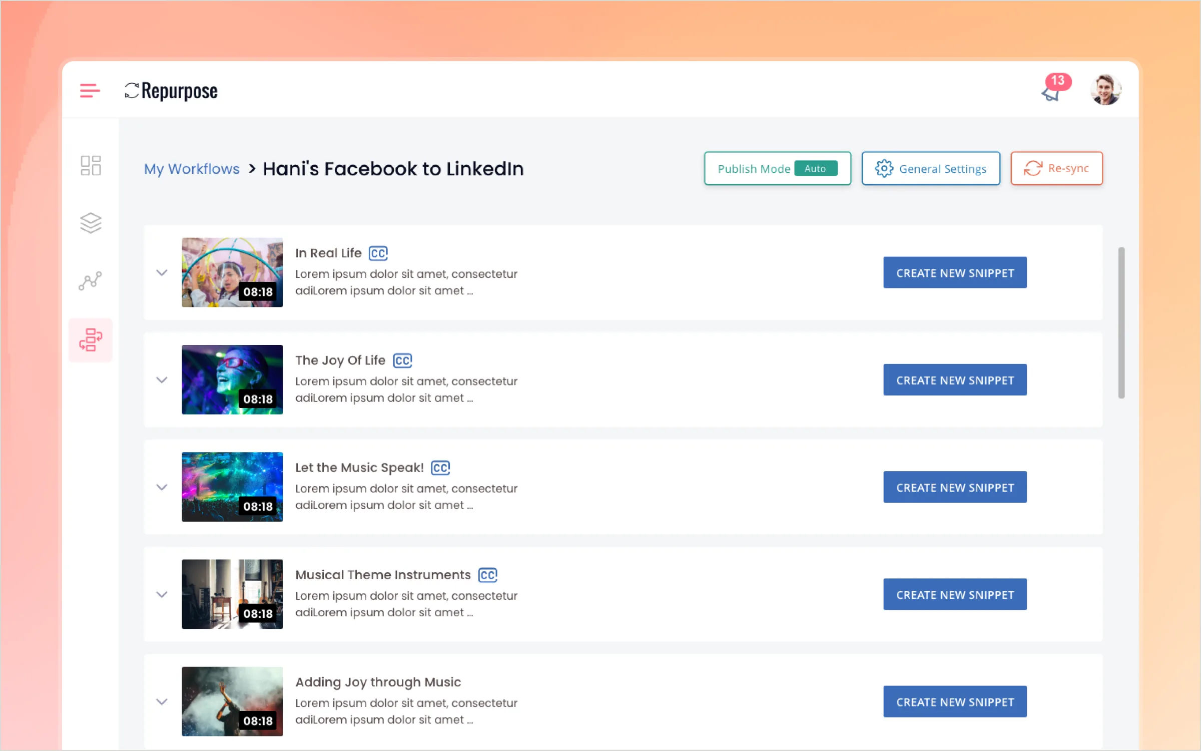
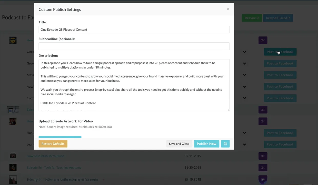
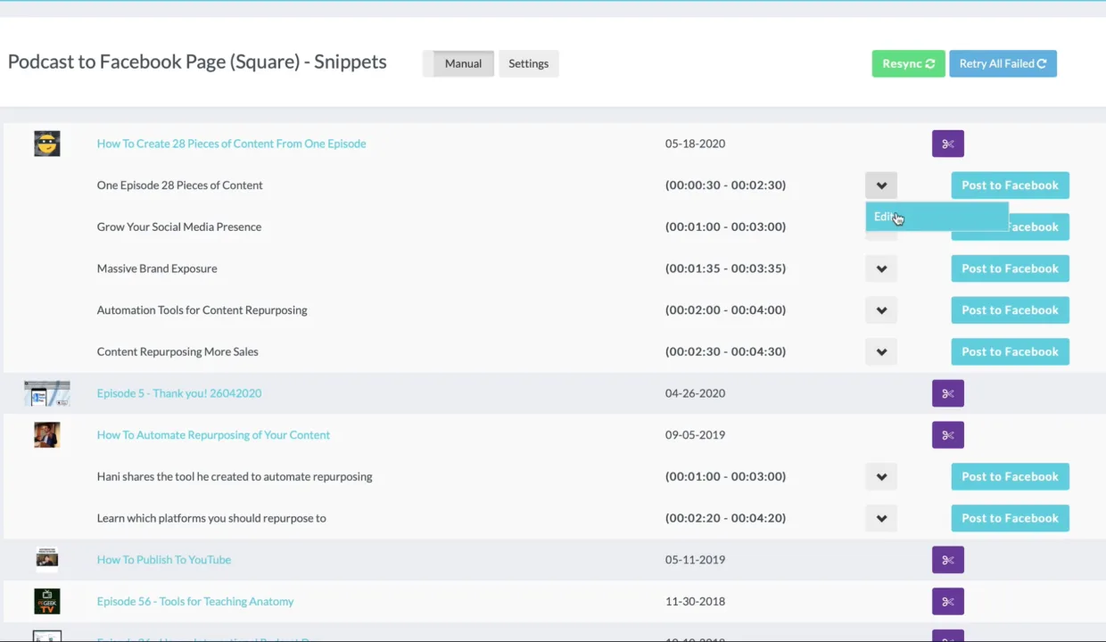
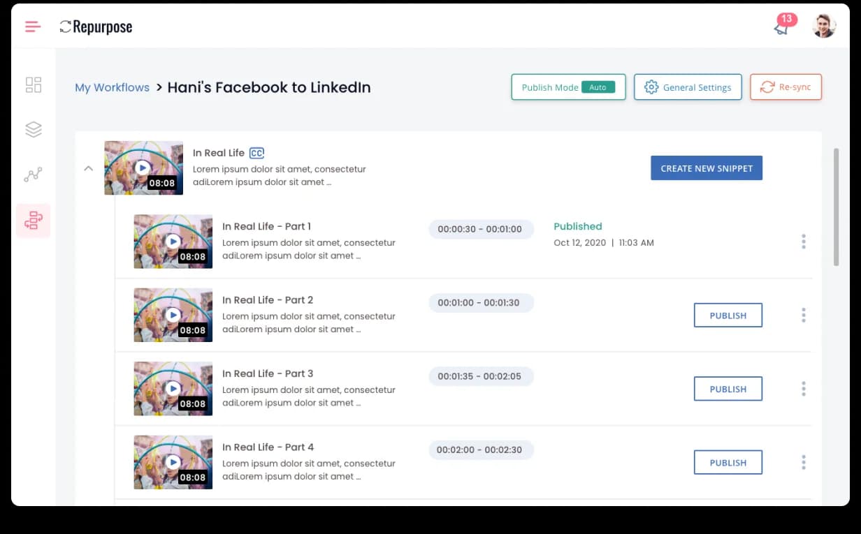
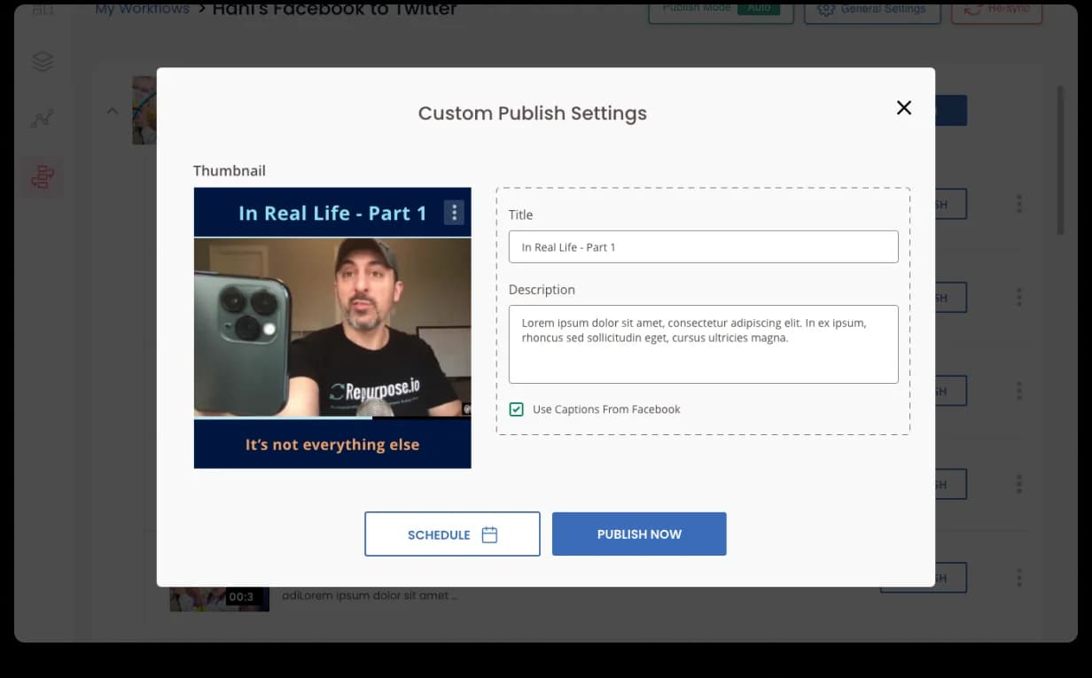
Once a workflow is running, creators need visibility before content goes out. The new workflow detail page is a centralized library: every imported video as an expandable row with thumbnail and CC badge, auto-generated snippets (Part 1–4) with timestamps and status pills, a Publish Mode toggle (Manual / Auto) at the top, and a Custom Publish Settings modal for per-snippet overrides. Creators stopped guessing what the engine was about to post; they started shipping more.


Landing page: from 8-second loads to converting visitors.
Once the SaaS redesign was nearly done, Hani brought us in on the marketing site too. We rebuilt the hero around one punchy headline + supporting visual, made "Get Started for Free" the loudest action on the page, layered in a CEO-led personal-demo option for high-intent visitors, switched testimonials to a rotating-highlights strip, and removed rigid agency pricing so sales could close upsells the calculator hadn’t imagined. The brief was a conversion ladder, not a refresh.
From a UX audit, in. 20,000+ paid creators, out.
A solo founder with paying users and a UX bottleneck. A paid audit. A full SaaS + landing-page rebuild. 20,000+ paid creators on the new platform, 40% faster connections, 5.0 Clutch across every category, and Hani sending other founders our way.
Book a free sprint