DizzionEnterprise DaaS · 2021, 2023

Turning a complex DaaS platform into an enterprise control center.

Outcome100+ screens redesigned end to end for Dizzion’s Cosmos Control Center. A complete UX overhaul, a component-based design system from scratch, dual light and dark themes, and verified Clutch 5.0.
Client
Dizzion
Cosmos Control Center — an enterprise DaaS platform helping regulated enterprise teams manage Desktop-as-a-Service infrastructure.
Engagement
Trial → 2 yrs
A trial sprint on the Data Center dashboard turned into a full-platform redesign and 2-year product design partnership.
Outcome
100+ screens
Across dashboard, drill-down pages, customer build, finance, support, maintenance, and a dual-theme design system.
★★★★★
Denovers completely revamped our SaaS application by introducing a new stunning UI, enhancing the overall product experience. A strategic approach to UX design ensured holistic improvements, through which Denovers was able to provide value to the product.
Clara Ross
Clara RossPrincipal Product Manager · Dizzion · enterprise DaaS
Where we started

What we walked into.

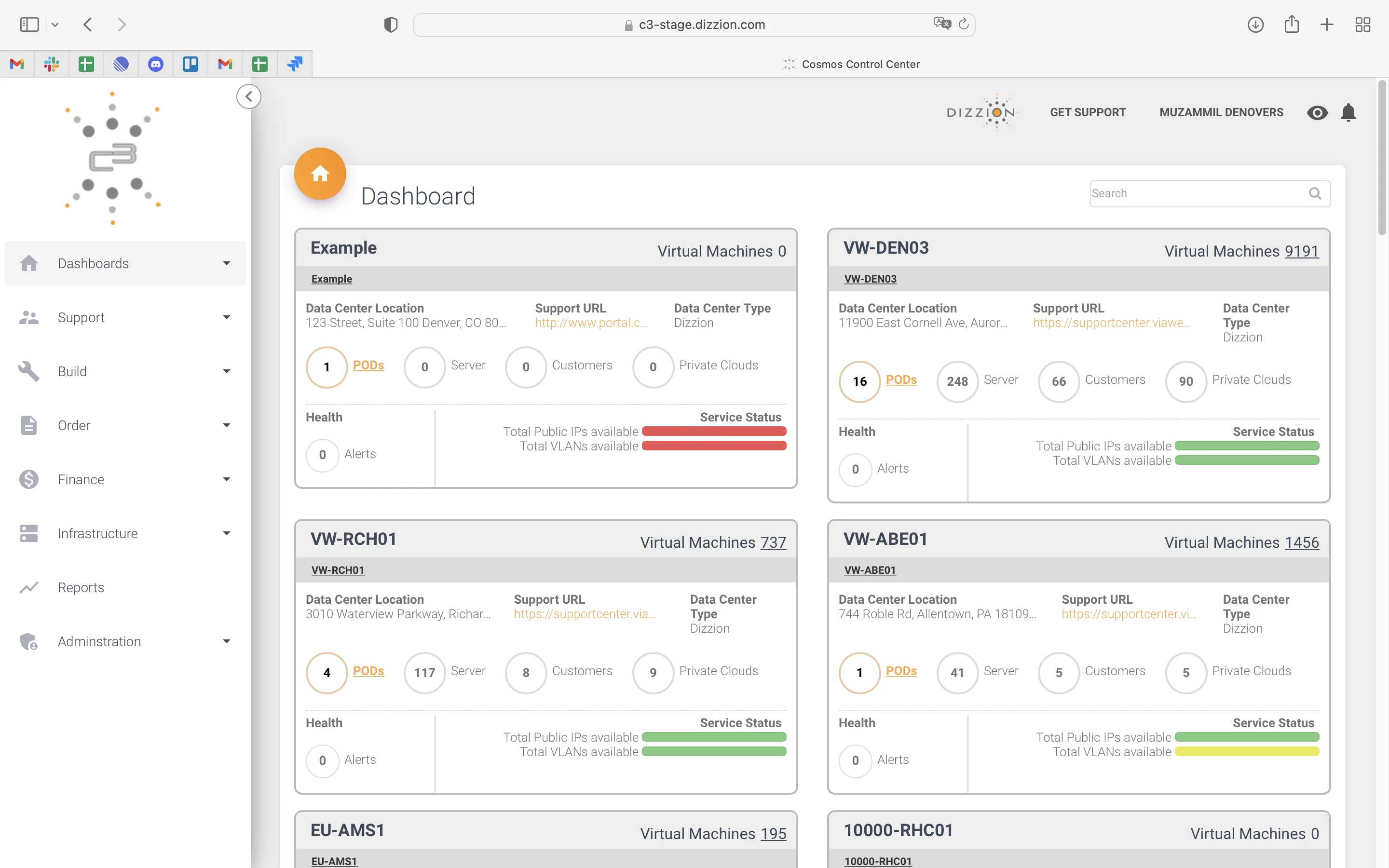
Dizzion had a powerful enterprise DaaS platform, and the product worked — but the interface had been outpaced by the platform’s complexity. The dashboard was a flat list where every data center looked equal. Deep records opened inside overlays instead of dedicated pages. Long workflows exposed raw configuration fields, and finance and support felt like separate tools. The product needed a design system strong enough to carry 100+ screens across light and dark themes. This is what the platform looked like when the engagement began.

Flat-list dashboard, 2023. Equal-weight data-center cards, no map, no scope filters, no quick way to see what needed attention
Flat-list dashboard2023
Brand stuck in 2015, 2023. Outdated styling, weak visual hierarchy, inconsistent interface patterns
Brand stuck in 20152023
Navigation by overlay, 2023. Important records opened inside modals, no clean URLs, no breadcrumb confidence
Navigation by overlay2023
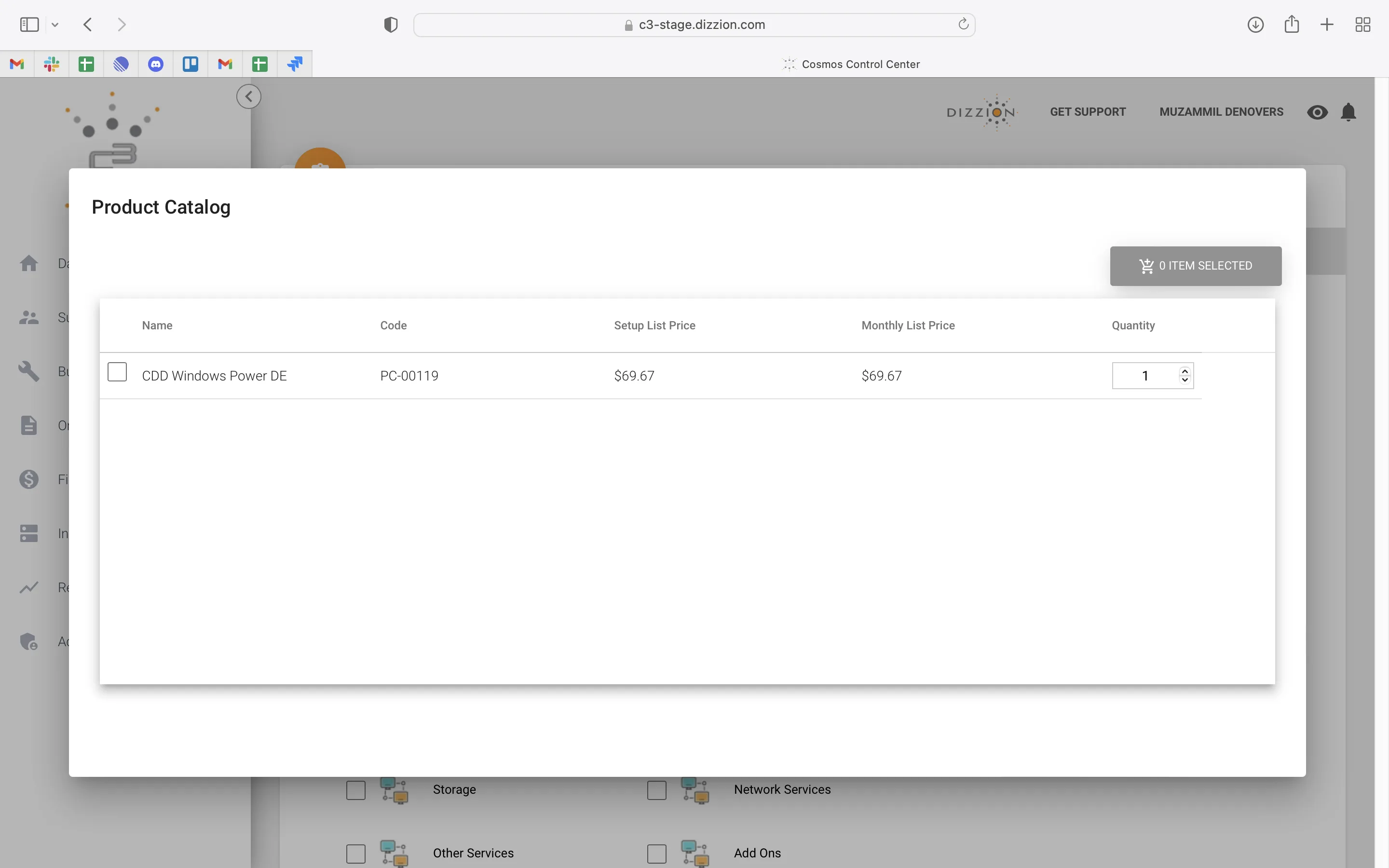
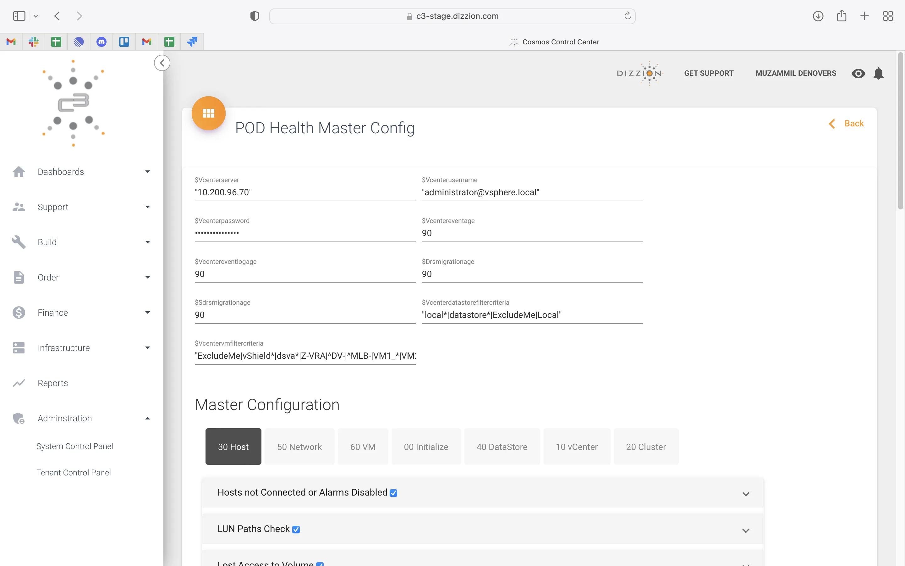
Raw config in operator UI, 2023. Technical fields exposed too directly, complex workflows felt harder than necessary
Raw config in operator UI2023
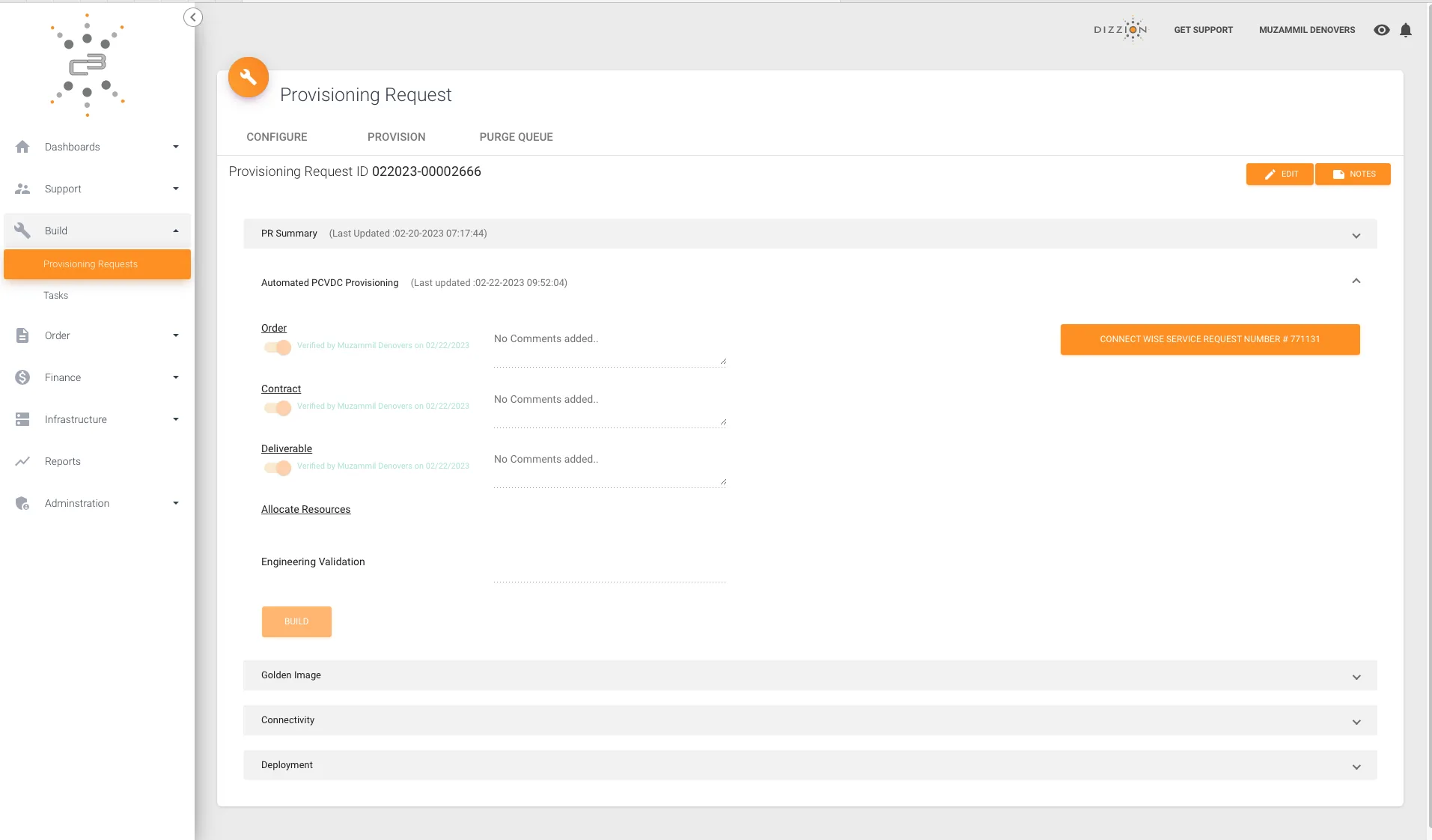
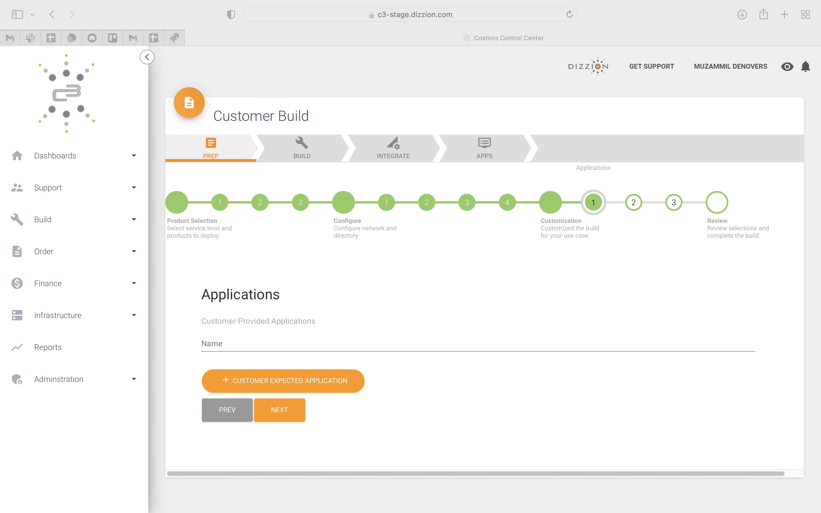
Customer Build wizard, 2023. Long setup flow, limited progressive guidance, heavy operational intake
Customer Build wizard2023
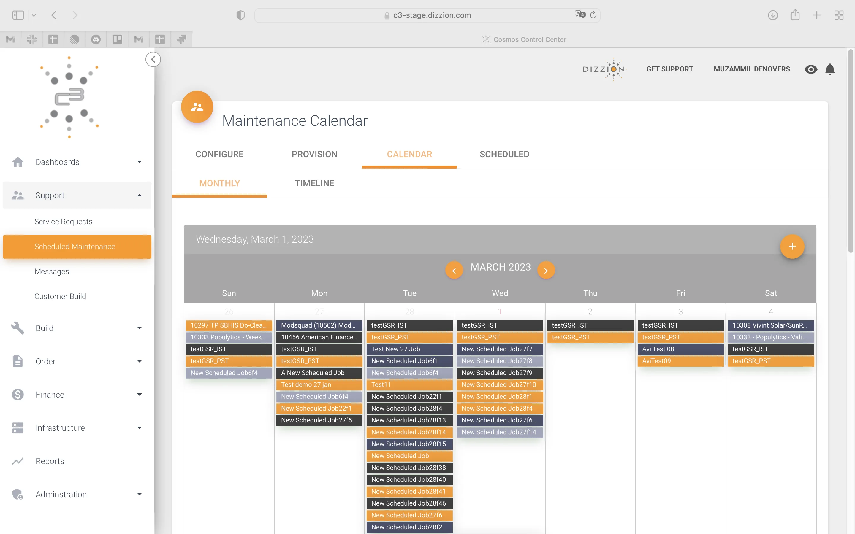
Maintenance calendar, 2023. Dense scheduling surface, weak pacing, limited hierarchy
Maintenance calendar2023
The story

A trial sprint on one module. Then the whole application.

Dizzion runs Desktop-as-a-Service infrastructure for regulated enterprise teams across BPO, financial services, healthcare, insurance, and contact centers.

Their platform, Cosmos Control Center, was already live and already important to daily operations. This was not a redesign sandbox. Real customers were using C3, so every design decision had to respect existing workflows, engineering constraints, and operational complexity.

Dizzion first gave Denovers one critical surface: the Data Center dashboard. It was the first screen many users landed on, and one of the places where the product’s complexity became visible. We redesigned it from a flat scrolling list into a command-center experience with a world map, status-coded data center pins, scope filters, list/map toggle, capacity indicators, and direct drill-down paths. That trial proved the direction.

The engagement expanded into a full-platform redesign across 100+ screens. Before redrawing everything, we built the system underneath: tokens, tables, filters, breadcrumbs, tabs, charts, status pills, forms, steppers, modals, and page shells. From there, we rebuilt the product module by module. Every major entity got its own URL. Modals became tabbed deep-dives. Raw configuration became structured wizards. Finance and support started feeling like part of the same product. And the entire platform worked across both light and dark themes.


Before2023
Before: the original C3 dashboard, an equal-weight list of data-center cards with no map, no scope filters
After · dark2024
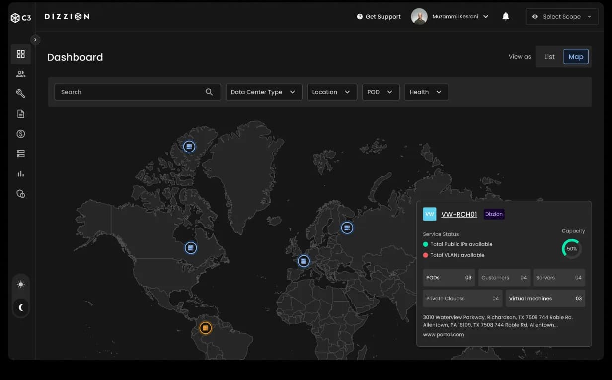
After: the redesigned C3 dashboard in dark theme, a world-map command center with status-coded pins, scope filters and inline drill-in
Chapter 01

Dashboard: a world map for the entire estate.

The C3 dashboard is where operators and customers land first. Previously, it behaved like a flat scrolling stack of identical cards — users had to work too hard to understand which data centers were healthy, which needed attention, and where to go next. We redesigned it around geography and operational scanning: a world map of data centers, status-coded pins, Data Center Type / Location / POD / Health filters, a List/Map toggle, and inline detail cards with capacity, KPIs, service status, and drill-down links. This trial-phase deliverable became the proof point that opened the full redesign.

Dashboard · map viewWorld map · status-coded pins · scope filters · inline drill-inTrial-phase deliverable
Dashboard · list viewList/Map toggle · same primitives · a scannable estateOne surface, two views
Chapter 02

The drill-down: every record gets a URL.

Below the dashboard, C3 is a hierarchy: Data Center → POD → Customer → Resource Pool. The old experience buried important records inside overlays and disconnected views, so users could reach information but rarely had a strong sense of place. We rebuilt the hierarchy into breadcrumb-driven detail pages — each major entity with its own URL, KPI header, tabs, charts, and status indicators. The Data Center page leads with capacity, service status, and tabs for Summary, PODs, VLANs, Network IPs, and Monitor. POD Management gets its own capacity dashboard. Customer Resource Pool goes deeper with CPU, RAM, DISK, virtual desktops, segments, integrations, and resource-adjustment patterns.

Data Center · PODsBreadcrumb · KPI header · tabbed deep-dive · chartsEvery record a URL
POD ManagementCapacity rings · cluster counts · saved filters · deck queueDrill level 2
Customer Resource PoolPer-tenant capacity · integrations · sub-tabset · service statusDrill level 3
Chapter 03

Customer Build: raw config replaced by a structured wizard.

Customer onboarding was one of the heaviest workflows inside C3. The old flow exposed too much raw technical configuration directly in the operator UI — the complexity was necessary, but the interface didn’t need to make it feel heavier. We rebuilt Customer Build as a structured wizard moving through clear stages: PREP → Build → Integrate → App, with nested sub-wizards for technical setup (VPN Name, VPN Details, IKE Phase 1, IKE Phase 2, and Active Directory). The same wizard pattern then extended into Provisioning Requests, Tasks, and Scheduled Maintenance.

Customer BuildPREP → Build → Integrate → App · structured intakeThe wizard pattern
Integrate · VPNVPN Name → Details → IKE 1 → IKE 2 → Active DirectoryNested sub-wizard
Scheduled MaintenanceCalendar / Timeline view · saved filters · same component familyWizard, propagated
Chapter 04

Finance and Support, on the same primitives.

Finance and support previously felt like separate apps inside the same platform. Contracts, billing, customer views, service requests, ticket details, attachments, and conversations all needed to feel connected to the rest of C3. We rebuilt these modules on the same component family as the infrastructure views. Finance received Contract View and Customer View tabs, expandable rows, saved filters, status pills, and clearer customer-level contract visibility. Support received breadcrumb-driven ticket pages, structured metadata panels, conversation threads, and attachment grids. Two different jobs. One product language.

Finance · ContractsContract / Customer pivots · expandable rows · saved filtersSame primitives
Support · Ticket detailConversation thread · structured metadata · attachmentsNo more overlays
Chapter 05

One system. Two themes. 100+ screens.

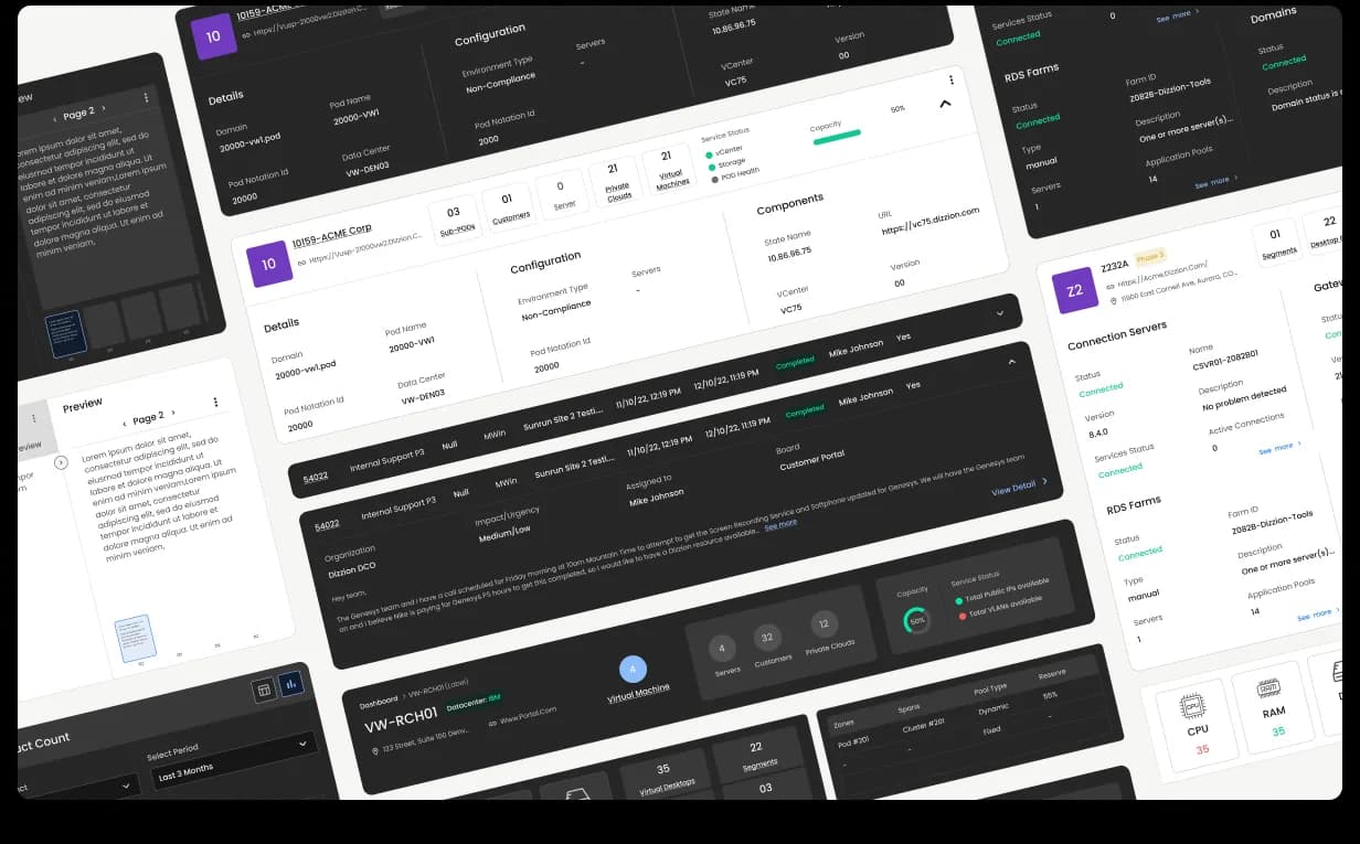
None of these surfaces were designed as one-off screens. The dashboard, drill-down pages, customer build flows, finance, support, maintenance, tables, filters, wizards, charts, modals, and status states were all assembled from a component-based design system built from scratch: tokens, typography, colors, tables, forms, breadcrumbs, tabs, filters, steppers, modals, status pills, charts, cards, and page shells. The same primitives rendered both light and dark themes without forking the product experience. That is what kept 100+ screens consistent.

Dizzion C3 design system composite, multiple surfaces tiled together to show the component library that powers the platform: same tokens, same primitives, both light and dark themes, all screens speaking one visual language
Design systemTokens · primitives · light + dark · 100+ screensThe foundation
Outcome · 100+ screens · verified Clutch 5.0

Trial sprint, in. Two-year partnership, out.

Dizzion came to Denovers with a SaaS product that worked, but an interface that no longer matched the maturity of the platform. We helped turn Cosmos Control Center into a modern enterprise control center for Desktop-as-a-Service operations. The final outcome included 100+ production screens, a design system built from scratch, dual light and dark themes, a dashboard command center, breadcrumb-driven record pages, tabbed deep-dives, a structured customer build wizard, finance and support modules, and reusable tables, filters, charts, forms, and status patterns.

Dizzion did not just get a new UI. They got a scalable product foundation for a complex enterprise SaaS platform.


Book a free sprint
Replies within one business day

Design the product users keep coming back to.

Tell us what you’re shipping and we’ll get back with a scoped sprint.

Book a free sprint
Get Started