Denovers revamped our app’s UX/UI design, which increased our 30-day retention by 11% and reduced the drop-off percentage from 51% to 14%. They had seamless project management and a proactive approach.

Denovers revamped our app’s UX/UI design, which increased our 30-day retention by 11% and reduced the drop-off percentage from 51% to 14%. They had seamless project management and a proactive approach.
Finwize started with a strong idea: make financial modeling easier for founders who aren’t finance experts. Early-stage founders need models for investors, hiring, revenue, and growth scenarios — but most of that still lives in spreadsheets that feel intimidating, fragile, and hard to explain in an investor conversation. The team wanted to turn that complexity into a visual SaaS product.
There were two possible directions on the table. One leaned into Strategy Modeling — helping founders visually map business ideas, goals, and execution paths. The other was Financial Modeling — helping founders build investor-ready models through a simpler visual interface. Instead of debating both for weeks, the team brought Denovers in to prototype both.
The Finwize team had already shipped Lity with us, so there was no long onboarding and no slow discovery — the same designer who understood how they work was reassigned to the new product, and the first sprint started fast. We designed rapid prototypes for both directions, each with its own product experience and landing page, giving the team something concrete to show stakeholders.
Feedback made the decision clearer: the team chose Financial Modeling as the MVP. The Strategy prototype wasn’t wasted — it shaped the visual planning vocabulary that survived into the final product: nodes, subnodes, hierarchy, and switchable views. From there we designed Finwize around one idea — make financial modeling feel less like Excel and more like a product founders can think inside.
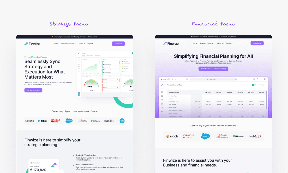
The first challenge wasn’t screen design — it was product direction. The founders had two strong ideas, but building both would have slowed the MVP and diluted the product. So we tested both through design: a Strategy Modeling track focused on business strategy, goals, and visual planning, and a Financial Modeling track focused on models, formulas, dashboards, and investor-ready planning. Each prototype let the team see the product in motion instead of discussing it abstractly. The outcome was clear — Financial Modeling became the MVP, and that decision gave the product focus.
Once Financial Modeling was the chosen direction, the product needed a planning surface. We designed the Business Modeling area as the place where founders map the logic of their business visually. Instead of starting from rows and cells, users build their model through a vocabulary of parents, child subnodes, dependencies, and properties. A founder could model departments, revenue streams, costs, teams, channels, or assumptions — then connect those pieces to financial calculations later. This became the surface every other flow returns to.
Not every founder plans the same way — some think in boards, some in lists, some in systems and hierarchy. So we designed three switchable views around the same underlying data: a Kanban view for founders who organize business areas visually, a List view for a clean, itemized way to review model components, and a Tree Flow view for systems thinkers who want to see parent-child relationships as a hierarchy. These weren’t separate products — they were three views of the same model. Users switch between Kanban, List, and Tree Flow without losing context or duplicating work, with a right-side control panel for live edits across all three.
The Formula Builder became the core value engine of the MVP. Founders still needed the power of financial modeling — formulas, assumptions, salaries, spend, revenue, dependencies, and projections — without the pain of managing all of it by hand inside spreadsheets. We designed the Formula Builder so users could connect business-model nodes to live financial calculations: define how one part of the business affects another, use templates for common calculations, and watch the impact flow into dashboards and reports. The product kept the depth of financial modeling, wrapped in a clearer interface.
Once the modeling logic was in place, the product needed surfaces that helped founders make sense of the numbers. The Dashboard auto-reflects data from the Business Model — widgets, charts, KPIs, and business metrics update as the model changes. The Financials section gives a structured view of the financial data behind the product, with edits rippling across the platform. And the Goals module connects planning to execution: founders create goals, subgoals, and tasks, then view them across Board, List, Chart, and Calendar surfaces. Together, these made Finwize feel less like a spreadsheet replacement and more like an operating layer for early-stage planning.
Finwize came to Denovers with a strong idea, two possible directions, and pressure to move quickly. We helped the team turn that uncertainty into a focused MVP — two rapid prototypes, a stakeholder-tested product direction, a visual business-modeling canvas, Kanban/List/Tree Flow views, a Formula Builder, dashboards, financials, and goals, all in a working MVP ready for investor and accelerator conversations. Within weeks, the team had a product they could put in front of stakeholders, and Finwize was accepted into a top accelerator and moved into beta with early adoption underway.
This wasn’t just a UI sprint — it was product direction, rapid validation, and MVP design moving together.