Denovers was excellent to work with in every aspect. Earning a complete design system from them alongside multiple mobile apps was truly seamless. Their pod stretched our brand across every smart-lighting surface we shipped without dropping a beat, same Figma, same release cadence, same quality bar as our internal team.
How embedded design helped an IoT smart-lighting brand ship multiple mobile apps.
What we walked into.
Smart lighting looks simple from the outside — turn lights on, dim them, change the color, set a routine, sync them with music. But the actual product experience is much more complex.
A smart-lighting app sits between the user, the hardware, the room, the mood, the schedule, and the brand. It has to feel simple enough for a consumer adjusting bedroom lights, but structured enough to support multiple devices, rooms, scenes, routines, and future mobile apps.
Cleanlife already had a global design system. But as the product roadmap expanded, they needed ongoing design support to keep new mobile apps and features consistent.
The challenge was not to redesign one screen. It was to extend an existing system across multiple smart-lighting experiences without breaking the brand, slowing down engineering, or creating one-off patterns.
Cleanlife needed a design partner who could join their internal workflow, understand the system quickly, and help ship product work continuously. That is where Denovers came in.
Customers wanted effortless control over lighting, mood, color, schedules, and device behavior.
Multiple mobile apps and features needed to stay consistent under one global design system.
Make technical IoT controls feel emotional, simple, and mobile-native.
Extend design capacity without hiring a full internal product design team.
One dedicated designer, inside the Cleanlife product workflow.
Cleanlife was not looking for a one-time UI refresh. They needed an ongoing product design partner who could manage, extend, and apply their global design system across different mobile applications. So Denovers assigned one dedicated product designer to work directly with the Cleanlife team — reviewing existing components, understanding brand rules, extending mobile patterns, and designing new apps and features within the same design language.
The model created continuity. Cleanlife did not have to brief a new designer every time a feature needed to move forward, so every new feature could be designed faster because the foundation was already understood, every app could feel like Cleanlife because the system was being extended rather than reinvented, and every interaction stayed consistent because design decisions were reusable across the product family.

Global design system: one foundation across multiple mobile apps.
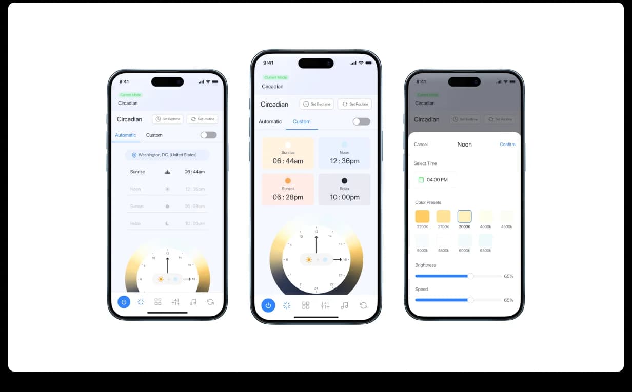
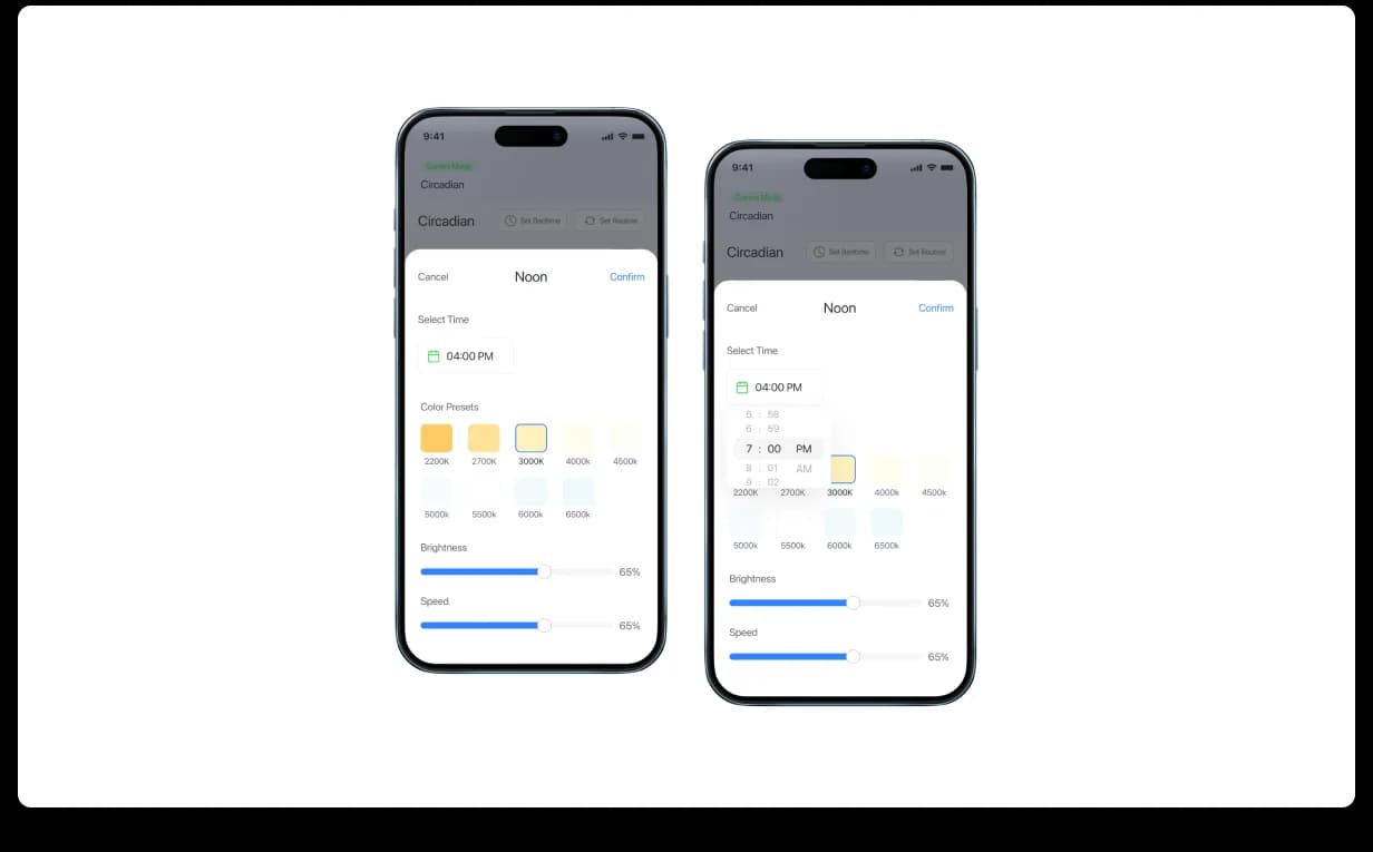
The global design system was the backbone of the engagement. Cleanlife needed more than attractive mobile screens — they needed a system that could support multiple smart-lighting products over time. We extended their design language into mobile-specific components and patterns: navigation primitives, control surfaces, status states, scene cards, color pickers, sliders, toggle patterns, device controls, routine builders, music-sync components, and iOS-native interaction behaviors.
This helped the product team avoid fragmented app experiences. Instead of designing each mobile app separately, new screens could be assembled from a shared library — making the product easier to scale, easier to maintain, and easier for users to understand across different Cleanlife apps.
Core lighting control: simple controls for complex hardware.
The core experience of a smart-lighting app is control. Users want to adjust light quickly, but the interface still has to handle multiple variables: power, brightness, saturation, hue, scenes, and device-level behavior. We designed the core control surface around immediate interaction — turn lights on or off, adjust brightness, use a dimmer ring, open scene shortcuts, and access color controls without feeling buried inside settings.
The goal was to make the app feel responsive and physical. When users move a slider or adjust a color, they should feel like they are directly shaping the room — reducing the gap between digital control and real-world lighting.

Color-wheel hue picker: giving users full-spectrum control.
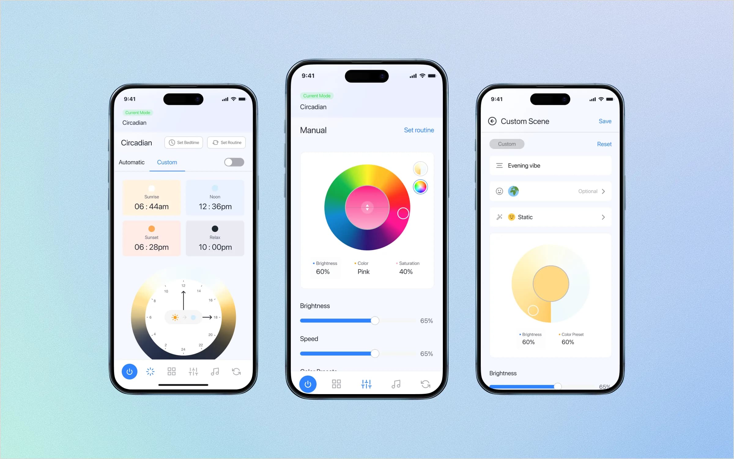
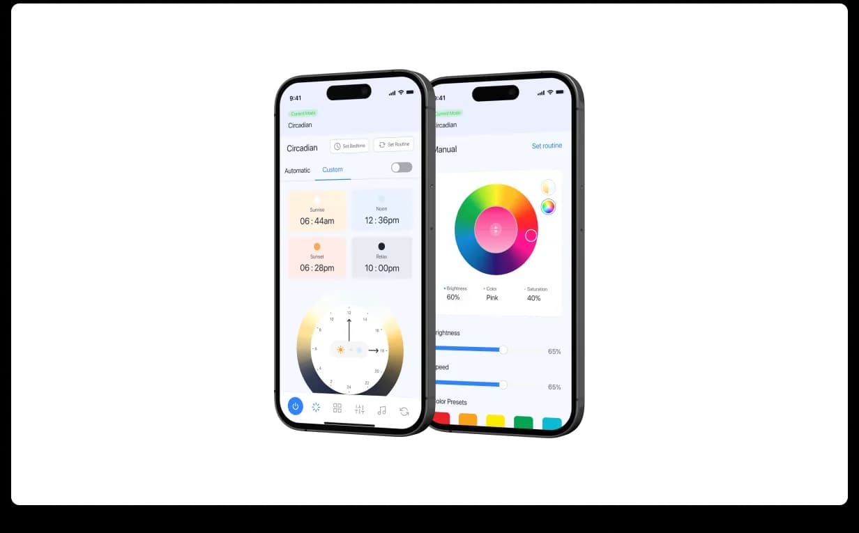
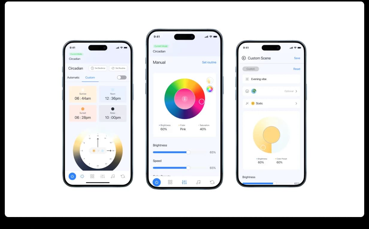
Color is one of the most emotional parts of smart lighting. People do not think in technical lighting values — they think in moods: warm, cool, cozy, blue, party, night, focus. We designed the color-wheel experience to let users “paint” their lighting visually, with full-spectrum color selection, brightness control, saturation adjustments, and live preview-style interaction.
This allowed users to fine-tune their environment without needing to understand technical color models. The experience stayed simple on the surface, while the system underneath supported more precise control when users wanted it.

Scenes: mood-first UX instead of settings-first UX.
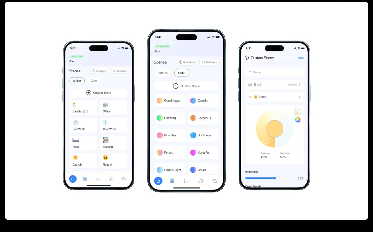
One of the biggest product decisions was to treat scenes as a first-class experience. Customers do not usually want to configure five different values every time they open the app — they want one tap for a mood: Goodnight, Reading, Disco, Cuddle Up, Cozy Up, Sunflower, Halloween, Coffee. We designed scenes as a visual gallery instead of a settings page, each represented with a named tile and color-coded mood preview so users could quickly scan, select, and activate the atmosphere they wanted.
We also designed a Custom Scene path, allowing users to create and save their own lighting combinations. This moved the experience from utility to lifestyle — the app was no longer only about controlling bulbs; it was about creating moments.

Custom scenes: save once, summon often.
Custom scenes gave users a way to turn personal preferences into reusable lighting modes. Instead of rebuilding a lighting setup every time, users could create a custom scene, define colors, adjust brightness, name the setup, and return to it later.
We designed this flow to balance ease and depth. Beginner users could save a simple mood quickly; power users could fine-tune stops, color values, brightness, saturation, and per-bulb behavior. This made the system flexible without becoming intimidating — the product respected both types of users: those who want speed and those who want precision.

Routines: lighting that follows the user’s day.
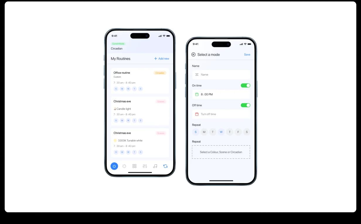
Smart lighting becomes more useful when it works automatically. Cleanlife needed routine flows that allowed users to connect lighting behavior with time, day, and repeat logic. We designed routines as named rules instead of raw schedules, using familiar language — When sunset, Workout time, It’s bedtime — where each routine connects a mode or scene with a time window and day-of-week pattern.
Users could set repeats, choose days, select a mode, and create automation without seeing the underlying device logic — making the routine builder feel mobile-native and human.


Music sync: making smart lighting feel alive.
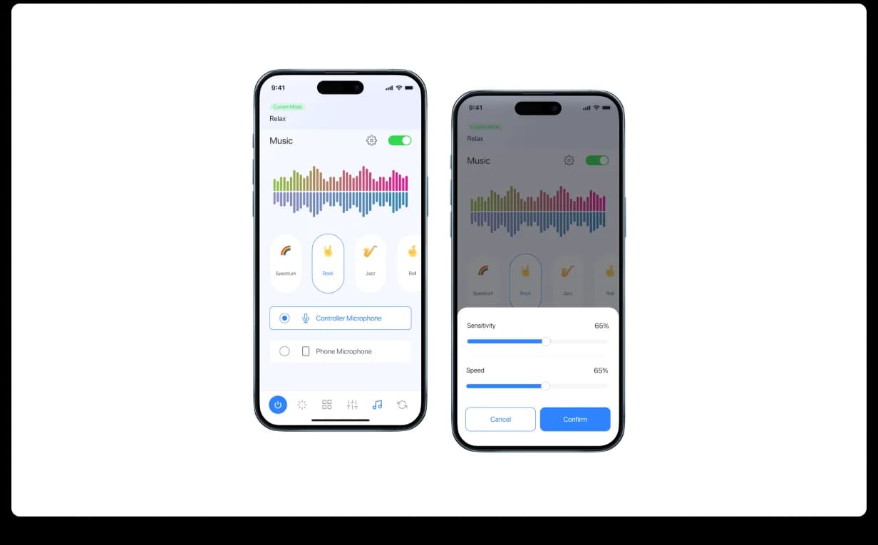
Music sync was one of the most expressive parts of the product — the feature users show their friends. The lights respond to music, colors shift with the beat, intensity changes with the track, and the room becomes part of the experience. We designed music sync around a live, visual, high-energy interface: a Disco toggle, multi-color waveform visualization, sensitivity controls, mode selection, brightness and saturation adjustments, and a save-customization action.
Even though the feature felt more playful than the rest of the app, it still reused the same design system primitives — keeping the experience exciting without feeling disconnected from the brand.

One global system, multiple mobile apps.
As an embedded partner — one dedicated designer inside Cleanlife’s internal process — we extended one global design system across multiple mobile experiences: control, color, scenes, custom scenes, routines, scheduled scenes, and music sync.
The result was a more scalable mobile foundation — new apps could ship without breaking consistency, and new features without starting from zero. This was not just mobile UI work; it was design-system extension for an IoT product ecosystem.
Building an IoT, mobile, or design-system-heavy product? Start with one critical flow. We’ll audit it, redesign it, and show how your product can become easier to control, easier to scale, and easier to keep consistent across every app.
Book a free product design sprint