How an Embedded Design Partnership Helped an eMobility Startup Scale Faster
Outcome→Neuron extended its in-house design capacity with Denovers, improving key UX flows across rider and operator apps while keeping one consistent design language across map interactions, input components, feedback patterns, vehicle details, and fleet-management workflows.
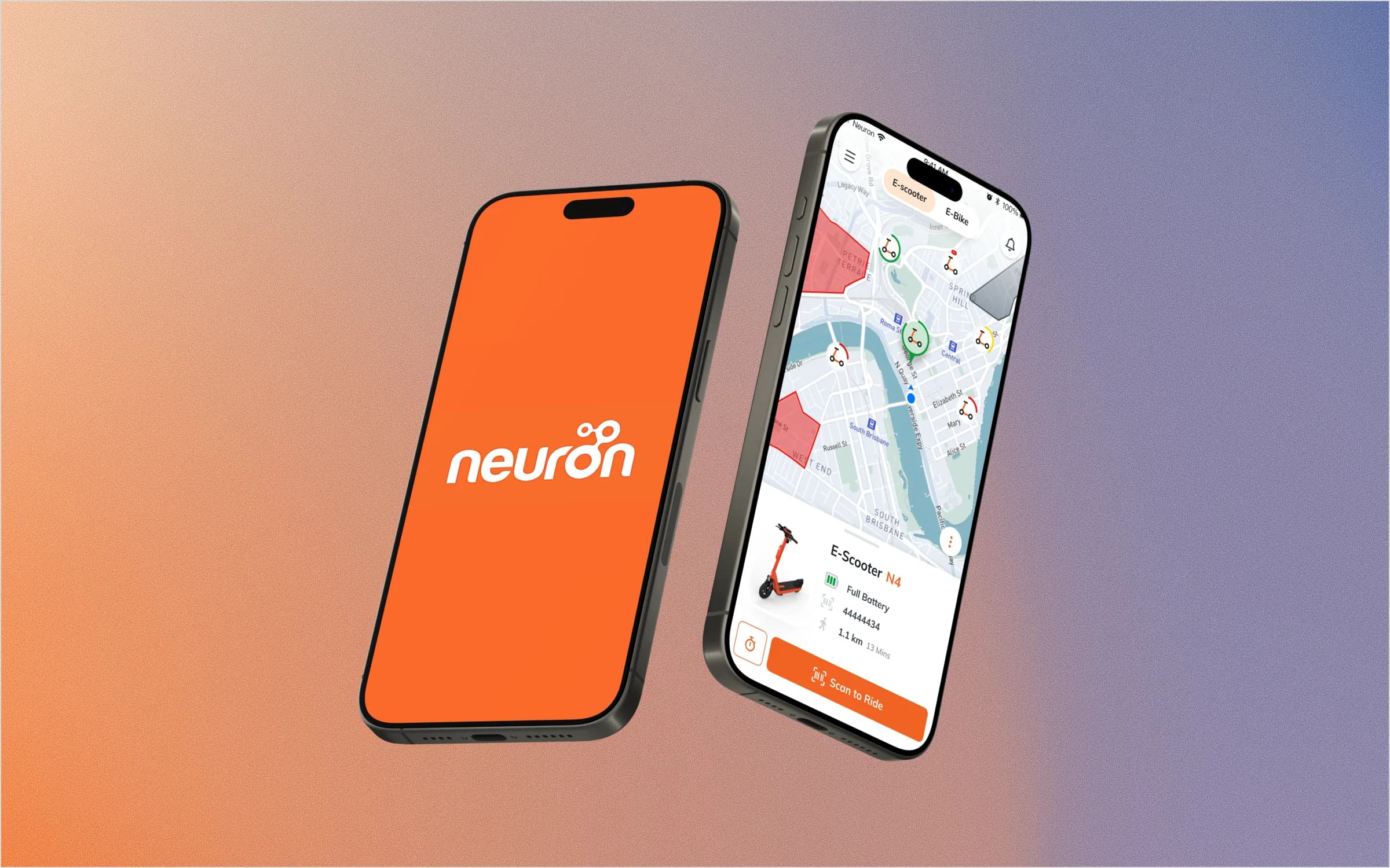
ClientNeuronRegional micromobility company helping cities move toward cleaner transportation through e-scooters and e-bikes across Southeast Asia and Australia.
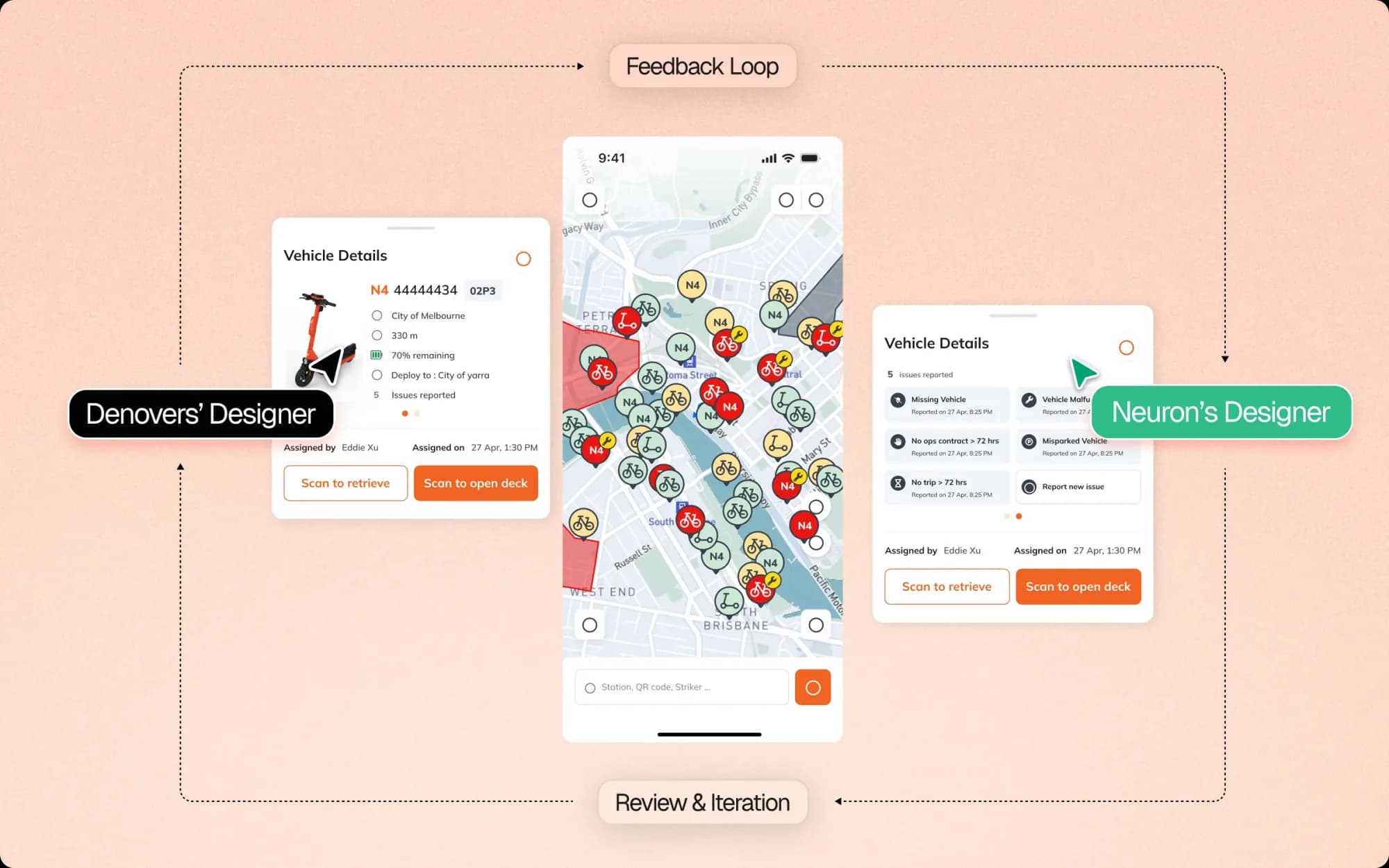
EngagementEmbeddedA dedicated Denovers product designer embedded into Neuron’s internal design team, working through daily scrums, sprint meetings, strategy sessions, design-system reviews, and iterative product feedback.
OutcomeBoth appsA more scalable and consistent mobility product experience across the rider app, operator app, home map, MapView pins, input fields, snackbars, vehicle detail bottom sheets, and fleet-management interfaces.
Where we started
What we walked into.
Neuron was already operating a live mobility product across multiple cities. They had e-scooters and e-bikes on the ground, real users, local operators, and an internal design team that understood the product deeply. But as the company scaled, the product experience started to feel the pressure.
The rider app needed to help users quickly find, evaluate, and rent nearby vehicles. The operator app needed to help local service partners monitor fleet health, battery levels, maintenance needs, and vehicle status. Both apps were connected to the same fleet, but they served very different users. Riders needed speed. Operators needed visibility. And the internal design team needed more capacity to keep up with feature growth without losing UX consistency.
That is where Denovers came in. Neuron did not need a disconnected design vendor. They needed an embedded design partner who could join their product rhythm, understand the existing design system, and start contributing from day one. Our dedicated designer joined Neuron’s product workflow, studied the existing design system, participated in daily scrums, joined sprint meetings, and worked through strategy sessions with the internal team — understanding how the product worked from the inside, not just how the screens looked.
The designer worked alongside Neuron’s team to research flows, brainstorm ideas, explore multiple iterations, and improve core areas across both apps. The goal was simple: help a fast-growing mobility team move faster without losing UX consistency.
Both appsRider app + operator app · one fleet, two audiencesThe starting point
Chapter 01
Home map: reducing noise around the rider’s first action.
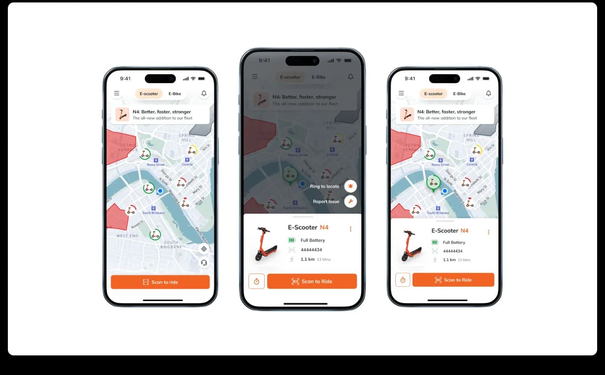
The home map was one of the most important surfaces in the rider app. When a user opens a mobility app, they usually have one immediate goal: find a nearby vehicle and start moving. But the existing map experience had become cluttered — too much information was competing for attention, which made it harder for users to focus on the most important action.
We redesigned the home screen map around clarity. Instead of placing too much information directly on the map, we introduced a floating panel that gave users access to the most relevant actions and vehicle information at the right moment. When users selected a vehicle, the panel could update with useful details; when they wanted to scan the map, the interface could stay quieter. This helped the rider experience feel more focused and less overwhelming.
Home mapCleaner map · floating panel · focused actions · faster vehicle scanningRider goal · find, understand, ride
Chapter 02
Input fields: turning inconsistency into reusable mobile primitives.
One of the system-level issues was inconsistent input fields. Input fields may look like small components, but they affect the entire product experience. When forms behave differently across screens, users start to feel friction — labels feel inconsistent, validation becomes unclear, spacing changes, and error states become harder to understand. For Neuron, this affected both usability and accessibility.
We explored multiple input field directions and moved toward a Material Design-inspired approach that aligned with mobile standards and could scale across the product. The goal was not to create a completely new visual language — it was to make the product feel more predictable. A consistent input system helped reduce user errors, improved form clarity, and gave the internal team a stronger component foundation for future flows.
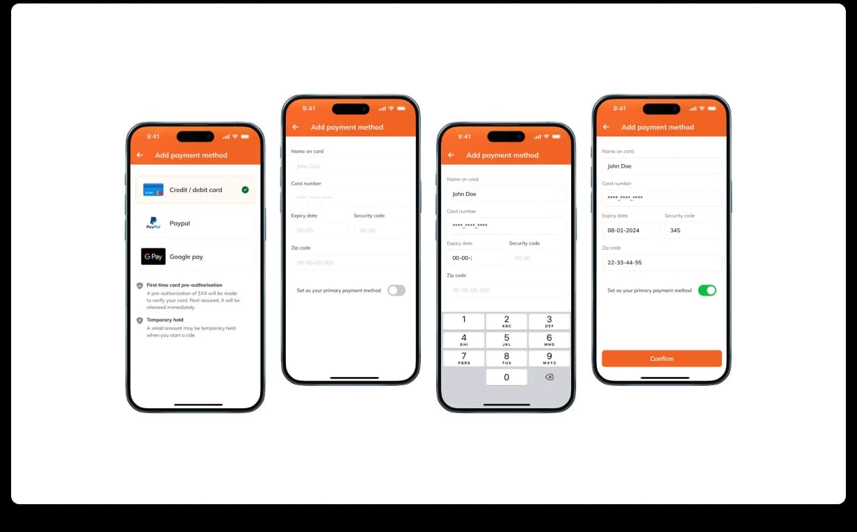
Input fieldsMaterial-aligned · consistent labels · better validation · scalable form behaviorForm primitives
Chapter 03
MapView pins: one fleet vocabulary for two audiences.
The map was not only important for riders — it was also important for operators. Both apps showed the same fleet, but each user group needed slightly different information. Riders needed to know which vehicle was nearby, what type it was, whether it was available, and how much battery it had. Operators needed those same signals, but with additional maintenance and service context.
So we created a shared MapView pin system. Each pin used distinct icons for vehicle type and showed battery level at a glance, and the same visual vocabulary could work across both rider and operator apps, with role-aware variations where needed. This made the map easier to read for everyone: riders could quickly select the best available vehicle, and operators could quickly identify what needed attention. Same fleet, two audiences, one design language.
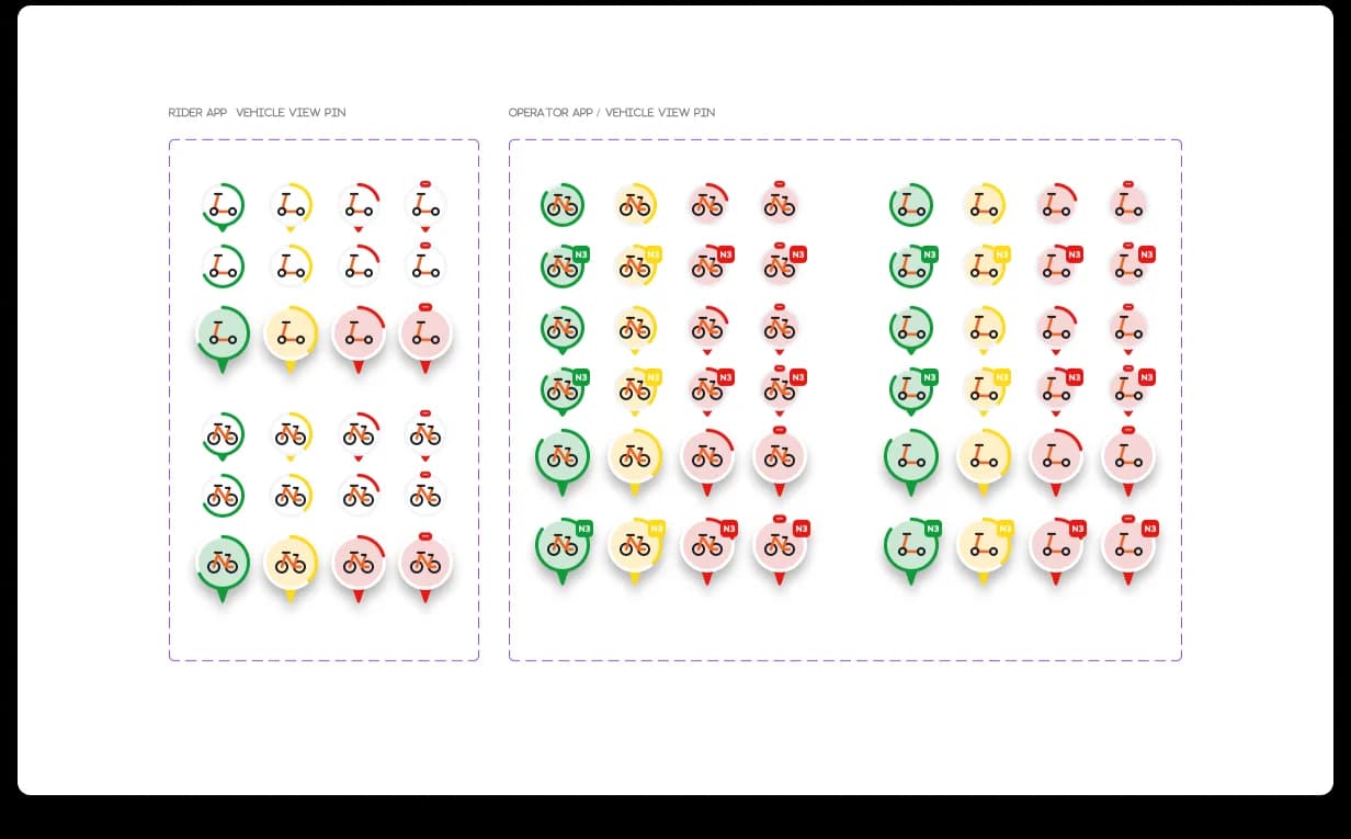
MapView pinsVehicle type · battery level · status · rider and operator variationsDesigned once · reused across both apps
Chapter 04
Snackbar feedback: real-time updates without blocking the ride.
The app previously used static banners for system messages. The problem was that banners often took too much space and disrupted the user experience. In a mobility app, interruptions matter — a user may be standing outside, scanning the map, walking toward a vehicle, or trying to unlock a ride. The feedback system needed to inform users without blocking the task.
So we replaced static banners with snackbar-style feedback. Snackbars gave users real-time updates in a lighter, less disruptive way — they could communicate status, confirmation, or warnings while still keeping the main interaction available. We also included clear dismiss behavior so users had more control. The result was a feedback layer that felt more modern, less intrusive, and more consistent with mobile interaction standards.
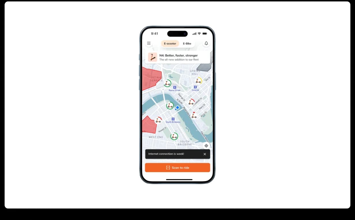
Snackbar systemFloating feedback · non-blocking messages · dismissible states · less disruptionFeedback layer
Chapter 05
Vehicle detail bottom sheets: making decisions easier to scan.
Vehicle detail screens were frequently used, but the old experience had too much information competing for attention. This created cognitive load at the exact moment where the user needed clarity: Which vehicle is this? How much battery does it have? Is it ready to ride? What action should I take next?
We redesigned the vehicle detail experience using bottom sheets that balanced information with action. The team explored multiple layout iterations to find the right level of density — too much detail would slow the user down, too little would reduce confidence. The selected direction gave users a cleaner, more action-oriented way to review vehicle information and move forward.
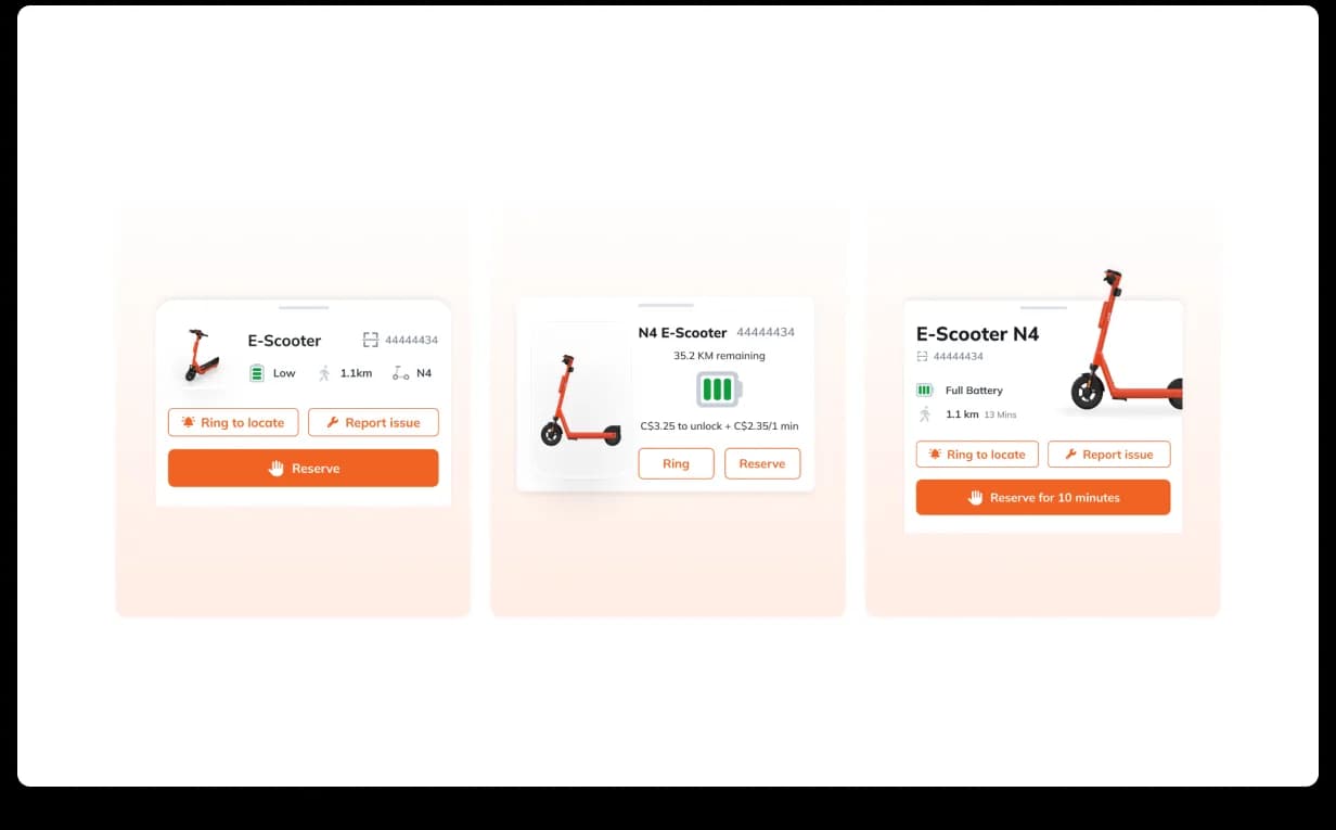
Vehicle detailsBottom sheet · clearer hierarchy · action-focused layout · faster decision-makingExplorations
Chapter 06
Operator app: clearer fleet visibility for local service teams.
The operator app was the operational side of the product. Local service partners needed to monitor and manage the fleet behind the scenes — checking battery levels, vehicle states, maintenance signals, location data, and other status indicators across scooters and e-bikes. The previous operator interface was cluttered and made it harder to assess vehicle status at a glance.
We redesigned the operator app with a cleaner component-based layout, clearer data visualization, distinct vehicle icons, battery indicators, and key status signals that were easier to scan. This helped operators move faster — instead of digging through dense screens, they could understand what needed attention and act accordingly. For a micromobility company, this matters because operational clarity directly affects fleet availability and service quality.
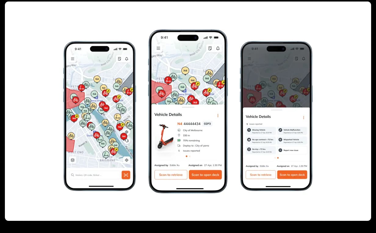
Operator appFleet visibility · battery levels · maintenance signals · vehicle status · faster triageBackend ops
Outcome · one design language
A stronger mobility experience across both sides of the fleet.
The real value of the engagement was not only in individual screens — it was in the shared product language we helped strengthen: input fields, MapView pins, snackbar feedback, bottom sheets, vehicle status indicators, battery indicators, operator data cards, map overlays, action states, and feedback states. This created consistency across the ecosystem: the rider app could stay simple and focused, the operator app could stay data-rich and operational, but both still felt like part of the same product — which is what design systems do when they are done well, helping growing teams move faster with fewer one-off decisions.
Neuron came to Denovers with a clear need: extend the design team without replacing it. We helped their team move faster across key rider and operator workflows while keeping the experience consistent and scalable. The rider app became easier to use through a cleaner home map, focused floating panel, improved vehicle detail bottom sheets, custom MapView pins, better input components, and less disruptive feedback patterns. The operator app became clearer through improved fleet visibility, stronger vehicle-state communication, battery-level indicators, maintenance-focused signals, and more structured layouts.
Most importantly, Neuron kept its internal design team intact. Denovers simply helped increase design velocity and support the product roadmap with an embedded designer who could move inside the team’s rhythm. This was not a redesign from the outside — it was product design support from inside the workflow.
Impact
Design capacity increased without losing product context.
The engagement helped Neuron strengthen rider app usability, operator app clarity, map readability, vehicle detail hierarchy, input consistency, feedback patterns, fleet-management visibility, cross-app design-system consistency, and product-design execution speed.
For a fast-growing micromobility company, that kind of support matters. When the product scales across cities, users, operators, and vehicle types, design cannot stay fragmented. It needs a system. It needs context. It needs people who can move with the roadmap.
Book a free product design sprint
More work in Enterprise SaaS.
100+ screens, dual-theme design system, and a 5.0 Clutch review across every category.
Outcome→2-year embedded partnership. Cosmos Control Center redesigned ground up.
Internal CRM redesigned and engineered to production for a 35-year home-improvement leader.
Outcome→Design + ReactJS implementation by one team. Ongoing partnership.