Denovers improved our process completion rates and improved feature release timelines with their designs. The combination of their approach, their technical proficiency, and their ability to challenge requirements had a profound effect.

Denovers improved our process completion rates and improved feature release timelines with their designs. The combination of their approach, their technical proficiency, and their ability to challenge requirements had a profound effect.
32co was already solving a meaningful healthcare problem. General dentists wanted to offer more advanced orthodontic treatments, but they needed specialist support, clearer workflows, and more confidence before taking on cases themselves. 32co’s platform bridged that gap — connecting dentists with expert mentors to submit cases, review treatment plans, understand complexity, and manage orthodontic treatment from one digital workspace.
But as the product grew, the experience had started to feel heavier. The platform was live, new features were shipping, and dentists were using it in real clinical environments — and the team needed ongoing design support without hiring a full-time designer internally. This was not a one-off redesign; 32co needed a dedicated design partner who could support feature releases, improve existing UX, respond quickly to ad hoc needs, and challenge requirements when needed.
So Denovers assigned one dedicated product designer who worked directly with their Product Lead — a dedicated Slack channel, two weekly video calls, fast reviews, direct feedback, the founder available when needed, and ongoing support for both planned features and ad hoc design requests.
The model worked because 32co was shipping continuously. Some weeks were about improving existing screens, some about new product features, some about reducing friction in clinical forms, and some about challenging the brief to make sure the final workflow made sense for dentists.
The goal was not just to make the product look cleaner. It was to help dentists complete cases faster, understand what to do next, and feel confident using the platform in a clinical setting.
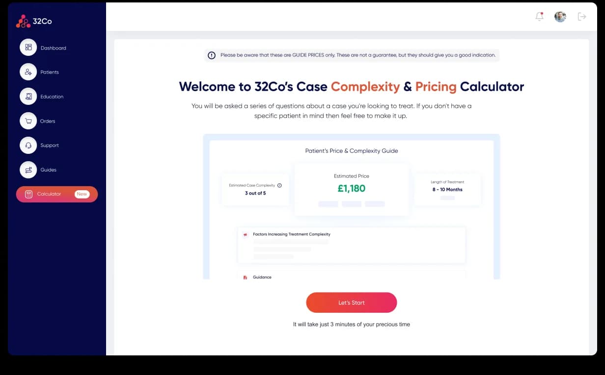
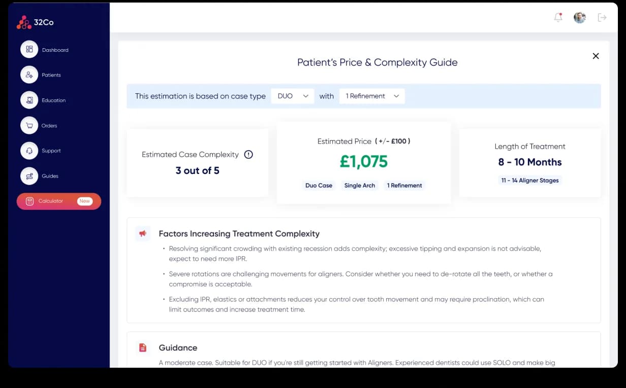
One of the most important workflows was the Case Complexity & Pricing Calculator. For a dentist, the first question isn’t “how does the platform work?” — it’s how complex is this case, what will it cost, how long will treatment take, and can I explain it clearly to my patient? We designed the calculator as a short, guided wizard: instead of a long clinical form, it made a clear promise up front — spend a few minutes answering focused questions and receive a useful estimate.
The result gave three core answers — estimated case complexity, estimated price with tolerance, and estimated length of treatment — but not just numbers. It included guidance explaining the factors increasing complexity and how to communicate them to the patient, turning the calculator from a form into a clinical decision-support tool.
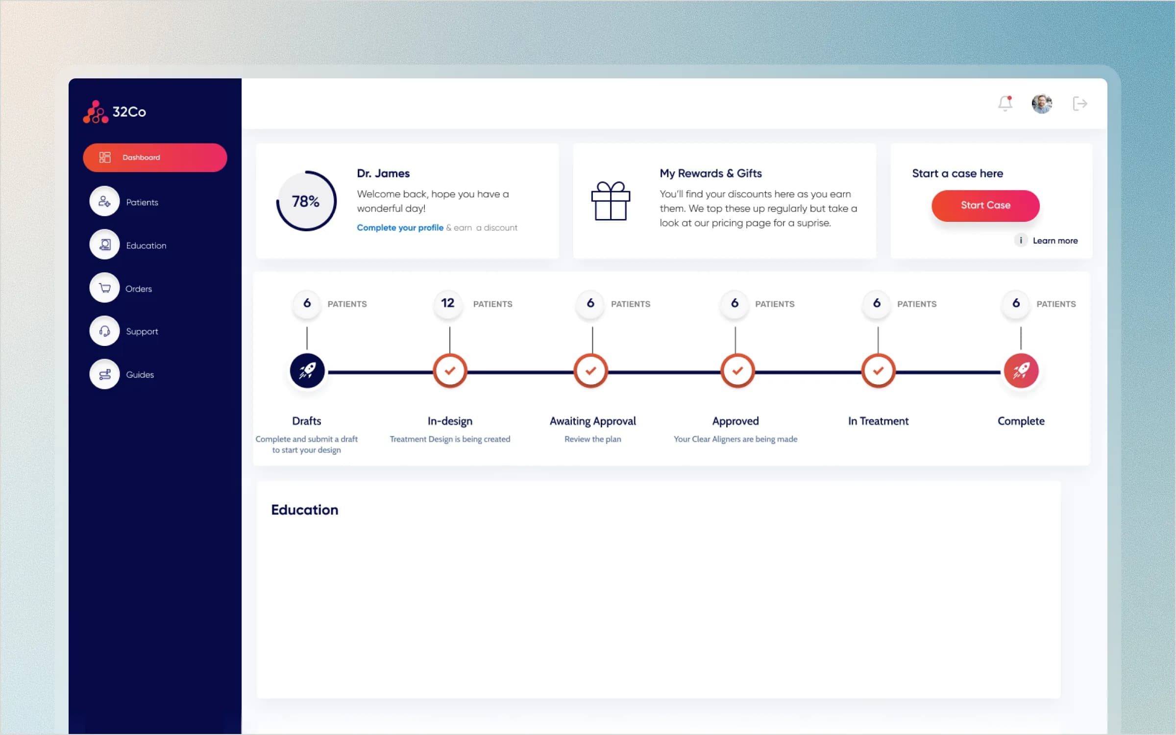
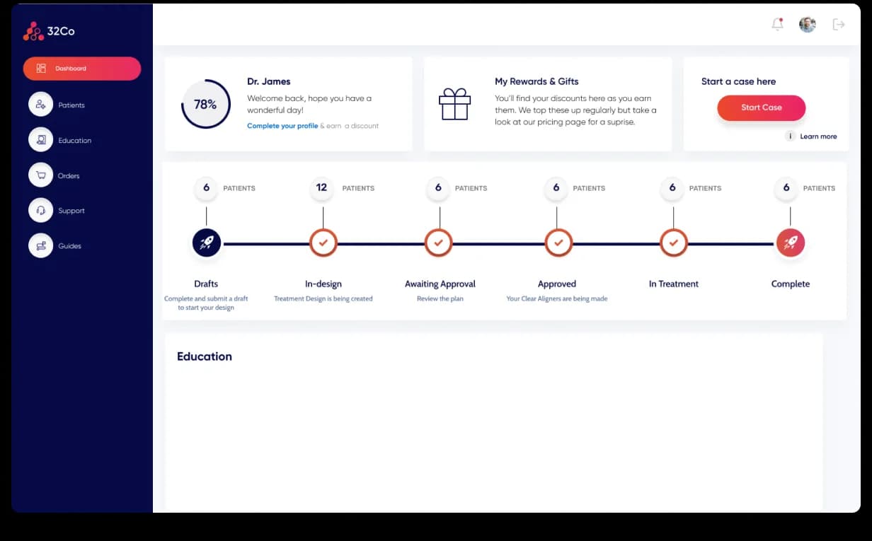
For a dentist, the platform had to answer one question immediately: where is each patient case right now? We redesigned the dashboard around stage visibility — instead of searching through pages or dropdowns, the full case lifecycle appears as a clear horizontal pipeline: Drafts, In-design, Awaiting Approval, Approved, In Treatment, Complete. That made status the core information architecture of the product.
Dentists could open the platform and instantly see what needed attention, what was waiting on them, and what had already moved forward. Supporting elements like profile completion, rewards, and a clear “Start a case” action stayed present, but the focus remained on case progress.
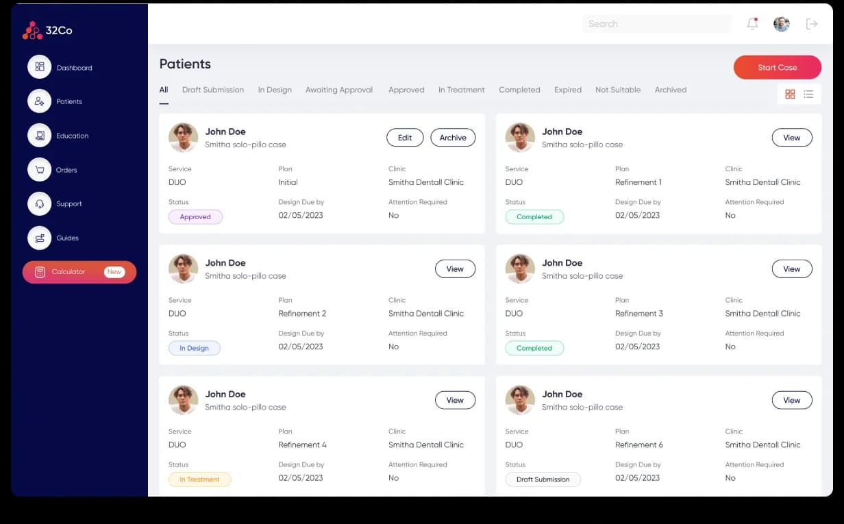
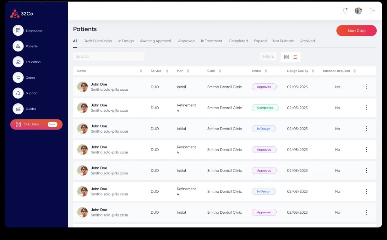
The patient list needed to support fast clinical scanning — dentists may have many cases at different stages, each needing a different action. We designed it around stage tabs, status pills, and quick actions, letting users switch between all cases, drafts, in-design, awaiting approval, approved, in-treatment, completed, expired, unsuitable, and archived.
Each patient card showed the most important information without forcing dentists into the detail page — name, service type, clinic, status, design due date, attention required, and edit/archive/view actions. Grid and list views supported different density needs, keeping the same information architecture while changing only the presentation.
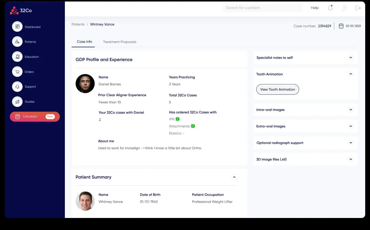
The patient detail page had to balance two opposing needs — fast access to the case summary, and deep clinical information: GDP profile, patient details, specialist notes, tooth animations, intra-oral and extra-oral images, optional radiographs, and 3D files. Showing all of that at once would overwhelm the page.
So we designed it around progressive depth. The main page surfaced what a clinician reads first — patient summary, case information, GDP profile, experience level, and treatment-proposal tabs — while more detailed clinical assets lived in an accordion-style side panel. The screen stayed calm by default, but dense information was one click away, without leaving the page or losing context.
Treatment proposals are one of the highest-trust parts of the product — dentists need to understand the proposed treatment clearly before they approve, adjust, or communicate next steps to the patient. We shaped the proposal experience so clinicians could review plans in context, keeping proposal information close to the patient case so it’s easier to compare details, review notes, and move forward without feeling lost in separate workflows. Case review became more structured and less fragmented.
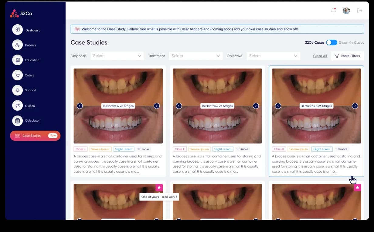
32co also needed a way for dentists to learn from completed cases and use them as patient-facing proof. We designed a case-study gallery where dentists could browse before-and-after cases, filter by diagnosis, treatment, and objective, and switch between wider case examples and their own completed cases.
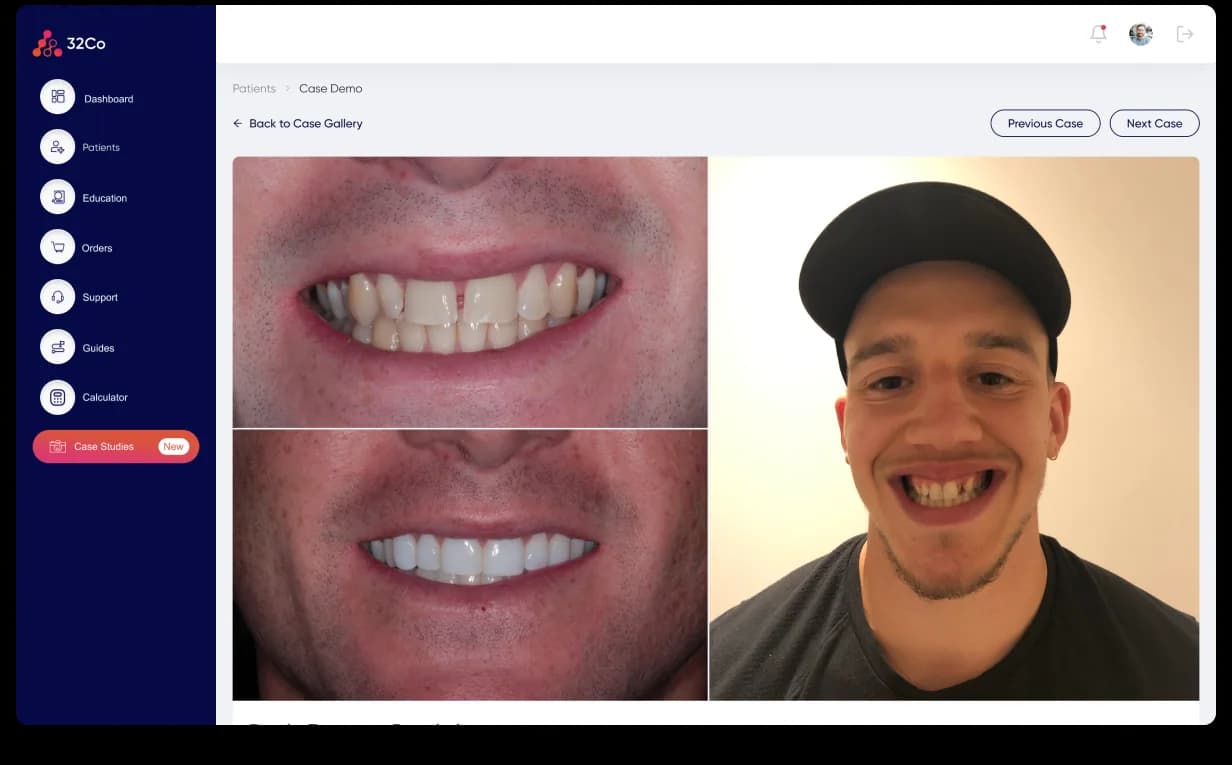
Each card turned clinical history into a reusable asset — a completed case was no longer just a record inside the system; it became proof a dentist could learn from, reference, and use in patient conversations. That helped the product support both clinical confidence and commercial storytelling.
32co came to Denovers with a live healthcare SaaS product, a growing feature roadmap, and a need for dedicated design support. As an embedded designer in the product workflow, we improved the experience across the product’s most important workflows — pricing, onboarding, patient management, case status, patient detail, treatment proposals, and clinical case studies — while helping the team keep shipping without waiting on a full hiring cycle.
The biggest value wasn’t a single screen; it was continuity. The engagement helped the team release features on time, improve form-completion rates, reduce time to completion, support dentists with clearer clinical workflows, free up the Product Lead from ad hoc design pressure, and build a more structured SaaS experience around the real case lifecycle. After the engagement, 32co raised £2.2M in seed funding led by Balderton Capital.
This wasn’t just better UI. It was a stronger healthcare SaaS workflow for dentists who need to move quickly, make confident decisions, and complete clinical work without unnecessary friction.
Building a healthcare SaaS product with complex clinical workflows? Start with one critical flow. We’ll audit it, redesign it, and show how your product can become clearer, faster, and easier for real users to complete.