Denovers did an incredible job under very tight timelines. The product received very positive reviews and is now in use by more than 200,000 users. It is durable, sleek and was completed in record time. I would highly recommend working with Denovers for any project.
Rebuilding a Y Combinator-backed pandemic data SaaS for 200,000+ users in 6 weeks.
What we walked into.
In 2020 and 2021, universities and institutions were under pressure to reopen safely — managing testing, symptoms, exposure reports, vaccination records, appointments, compliance, and health data across thousands of students, staff, and administrators.
CoVerified had the right product at the right time. The backend was already strong, built on Laravel/Lumen and AWS, with real demand, real urgency, and real institutional users waiting. But the interface had to catch up fast.
This was not a normal SaaS redesign.
The product needed to handle sensitive healthcare data, high-volume reporting, and time-critical pandemic workflows, while staying usable for non-technical administrators, nurses, campus staff, and students.
CoVerified needed a stable, modern platform in 6 weeks. They interviewed multiple firms and considered building in-house, and chose Denovers because we could move quickly, provide design and frontend support together, and stay personally involved from the first interaction.

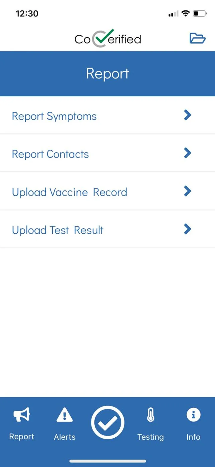
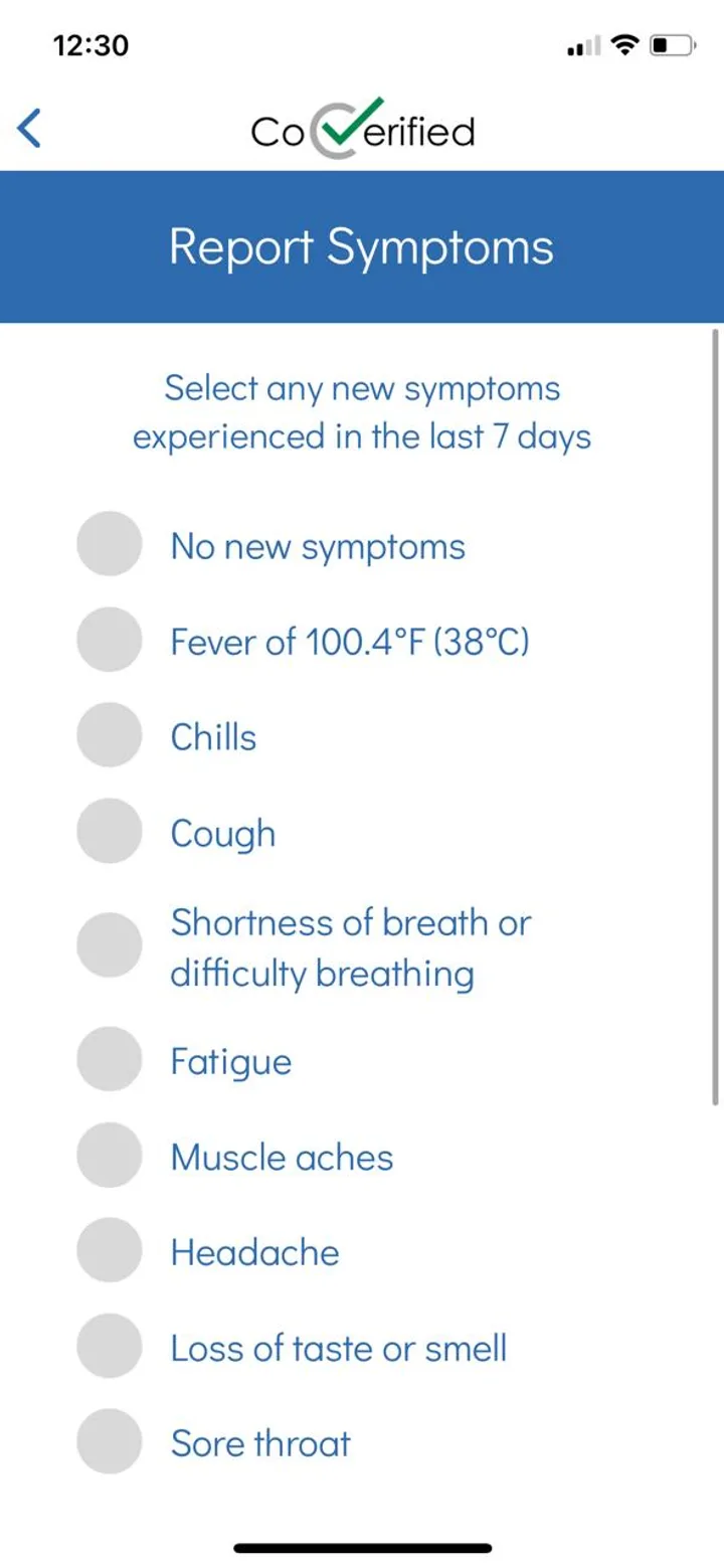
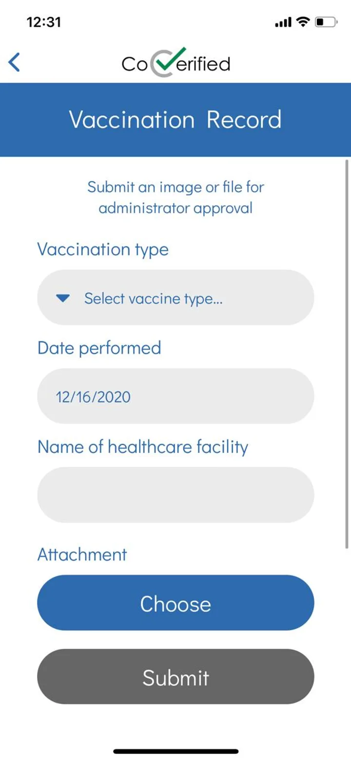
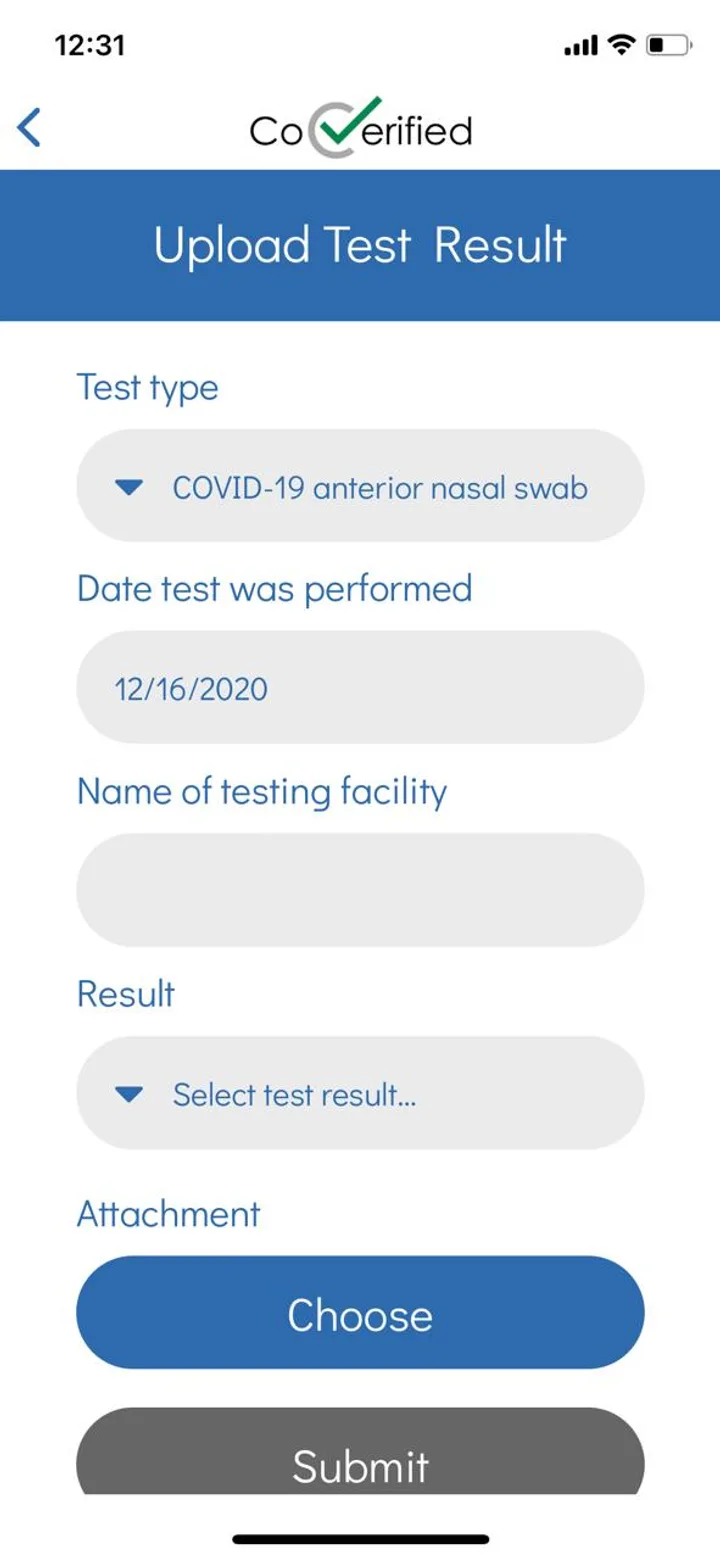
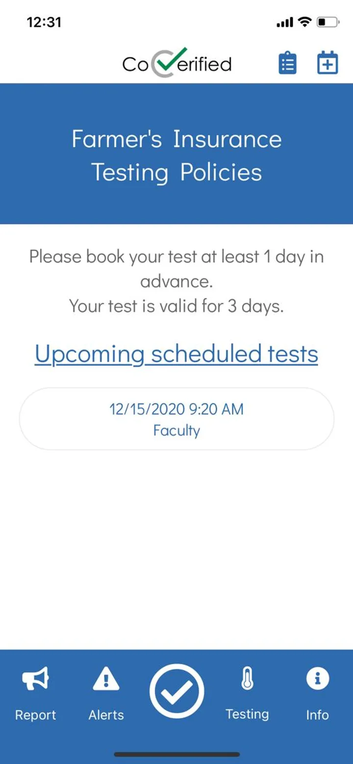
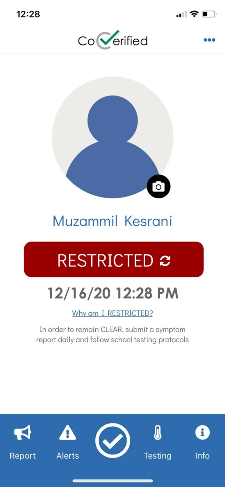
Before — the CoVerified app we inherited


A validated healthcare product needed a frontend team that could move at pandemic speed.
CoVerified was not looking for a cosmetic redesign. They needed a product team that could turn a data-heavy healthcare platform into something institutions could actually use under pressure. The backend was already doing the heavy lifting; the frontend needed to make the data understandable. That meant we had to redesign and build in parallel.
Designers worked on the complex admin surfaces — command center, reports, tracing, compliance matrices, appointment sites, status tables, and healthcare workflows. Frontend engineers picked up approved designs and implemented them in React and React Native while staying aligned with the existing backend infrastructure.
The collaboration had to be fast and direct. Slack became the single channel between business leadership, design, development, and CoVerified’s internal team. When scope changed or deadlines tightened, Denovers leadership was directly involved instead of sitting behind layers of account management.
The result was a 6-week sprint that moved from redesign to frontend delivery without slowing the backend team down.
From a basic status app to a full data platform.


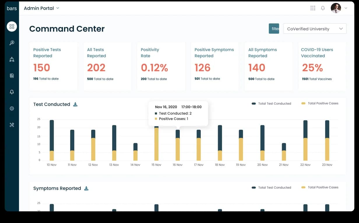
Command Center: pandemic data in one glance.
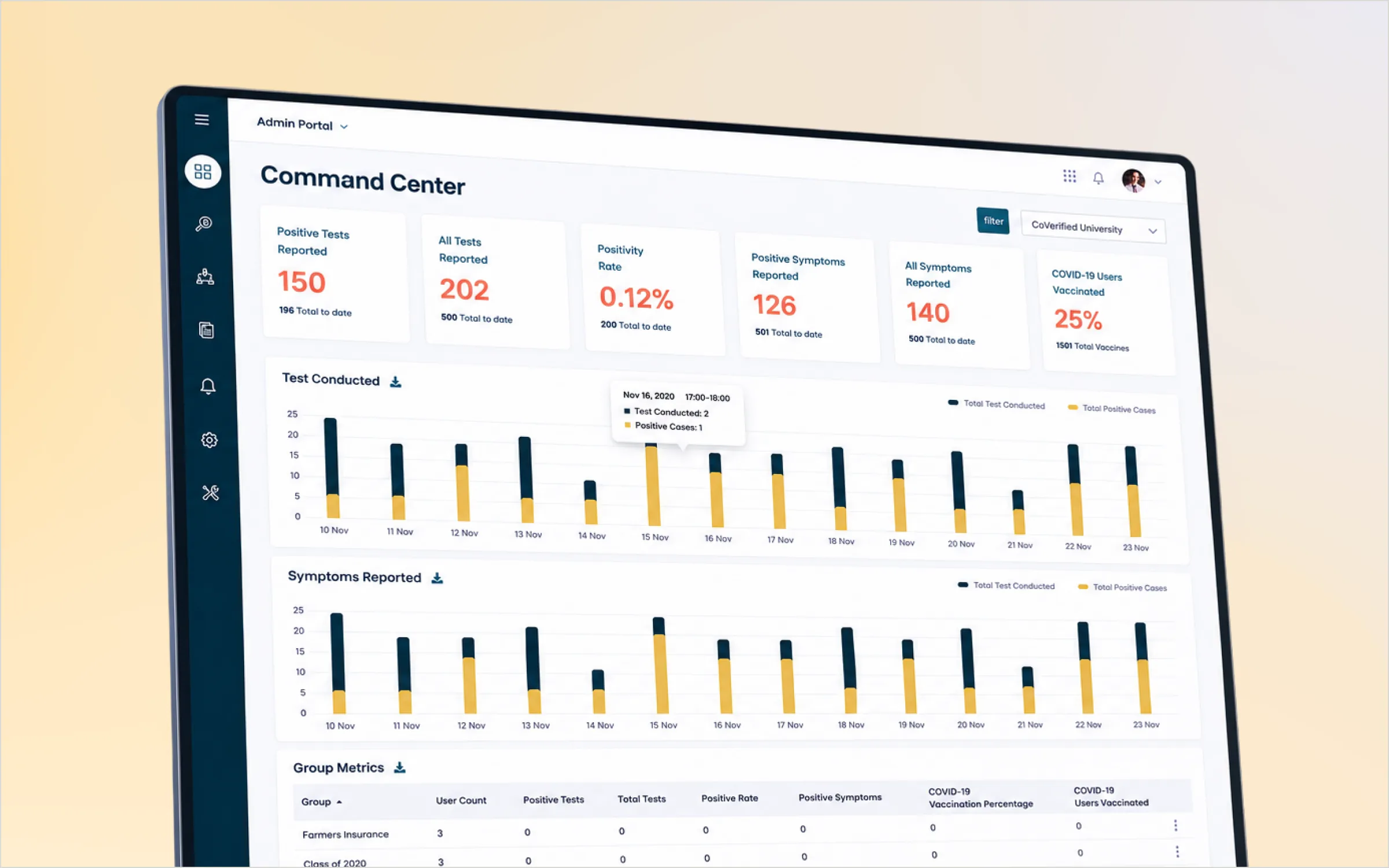
The Command Center was the heart of the admin experience. Campus teams needed to understand what was happening across testing, symptoms, vaccinations, and positivity rates without digging through multiple reports, so we redesigned the dashboard around fast scanning.
Key metrics surfaced through KPI tiles — positive tests, all tests, positivity rate, positive symptoms, all symptoms, and vaccinated users — with stacked bar charts for trends over time and tooltips for detail without clutter. The goal was not just to show data; it was to help admins know what needed attention.

Reports & Tracing: every student, every status.
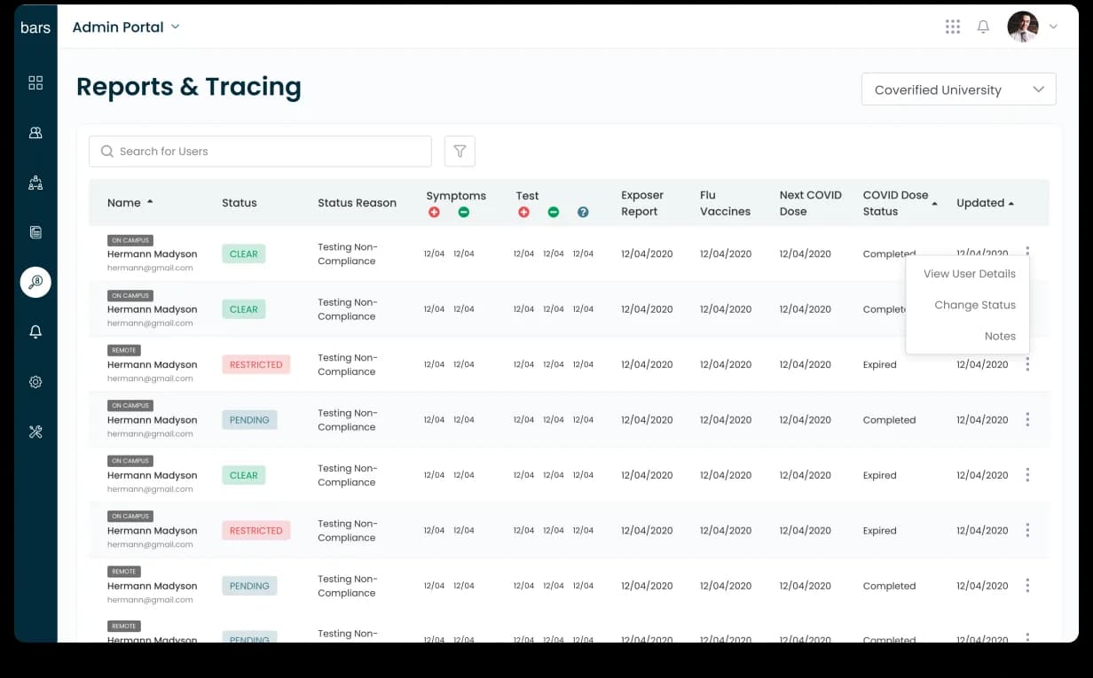
Pandemic operations depend on status clarity — who is clear, restricted, or pending; who reported symptoms; who had exposure; who needs follow-up. The Reports & Tracing table had to carry dense healthcare data without becoming unreadable, so we designed status-first tables with clear CLEAR / RESTRICTED / PENDING pills.
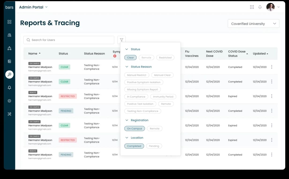
Each row carried context — user type, campus status, symptoms, tests, exposure reports, flu vaccine, next COVID dose, dose status, and last update — and filters let admins slice by status, reason, registration, and location without leaving the page. A high-volume operational table became a usable control surface.


Appointment Sites: testing locations, schedules, and capacity.
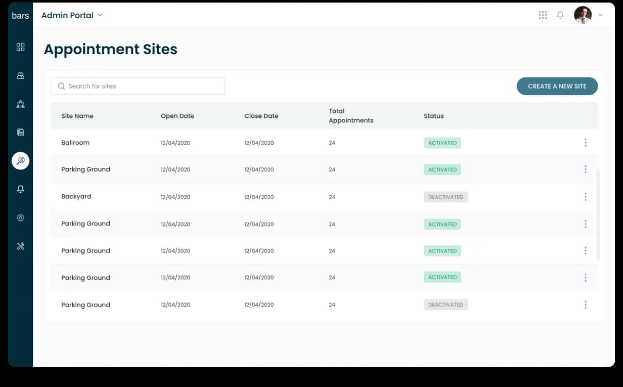
Universities were not running testing from one place — ballrooms, parking lots, temporary sites, campus buildings, outdoor locations, and rotating appointment windows. CoVerified needed a clear way to create and manage them, so we designed Appointment Sites as a list-first view: site names, open and close dates, total appointments, and activation status in one table.
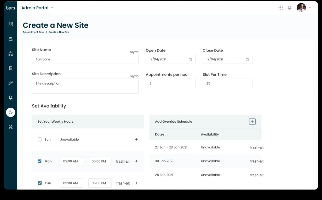
From there, admins could create a site, define details, set open and close dates, configure appointments per hour, set weekly availability, and add override schedules for one-off changes — making site setup feel structured instead of chaotic.


Appointment Creation: recurring schedules without confusion.
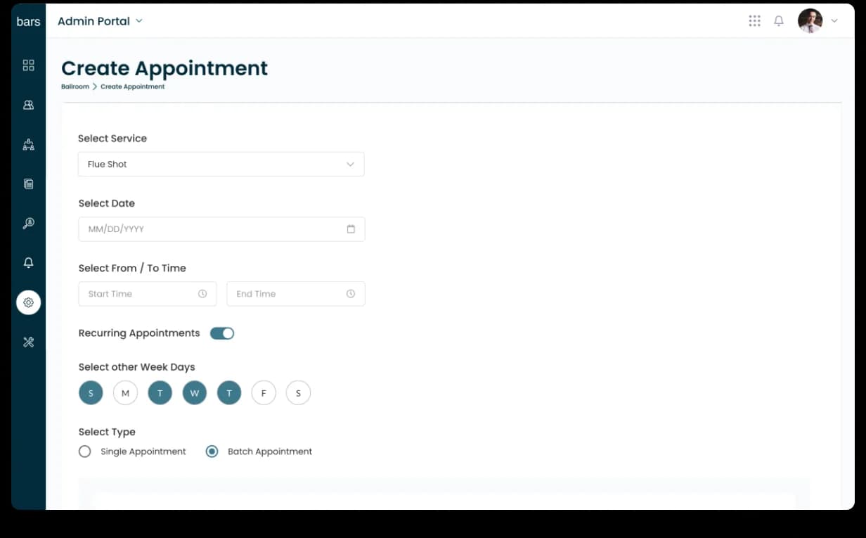
Testing programs needed repeatable appointment logic — by service type, date, time range, recurrence, weekday, and appointment type. We designed the Create Appointment flow to make recurring setup clearer: select a service, choose date and time, enable recurring appointments, pick weekdays, and choose single or batch — reducing the mental load of managing repetitive campus testing schedules.

Compliance Matrix: health requirements across groups.
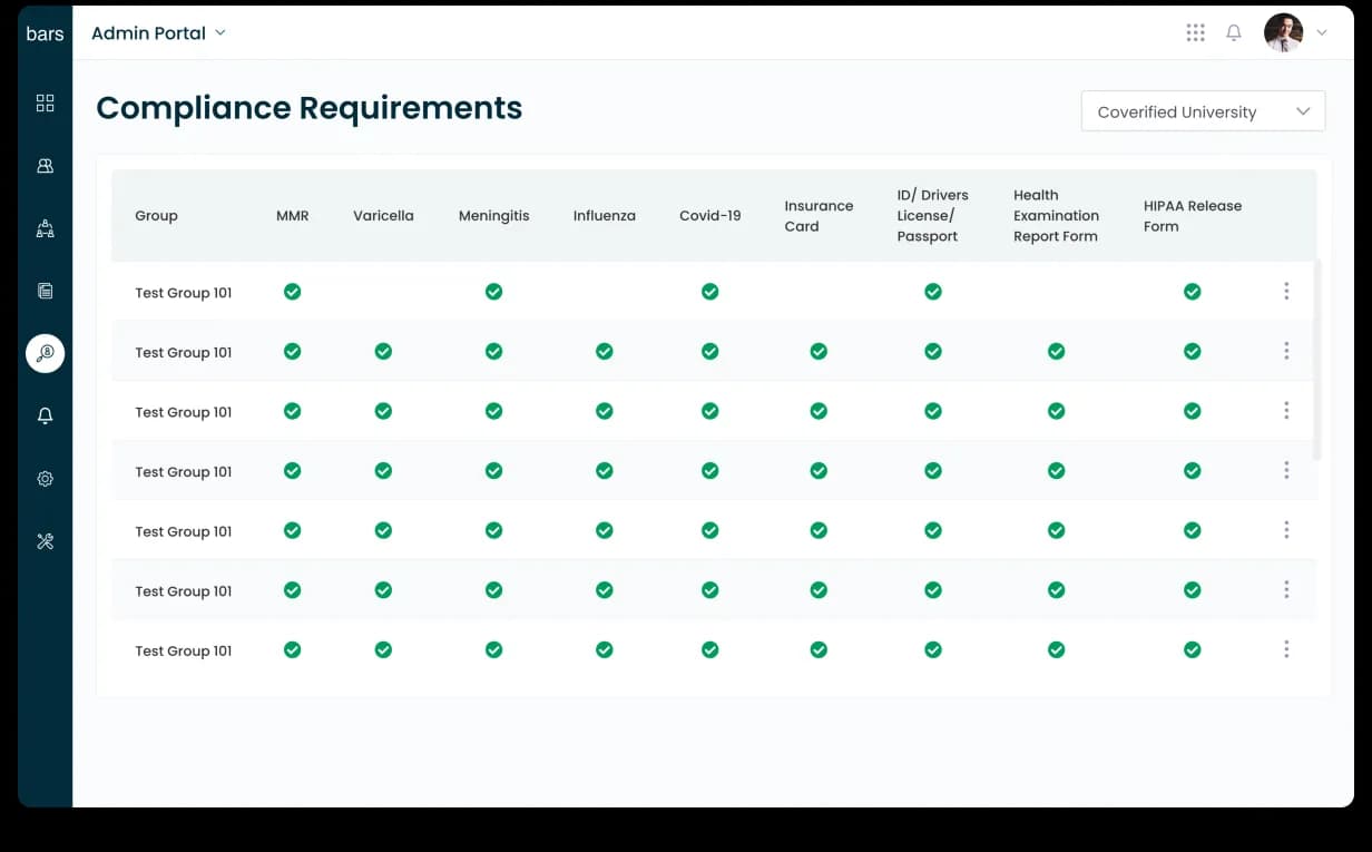
Beyond COVID testing, institutions had to manage vaccination and document compliance — MMR, Varicella, Meningitis, Influenza, COVID-19, insurance card, ID, health examination forms, and HIPAA release forms. We designed the Compliance Matrix as a grid: groups down the side, requirements across the top, each cell showing complete, pending, or missing — so admins could read compliance across entire student or staff groups in one view.

Group Management: bulk actions for institutional teams.
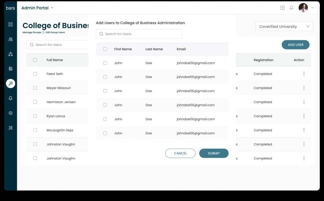
Universities manage users in groups — a college, department, class, or administrative unit might need hundreds or thousands of users added, reviewed, or updated. We designed a group workflow with a three-pane structure: existing users, add-user form, and group status. Admins could add multiple users, review registration status, and submit group-level changes from one screen — helping institutional teams operate at scale.

100+ screens. 6 weeks. 200,000+ users.
CoVerified came to Denovers with a validated healthcare data product, a strong backend, and an urgent deadline. We helped turn it into a modern, stable, high-volume SaaS platform institutions could rely on during one of the most operationally intense periods in healthcare and education.
The delivery: 100+ redesigned screens, React and React Native implementation on top of Laravel/Lumen + AWS, the Command Center, Reports & Tracing, Appointment Sites, Compliance Matrix, group management, and high-volume analytics — shipped in 6 weeks, live to 200,000+ users, with a verified Clutch 5.0 rating.
This was not just a UI redesign. It was a full product rebuild under pressure, where speed, clarity, healthcare data, and engineering execution had to work together.
Building a healthcare, data-heavy, or mission-critical SaaS product? Start with one critical workflow. We’ll audit it, redesign it, and show how your product can become clearer, faster, and easier to operate at scale.
Book a free product design sprint