Denovers revamped our app’s UX/UI design, which increased our 30-day retention by 11% and reduced the drop-off percentage from 51% to 14%. They had seamless project management and a proactive approach.

Denovers revamped our app’s UX/UI design, which increased our 30-day retention by 11% and reduced the drop-off percentage from 51% to 14%. They had seamless project management and a proactive approach.
Lity had a strong mission: help more people switch to electric vehicles by making EV ownership feel practical, understandable, and personal — tracking trips, analyzing habits, and comparing combustion cars against EVs.
But the experience wasn’t doing the mission justice. Users downloaded the app, then dropped off before the value moment: signup created friction too early, and permissions interrupted before users had a reason to trust the app.
The core idea was powerful. The UX was leaking adoption.
Lity needed a designer who could join fast, understand mobility workflows, and make the app modern enough to keep users coming back. That is where Denovers came in.
People wanted to understand EV ownership, but the app made the first experience too heavy.
The value was hidden behind signup, permissions, and disconnected features.
Turn EV adoption into a guided, personal, and habit-based mobile experience.
Improve adoption, retention, and product credibility for future growth across Europe.
Lity didn’t need a disconnected agency workflow. They needed a designer who could become part of the team, move quickly, and understand both mobile UX and mobility product logic. From two designers they interviewed, they picked the one with prior fleet-management experience from our Neuron engagement.
The designer started with a UX audit that named the biggest leaks — onboarding friction, early permission asks, weak value visibility, and fragmented EV planning — then worked with Lity through daily collaboration: meetings, user feedback, Looms, mood boards, and Figma, iterating before anything moved forward.
The goal wasn’t just to make the app look better. It was to make users understand the value of switching to an EV faster.
The first leak was obvious.
Users were being asked to sign up before they had fully understood what Lity could do for them.
For an EV adoption app, the first experience needs to build curiosity and confidence. Users should quickly see how the app tracks their driving, compares vehicle costs, and helps them understand whether an EV fits their lifestyle.
So we redesigned onboarding around speed and progressive trust.
Instead of forcing users through heavy upfront information, the new experience made it easier to enter the app, explore the product, and decide later whether to create an account.
The permission flow was also reworked.
Instead of asking for location, motion, and notifications too early, permissions were moved closer to the moments where they made sense.
Location when users explored charging stations.
Motion when users started trip tracking.
Notifications when they had a reason to receive updates.
This gave users more control and reduced the feeling of being interrogated before they saw the product’s value.
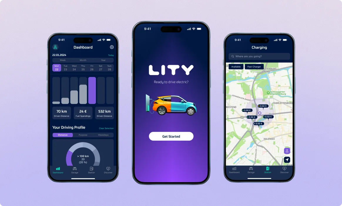
Once users entered the app, the dashboard had to explain why Lity mattered.
The product was already tracking important driving data, but the experience needed to make that data easier to understand.
We redesigned the dashboard around simple, visual feedback.
Users could see trip patterns across week, month, and year views. Key cards showed driven distance, fuel usage, consumption, and other driving metrics. Charts helped users understand their driving profile without needing to interpret raw data.
This turned the dashboard into the app’s value moment.
Instead of simply showing numbers, it helped users understand their own mobility behavior.
That behavior then became the foundation for EV recommendations, savings comparisons, and future purchase decisions.
The Garage became one of the most important parts of the product.
Lity was not just asking users to browse electric vehicles.
It was helping them answer a personal question:
Would an EV actually work for my life?
To make that decision easier, we redesigned the Garage so users could add their current combustion car and compare it with virtual electric vehicles.
Users could review vehicle expenses, remaining range, charging time, fuel or energy usage, and route-based savings.
The experience made EV adoption feel less abstract.
Instead of asking users to imagine the difference, the app showed the comparison using their own driving habits.
This helped Lity move from a tracker to a decision tool.
Once users understood their driving habits, the next step was discovery.
Lity wanted users to explore electric vehicles inside the app instead of leaving the journey and searching elsewhere.
So we designed the Discover experience as an EV marketplace.
Users could browse electric car options with key details: model, price, range, charging time, features, and other decision-making information.
The important part was context.
This marketplace was not just a static list of cars.
It was connected to the user’s actual driving behavior.
That meant users could evaluate vehicles based on the lifestyle and route patterns Lity was already helping them understand.
The product journey became stronger:
Track driving. Understand habits. Compare vehicles. Explore options. Move closer to adoption.
Range anxiety is one of the biggest emotional barriers to EV adoption.
Users do not only ask, “Which EV should I buy?”
They ask:
Where will I charge it? Can I make this trip? What happens if I run low? Will I need another app to plan everything?
Lity wanted to answer those questions inside one product experience.
So we introduced the Stations module.
The module included nearby charging stations on a map, station details, directions, sharing options, charging costs, voltage information, and route planning.
Users could search destinations, plan trips, and identify charging stops along the way.
This made the EV journey feel more complete.
Instead of pushing users toward multiple external apps, Lity became the place where users could understand, plan, and act.
Beyond the core flows, we helped introduce seasonal interface moments — including a winter theme with minimal but warm animations — to give the app a more emotional layer.
For a climate and lifestyle product, small moments like this make it feel less like a utility and more like a companion in the user’s mobility journey.
Lity came to Denovers with a meaningful climate mission but a user experience that was limiting adoption. We redesigned it around one principle: show users the value before asking too much from them.
The impact was measurable. Drop-off from download to key interaction fell from 51% to 14%, 30-day retention rose to 11%, and the redesign helped Lity secure follow-on funding to expand its EV adoption mission across Europe.
Building a mobile app or climate-tech product users need to adopt faster? Start with one critical flow. We’ll audit it, redesign it, and show how your product can become easier to understand, easier to trust, and easier to keep using.