Denovers improved the UX/UI of our webshop effectively and helped raise our conversion rates. They rebuilt our quick-commerce surfaces across a 4-breakpoint responsive system that finally felt like a luxury brand at every screen size. The collaboration was easy due to their well-organized responsiveness.
Fast fashion. Luxury UX.
Imagine premium fashion at your door in two hours, with a webshop that feels just as fast.
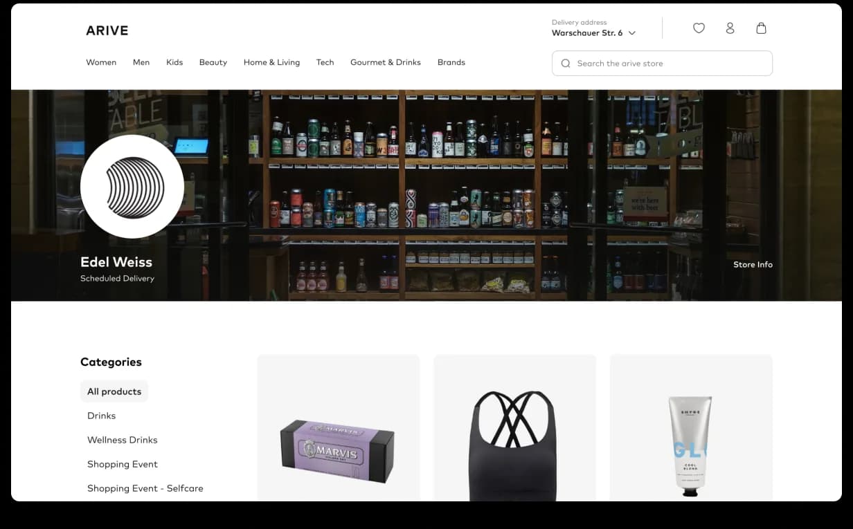
Arive is a German quick-commerce brand delivering premium fashion in two hours. The mobile app was already loved; the webshop hadn’t kept up. They came to us through a free-trial sprint, one senior product designer, paid concepts on the actual problem, that converted into an embedded engagement. We rebuilt the webshop end-to-end across five surfaces under a four-breakpoint responsive system.
From cold outreach to a free-trial sprint to a daily-scrum embed.
Arive is a German quick-commerce brand delivering premium fashion in two hours. The mobile app was already loved; the webshop hadn’t kept up. Arive’s VP of Product wanted to verify quality fast, so we led with a paid free-trial sprint on the actual problem (navigation and grid) instead of a pitch deck. One senior product designer, days of output. The contract followed.
The designer joined Arive’s product team as part of the in-house pod: daily scrums with the PM and engineers, live syncs with QA, CEO review on the rebuild. Five surfaces rebuilt end-to-end (navigation, search, PDP, checkout, on-demand curation) on a four-breakpoint responsive grid baked into the design system. Marketing ships campaign pages on demand; conversion and AOV both climbed.

Beautiful brand, busy webshop.
Arive had built a name on speed, premium fashion at the door in two hours, an app that felt as polished as the brands it carried. The webshop hadn’t caught up: categories crowded the top bar, search returned a flat list with no inspiration, layouts broke between phone and laptop, and visual content lacked brand cohesion. Our job was to build a front door that felt as fast and as premium as everything Arive had already promised.

Navigation, with breathing space.
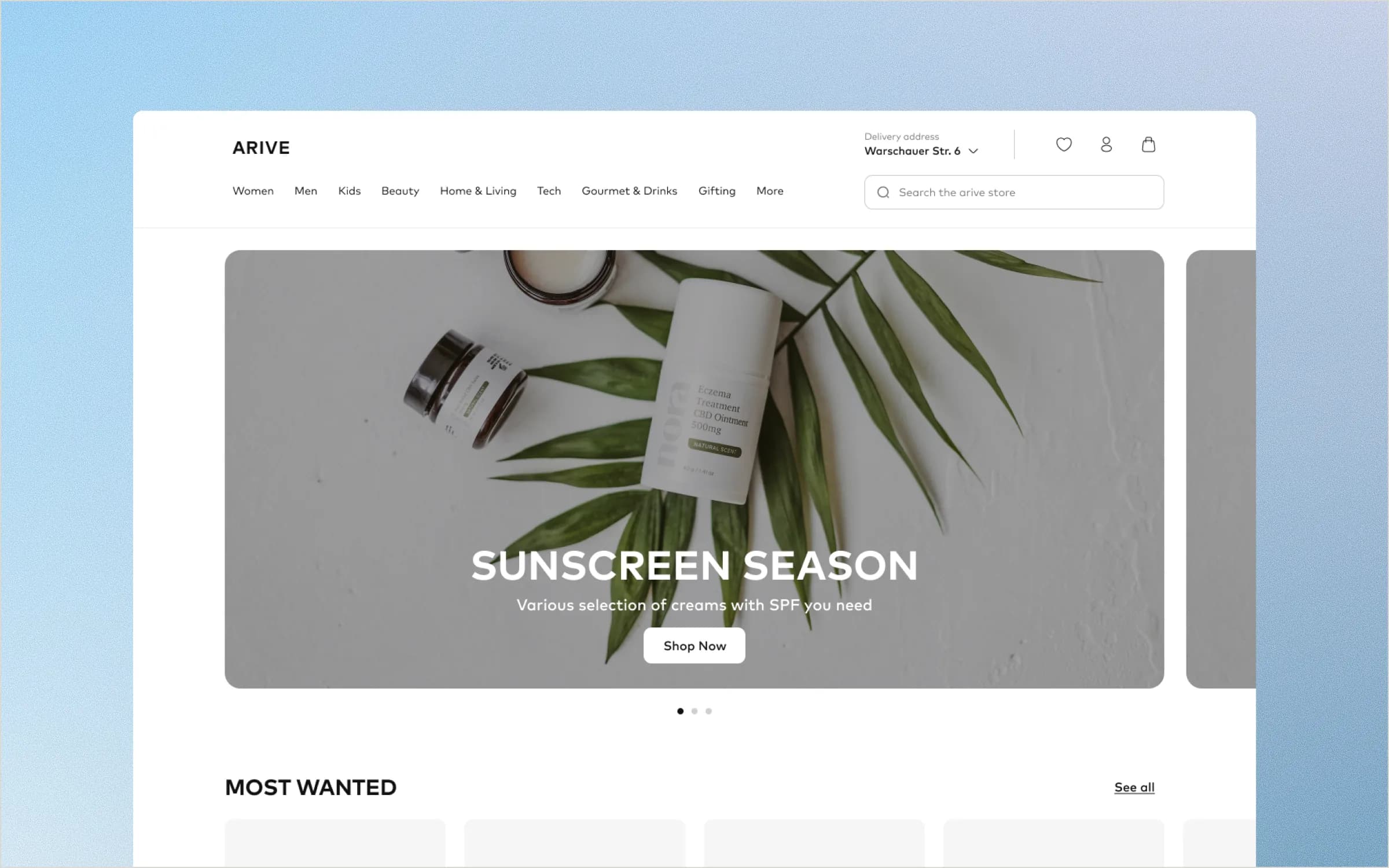
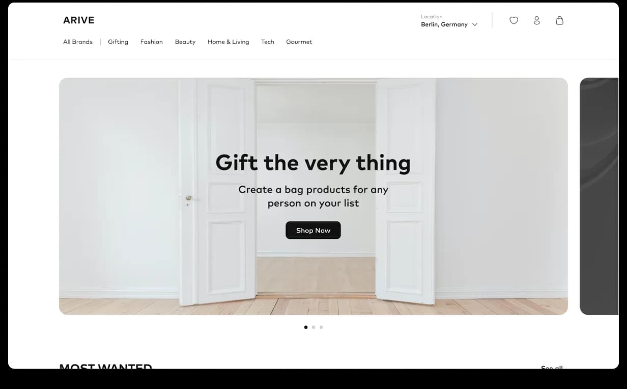
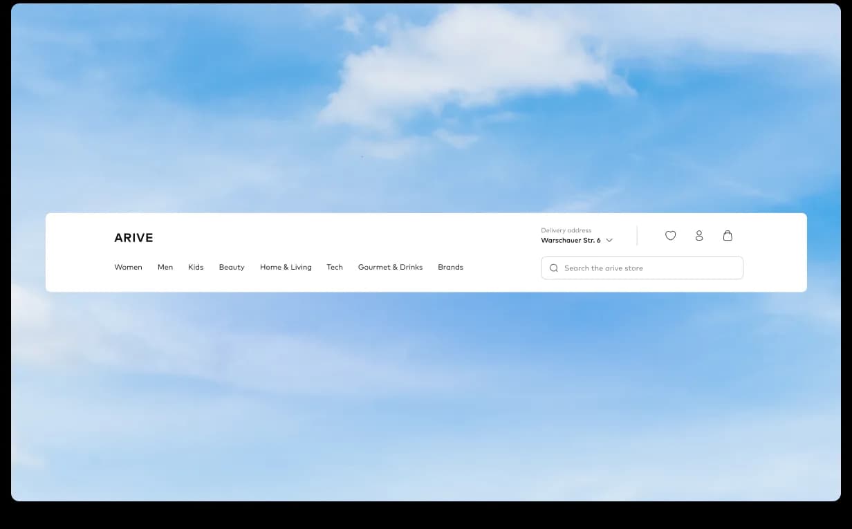
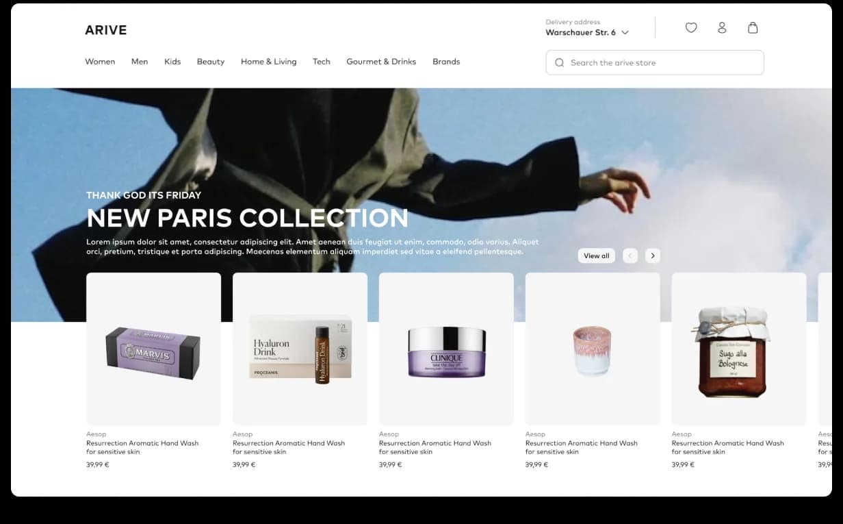
The old top bar tried to fit everything, categories on top of categories, search icon lost behind labels. We rebuilt the navigation around three rules: minimal top bar with breathing space, an integrated non-intrusive search icon, and a scalable category hierarchy. Any shopper, on any device, finds what they came for in two clicks, and the system holds when Arive launches the next brand. The same discipline runs through the home rails: brand-led editorial composition, fewer modules, each earning its place.

Search reframed as discovery.
Search on the old webshop was a dead end, query in, flat list out, nothing in between to pull a shopper deeper. We rebuilt it as a window-shopping surface: predictive UI showing trending items and previous searches as you type, a dual-pane layout with suggestions on one side and matching products on the other, and a smooth handoff from input to grid the moment a shopper picks a path. “Looking for X” became “let me see what’s around X”, the rabbit hole fashion buyers want to fall into.

One brand, every screen size.
Arive’s shoppers don’t sit still, phone in a café, laptop on the couch, tablet in bed. The old webshop fragmented across that journey. We rebuilt the responsive system from the ground up: four canonical breakpoints (mobile, tablet, small desktop, widescreen) baked into the design system, touch-target rules per device, image grids that hold their composition at every size. The same brand, the same trust, the same conversion path, phone or widescreen.


On-demand curation, no developer bottleneck.
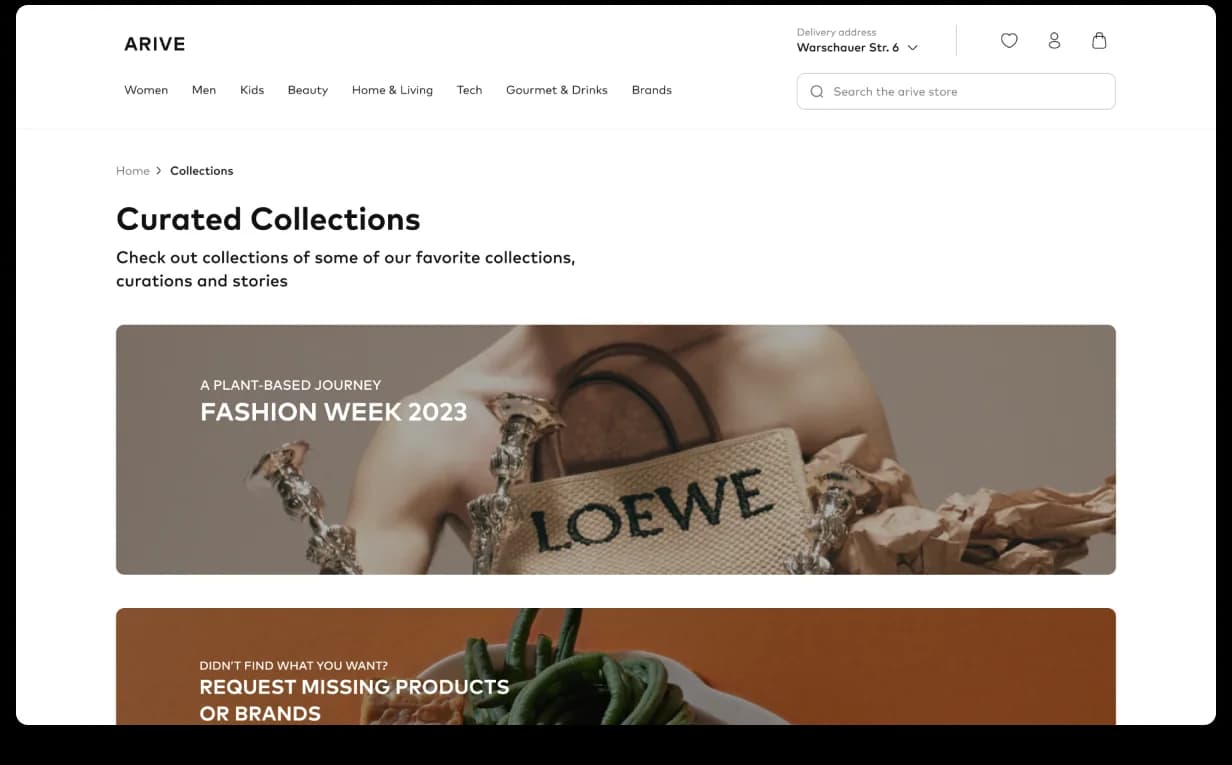
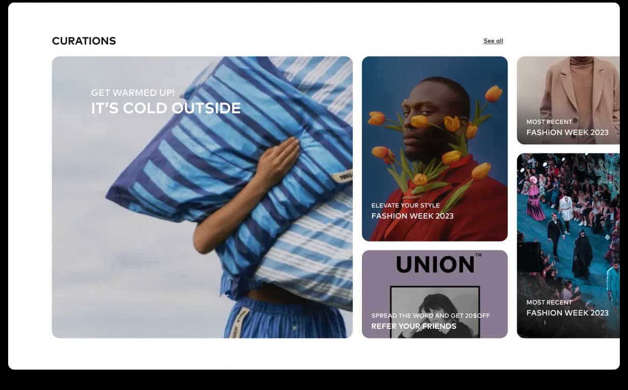
Fashion runs on timing, weather shifts, a pop star wears a coat, a runway show drops, marketing needs a page live by Friday. We built a curation system that turned the marketing team into the publisher: flexible page templates (“Rainy Day Looks,” “Spring Edit,” “Festival Fits”), modular banner slots tuned per brand, and component swap-outs designed for promo turnover. What used to take an engineering sprint now takes a designer an afternoon, and every page still ties back to the brand’s premium identity.


PDP, checkout, confirmation, finally clean.
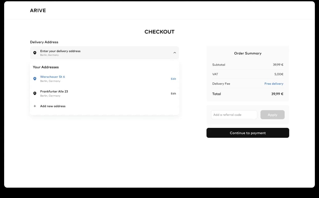
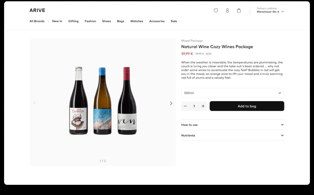
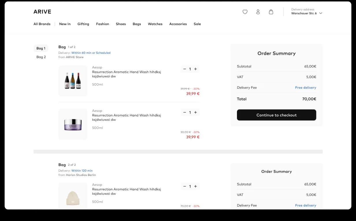
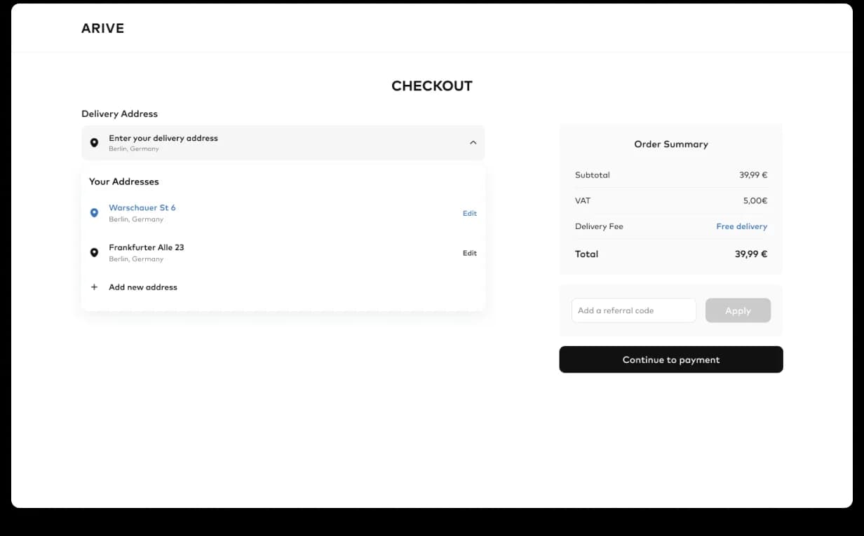
The conversion path is where every webshop earns or loses its business. The product page leads with imagery the brand earns, gives the buy-button a permanent home, and pulls reviews, delivery and size guidance into the same fold, with the two-hour delivery promise visible where it earns trust. The checkout is a single linear flow with clarity on shipping costs and cart state. The order summary is the moment of trust, receipt, delivery window, support route, cleanly stacked. Three surfaces, no friction break.


Conversion-ready, at last.
Conversion and AOV climbed. Marketing ships campaign pages on demand. Search drives discovery, not dead-ends. The webshop finally feels as fast and as premium as the two-hour delivery promise, verified Clutch 5.0 from Armin Krahl, VP of Product.
Book a free sprint