Mashvisor Real-estate data analytics · 2023, 2024

How design turned an Airbnb-investment analytics SaaS into a decision-ready one.

Outcome A 7-day paid trial converted into an embedded engagement that rebuilt 7 product surfaces end-to-end. Verified Clutch 5.0 across every category.
Mashvisor. Airbnb-investment analytics SaaS

Data-heavy SaaS rarely loses to a competitor with better data. It loses because users can’t turn the data into a decision.

Mashvisor is a US real-estate analytics SaaS for investors and agents, property data, pricing tools, calculators, agent portfolios. The data was there. The UX kept its own users from finding it. The Product Manager came to us for a 7-day paid UX trial. The trial converted into an embedded engagement, and we rebuilt seven product surfaces end-to-end.

01

Feature-rich, UX-poor. Years of capabilities added without an IA pass, even seasoned investors found the interface unintuitive. Every feature was there. None of them were findable.

02

Two audiences, one interface. Investors need to compare and underwrite; agents need to publish portfolios and capture leads. The product was being optimized for whichever cohort complained loudest that week.

03

Prove it first. The PM wasn’t committing to a multi-month rebuild on a pitch. They scoped a 7-day paid audit. If the diagnosis landed, the engagement opened up.

★★★★★
Denovers untangled our data-heavy analytics platform and rebuilt it as something everyday investors could actually navigate. The attention to detail in every aspect and futuristic collaboration gives us confidence that Denovers will always meet our project requirements. They operated as an extension of our team from day one of the trial.
Erqem
Erqem Product Manager · Mashvisor · real-estate data analytics platform
Engagement
↑ Boost
User engagement up after the rebuild, per the verified Clutch review, alongside resolved functionality issues.
Findability
Simplified UX
Complex searches in just a few clicks. Data visualization through graphs and SaaS-based tables.
Productized
New tier
Agent website builder shipped as a first-class surface, earned its own Pro+ pricing tier and sales-demo lead.
Rating
5.0 Clutch
Verified across every category. Quality / Schedule / Cost / Willingness to refer.
The story

A 7-day audit that turned into a 7-phase rebuild.

Mashvisor's PM found us via outreach. Pricing fit, culture fit, and the Clutch ratings sealed it. They scoped a 7-day paid trial, stakeholder interviews, heuristic reviews, affinity mapping. The brief was simple: surface what was actually broken before drawing a single new screen. We came back with 42 issues clustered into 6 design problems. That artifact converted the trial into the long-term engagement.

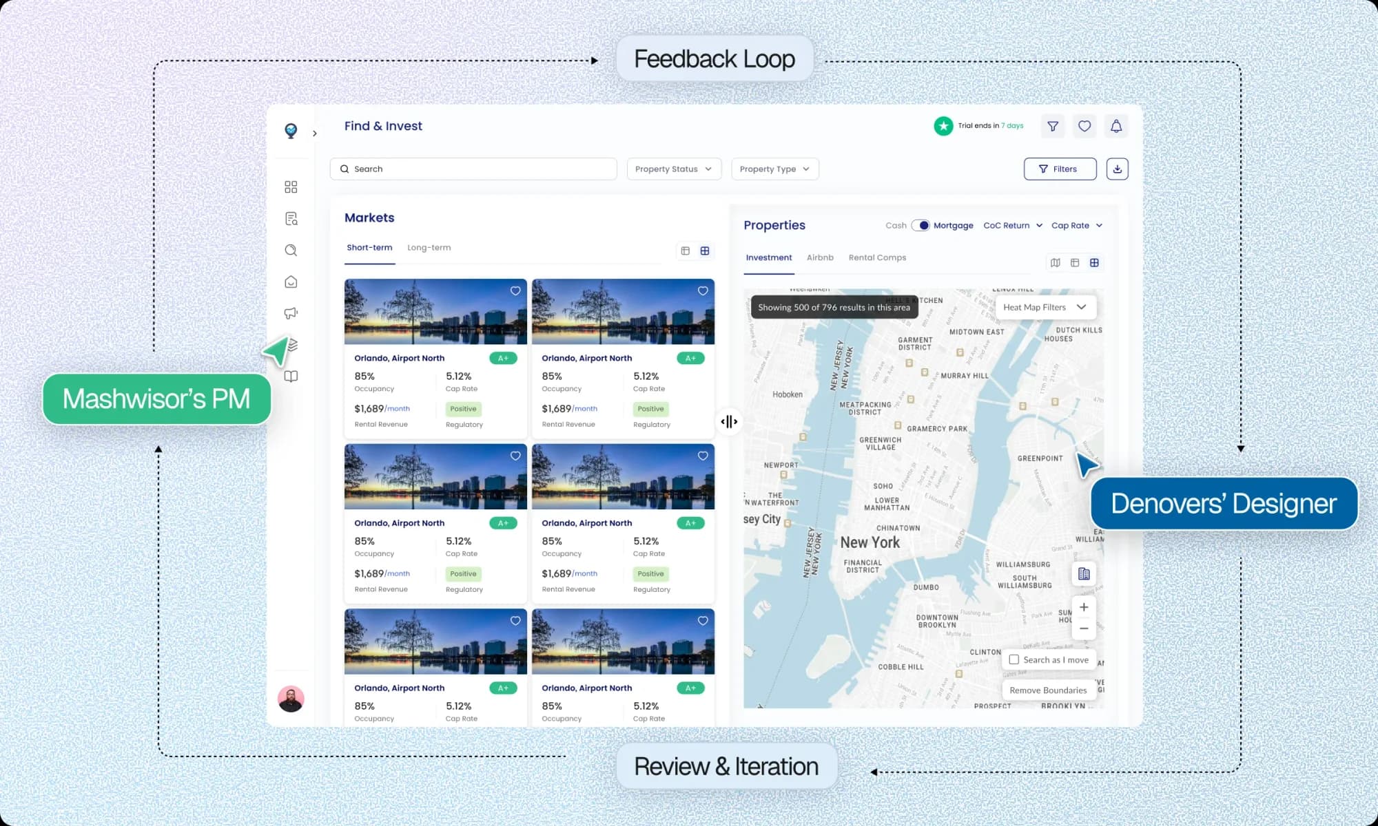
From there we embedded a senior product designer into the team, ran daily syncs with the PM and weekly stakeholder reviews, and rebuilt the navigation around the verbs the user actually does (Search, Analyze, Compare, Build, Manage). Every flow returned to a single property, so the property-details page became the spine. From that spine we shipped seven surfaces in sequence, calculators, listing tables, research and analyze, the agent website builder (which earned its own Pro+ pricing tier), and signup and pricing. All assembled from the same primitives so density and pacing stayed disciplined. The work landed a verified 5.0 Clutch across every category.

ClientMashvisor · US real-estate analytics SaaS
RegionUnited States
Engagement7-day paid audit, embedded designer
Status5.0 Clutch across every category
Chapter 01

Feature-rich, UX-poor. The audit found why.

Mashvisor had spent years adding capabilities, every feature was technically there, none of them were findable. Seven days of stakeholder interviews, heuristic reviews, and affinity mapping narrowed a long list of user complaints into 42 issues clustered into 6 design problems, in priority order. The audit was the artifact that converted the trial into the engagement.

figjam.com/audit/mashvisor-affinity-map
UX AUDIT · AFFINITY MAP · 7 DAYS · 42 ISSUES → 6 CLUSTERS CLUSTER 01 · NAVIGATION Overwhelming, scattered. 12 ISSUES Users can’t find rental data. No path between calculators & insights. CLUSTER 02 · DATA HIERARCHY No signal in the noise. 9 ISSUES Cap rate buried below cosmetics. No primary action per screen. CLUSTER 03 · CALCULATORS Powerful, but hidden. 7 ISSUES No toggle between STR / LTR. Inputs reset on every recalc. CLUSTER 04 · LISTING TABLES No structured comparison. 6 ISSUES Sort doesn’t persist. No way to bulk-shortlist. CLUSTER 05 · AGENT SITE No way to showcase. 5 ISSUES Agents asking for portfolio export. No public listing page. CLUSTER 06 · SIGNUP Lengthy & complicated. 3 ISSUES 9-step form, no progress signal. Pricing buried 2 clicks deep. METHOD · STAKEHOLDER INTERVIEWS · HEURISTIC REVIEW · AFFINITY MAPPING IN MIRO From 42 individual issues to 6 design problems. Each cluster mapped to a product surface in the redesign roadmap. Trial converted to engagement on day eight.
Audit Affinity map · 42 issues clustered into 6 design problems Day 1, 7
Chapter 02

A new IA, with the property page as the gravitational center.

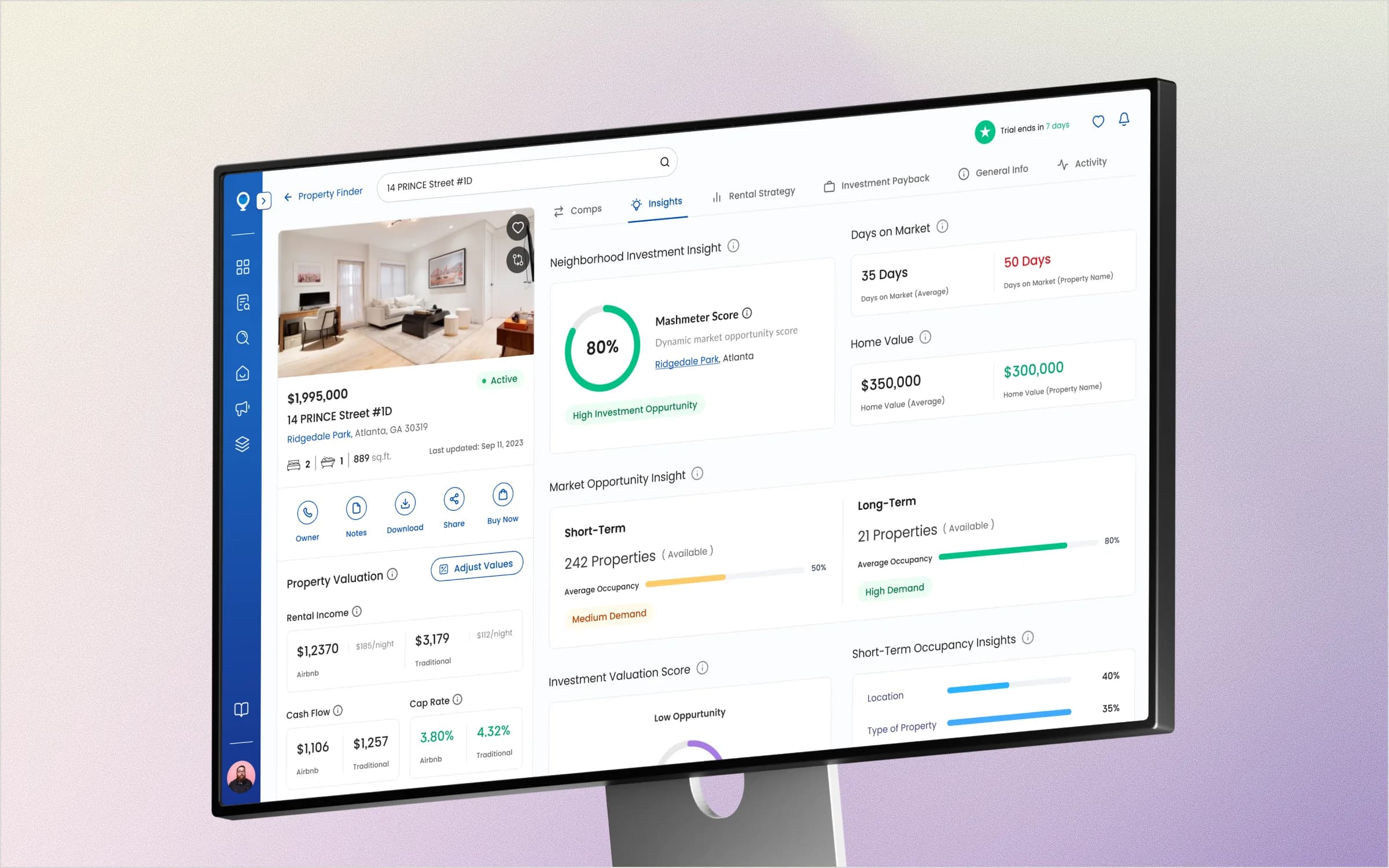
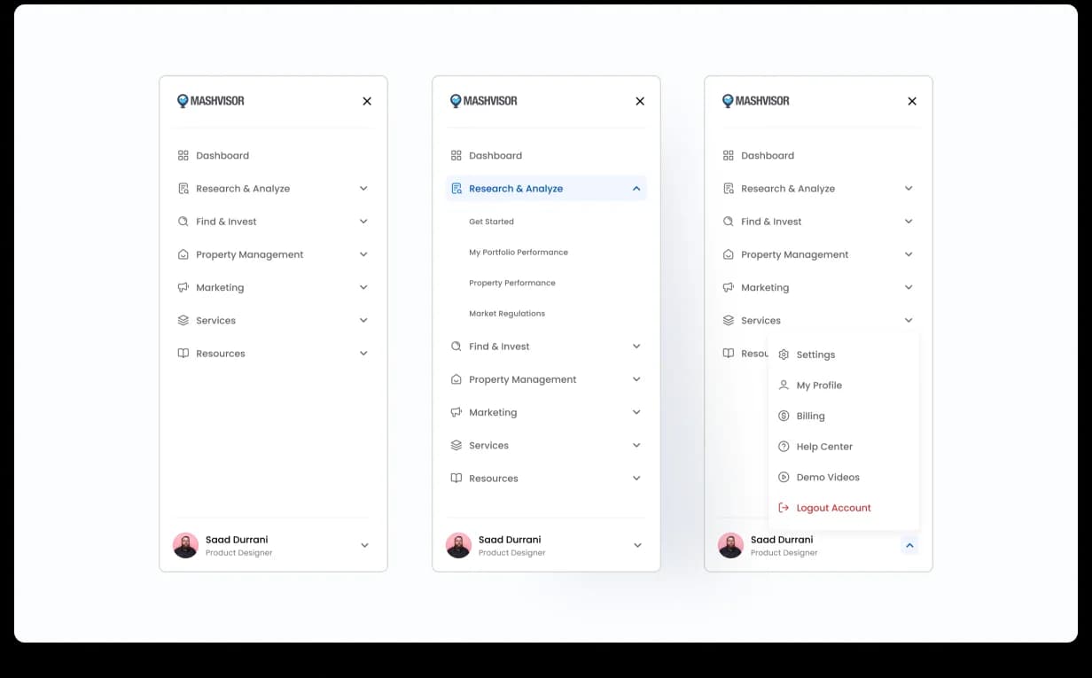
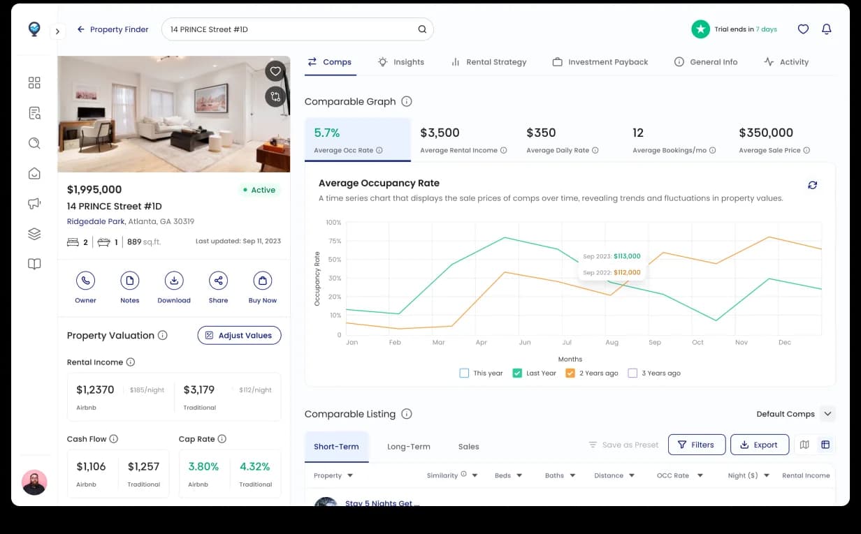
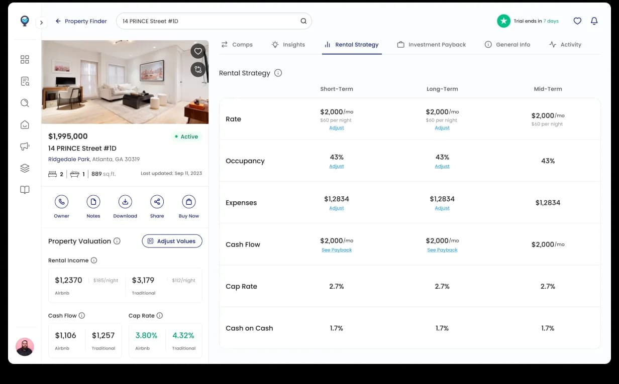
We rebuilt the IA around tasks not features (Research & Analyze, Find & Invest, Property Management, Marketing) and made the property-details page the surface every other flow returns to, persistent KPI panel on the left, tabbed analysis on the right (Comps / Insights / Rental Strategy / Investment Payback). One page, four jobs done.

app.mashvisor.com/navigation
Mashvisor task-based navigation, three side-panel views: collapsed top-level, expanded with sub-items (Get Started, My Portfolio Performance, Property Performance, Market Regulations), and the user account menu open
Navigation Task-based nav · three views: collapsed, expanded with sub-items, account menu IA rebuild
app.mashvisor.com/property/details
Mashvisor property details page, persistent KPI panel with rental income, cap rate, cash flow; tabbed analysis showing Comps, Insights, Rental Strategy, Investment Payback, General Info, Activity
Property page Persistent KPI panel + tabbed analysis · the spine every other flow returns to The foundation
Chapter 03

Turning data into a decision.

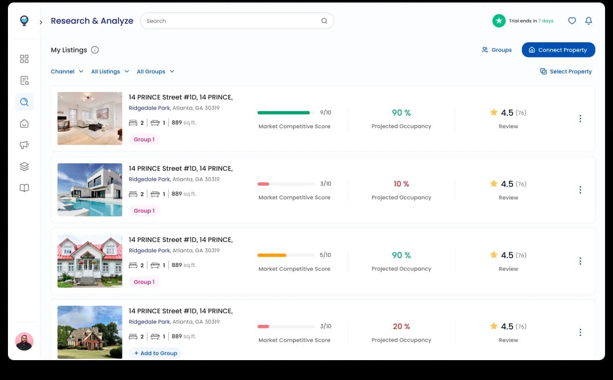
The calculator is where Mashvisor stops being a data product and starts being a decision tool: short-term vs long-term rental scenarios, cash vs financed, cumulative-return projection updating live as inputs change. The research surface adds the missing layer, direct Airbnb account sync (no copy-paste), monthly revenue trends, occupancy by listing. Investors stopped second-guessing whether the numbers were current.

app.mashvisor.com/calculator
Mashvisor rental strategy calculator, short-term/long-term toggle, cash/financed scenarios, inputs and outputs side-by-side with payback projection updating live
Calculator STR/LTR toggle · cash vs financed · cumulative-return projection updates live Decision tool
app.mashvisor.com/research
Mashvisor research and analyze surface. Airbnb account sync card, monthly revenue trends bar chart, KPI side panel, occupancy by listing breakdown
Research & Analyze Airbnb account sync · monthly revenue trends · occupancy by listing Live data
Chapter 04

The listing tables, sortable, sticky, scannable.

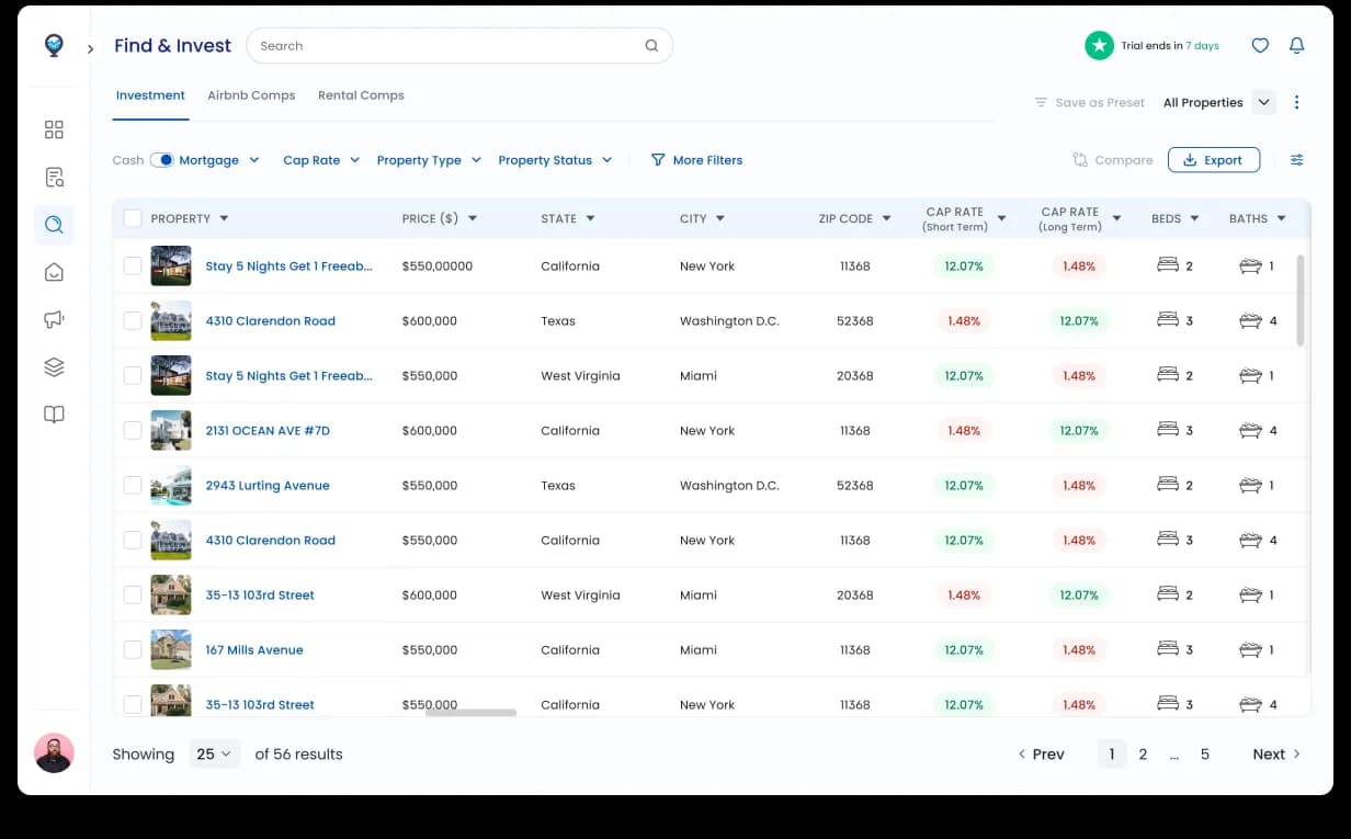
The browse experience is what active investors live in. We rebuilt it as a scrollable table with sortable columns, sticky headers, hover-popup property preview, removable filter chips for high occupancy / price cap / location, and bulk-action shortlist tools. Sort persists across pages. The difference between scrolling for an hour and finding the right three properties in fifteen minutes.

app.mashvisor.com/listings
Mashvisor listing tables, filter chips, sortable columns, hover popup with property preview
Listings Filter chips · sortable columns · hover popup preview · bulk shortlist Browse + compare
Chapter 05

The agent website builder, productized.

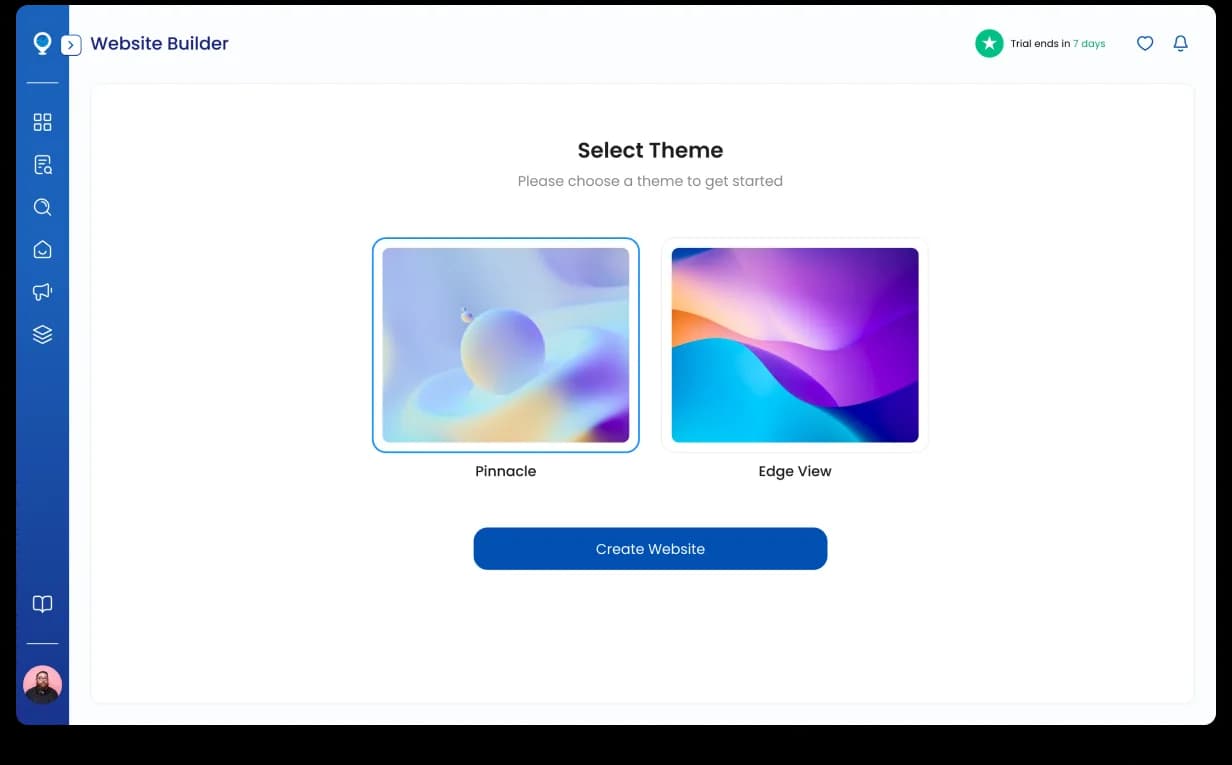
Agents wanted to publish their portfolio publicly. We built it as a stepper flow (domain → theme → content → portfolio → publish) with smart defaults at each step, live preview, and portfolio sync from the agent’s Mashvisor account, no copy-paste. Built as its own first-class surface, not a setting toggle. The work earned its own pricing tier and became a marketing differentiator the sales team uses on every demo.

app.mashvisor.com/builder
Mashvisor agent website builder, stepper flow with live preview and portfolio sync from the user's Mashvisor account
Website builder Stepper flow · live preview · portfolio sync · published on the agent’s domain Productized feature
Chapter 06

The on-ramp: signup + pricing, finally legible.

The audit found the same problems on the marketing site as inside the app: features hidden, no progress signal, pricing buried two clicks deep. We rebuilt signup as a 3-step stepper (use-case → details → confirm) with a real progress indicator, and pricing as a four-tier page (Lite / Standard / Professional / Enterprise) with a billing toggle and "Most Popular" anchor on Standard. Prospects find their own answer; sales doesn’t have to walk every lead through the price.

mashvisor.com/signup
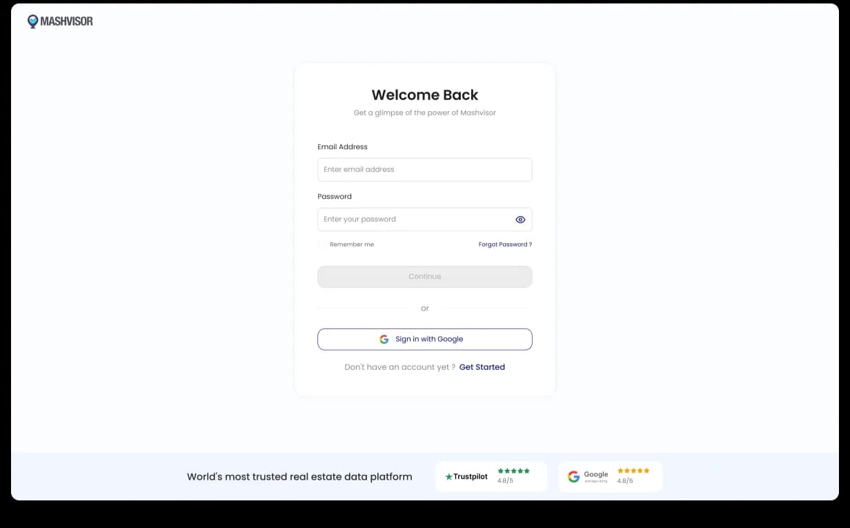
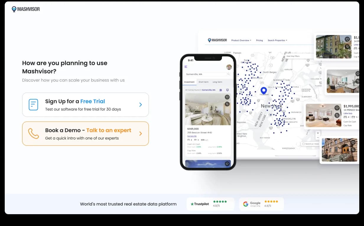
Mashvisor signup stepper Step 1 of 3, ‘How do you want to use Mashvisor?’ with use-case selection cards: Research & Analyze, Find & Invest, Property Management, Marketing, Other Need, with progress indicator at bottom
Signup · Step 1 / 3 Use-case selection cards · multi-select · real progress indicator Stepper
mashvisor.com/pricing
Mashvisor pricing page, four tiers (Lite, Standard with Most Popular tag, Professional, Enterprise) with billing toggle (Every 3 months / Yearly) and per-tier feature lists
Pricing Four tiers · Lite / Standard / Professional / Enterprise · billing toggle “Most Popular” on Standard
Outcome · 7 surfaces rebuilt · verified Clutch 5.0

From data-heavy to decision-ready.

A platform that can finally onboard and retain users new to real-estate investing. Easier feature discoverability, better data comprehension, reduced onboarding friction, and greater adoption of calculators, property insights, and the agent website builder. Mashvisor stopped fighting its own UX.

Book a free sprint
Trial sprint · on us

Data-heavy SaaS losing users to its own UX? Start with a free trial sprint.

One scoped surface, no ramp-up. The same way we started with Mashvisor. If it doesn’t click, keep every file we ship.

  • Capped at 4 sprints / month
  • No card · NDA on request
Next case study → Case 04 · Fils · Enterprise climate fintech

How design helped an enterprise climate fintech go bank-grade.

Embedded design pod for Fils, 7 products under one shared system, live with an anchor bank in twelve weeks. GLEC + GHG Protocol native.

7 Products shipped
12 wk Sprint
GLEC. + GHG Protocol
ClimateTech · Enterprise · Bank-grade Read →